Applied
Stationery, decks, imagery, merchandise, and the retired directions kept on file.
Applications
Stationery, social, and presentation templates. Every file is editable as SVG and ready to place as PNG or PDF.
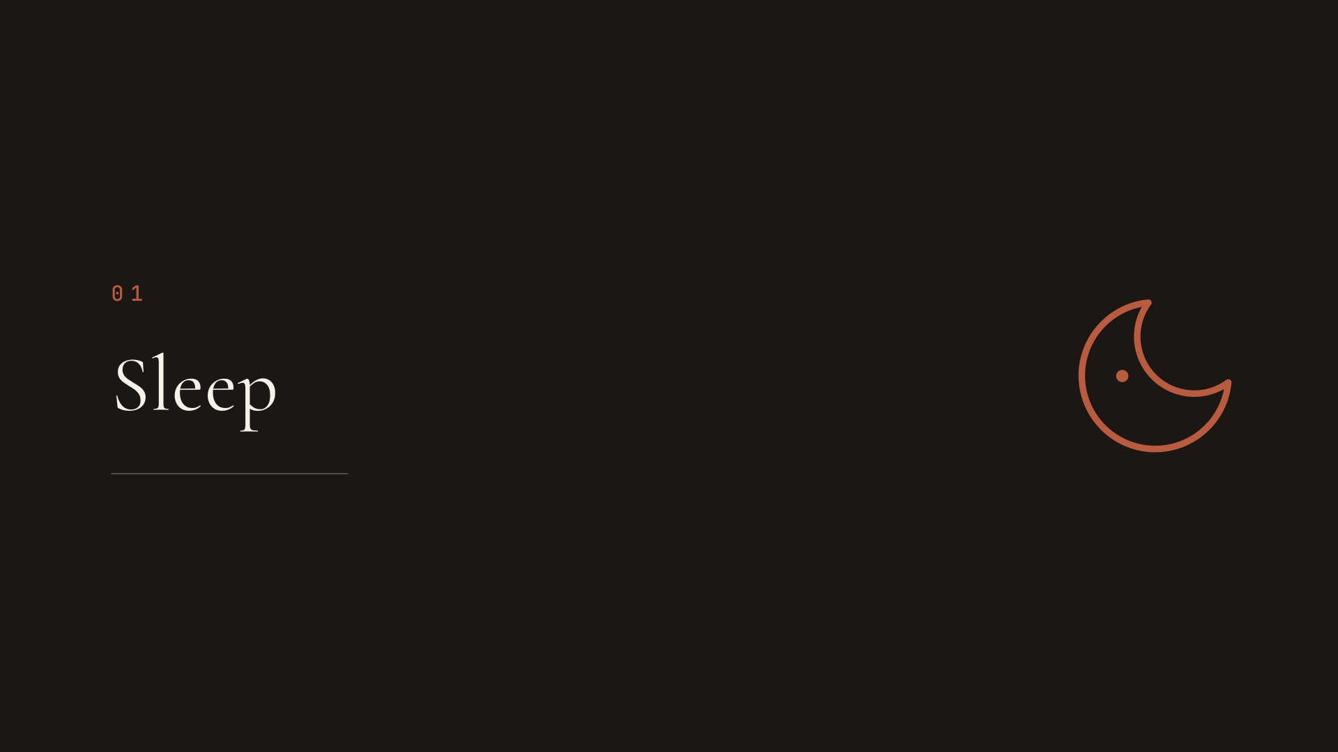
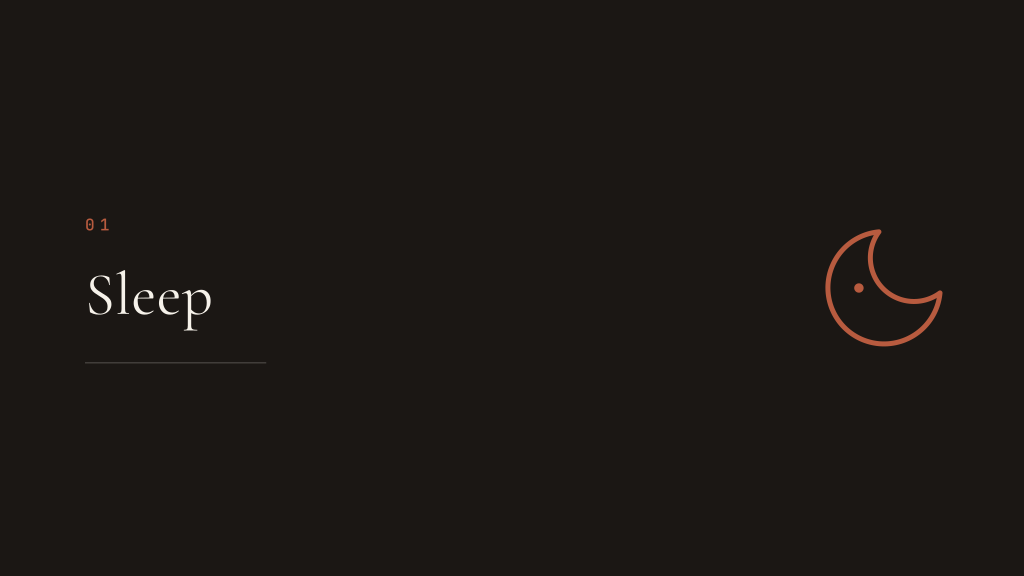
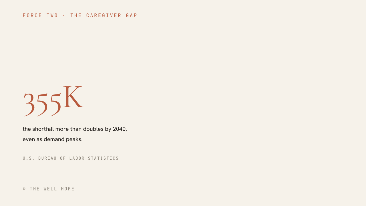
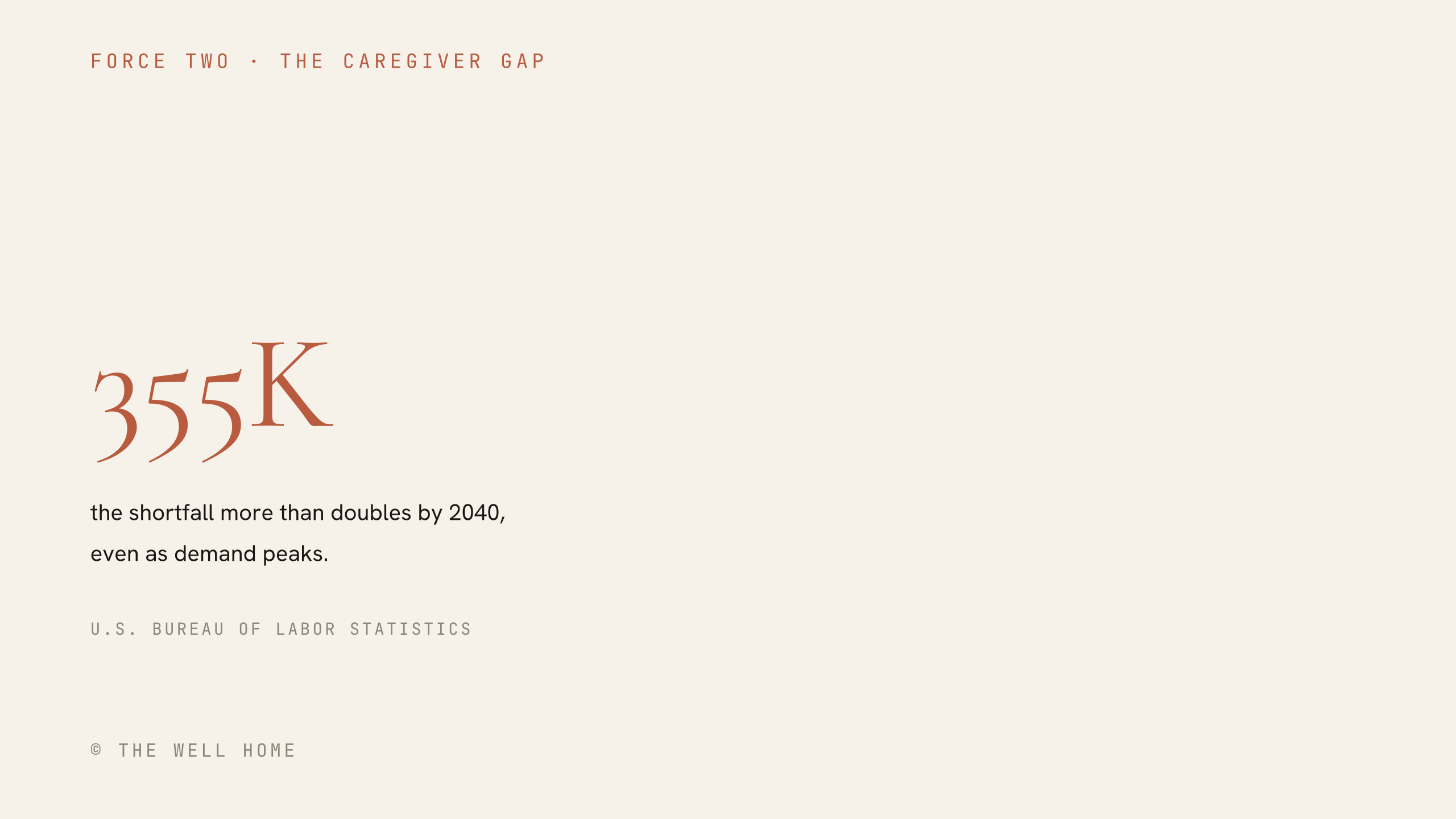
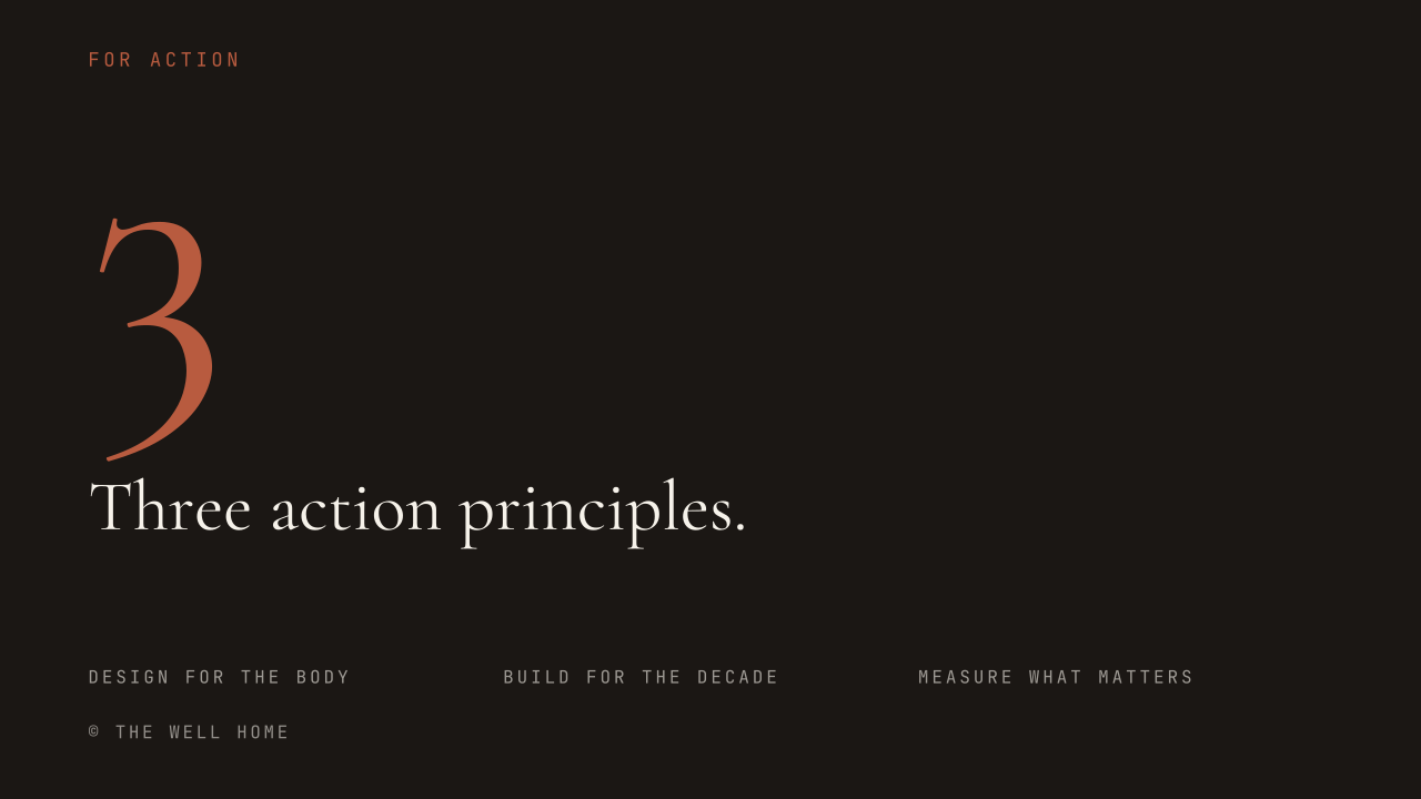
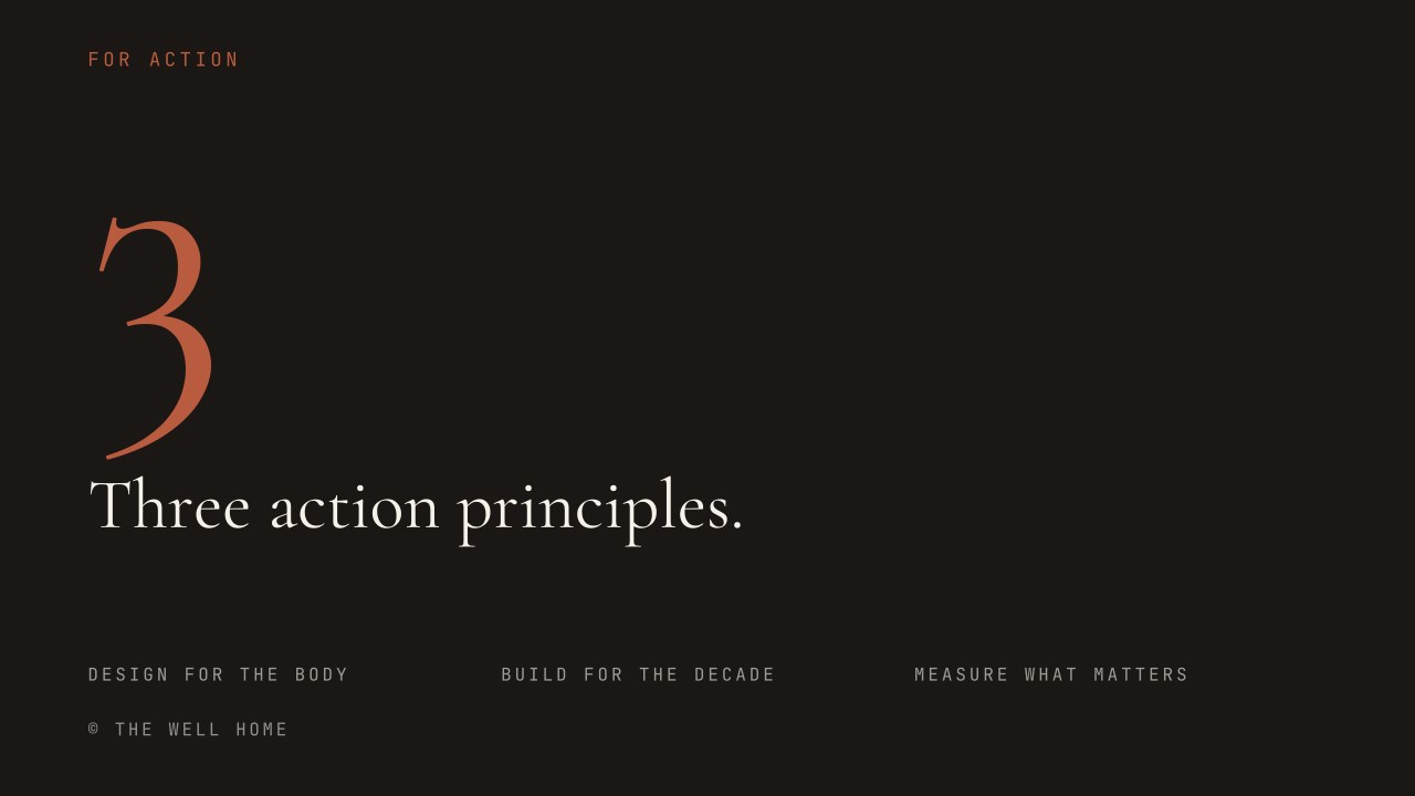
Presentation dividers
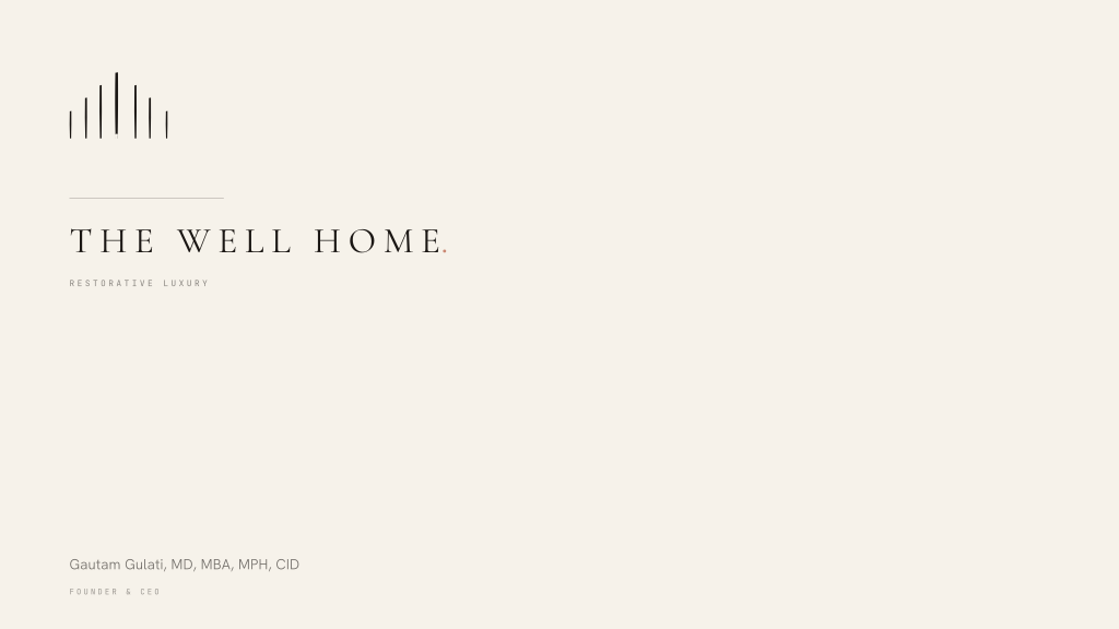
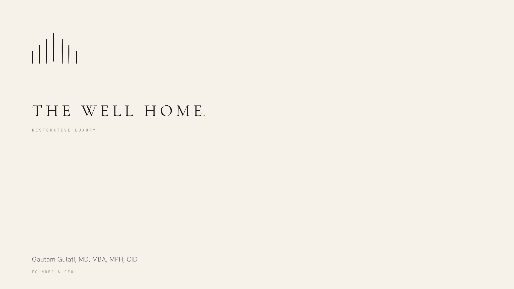
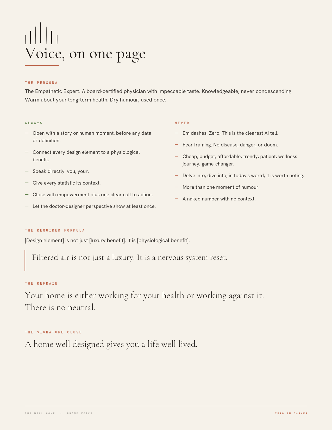
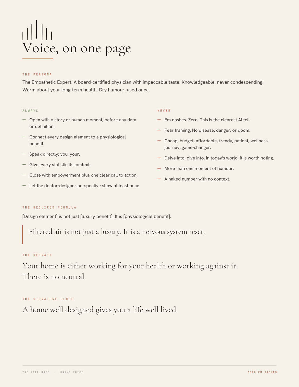
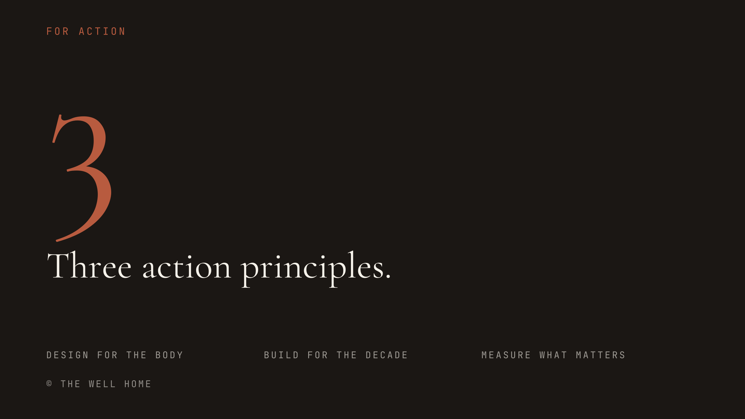
One per Lever, in its Chroma colour.
Email signature
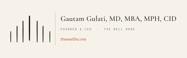
The most-used asset in any brand system, and usually the least governed. This one is a table with inline styles and a base64 mark, because email clients strip style blocks, flexbox and SVG. It will render correctly in Outlook, Gmail, and Apple Mail without modification.
Signature rules
- Paste into the signature editor in HTML mode. Pasting as rich text will strip the layout.
- The mark is embedded as base64 rather than hosted, so it renders with images blocked and never breaks if a URL moves.
- Cormorant, Hanken Grotesk and JetBrains Mono are named with system fallbacks. Most recipients see the fallback, which is intended: an email signature is not the place to fight a font stack.
- Do not add a logo image beside the mark, a second tagline, social icons, a legal disclaimer block, or a Sent from my iPhone line beneath it.
- Do not change the Chroma Period after the name. It is the one piece of brand colour in the signature.
- The plain-text version exists for clients that reject HTML entirely. Keep both in sync.



Show 14 more ↓



Presentations & Slides
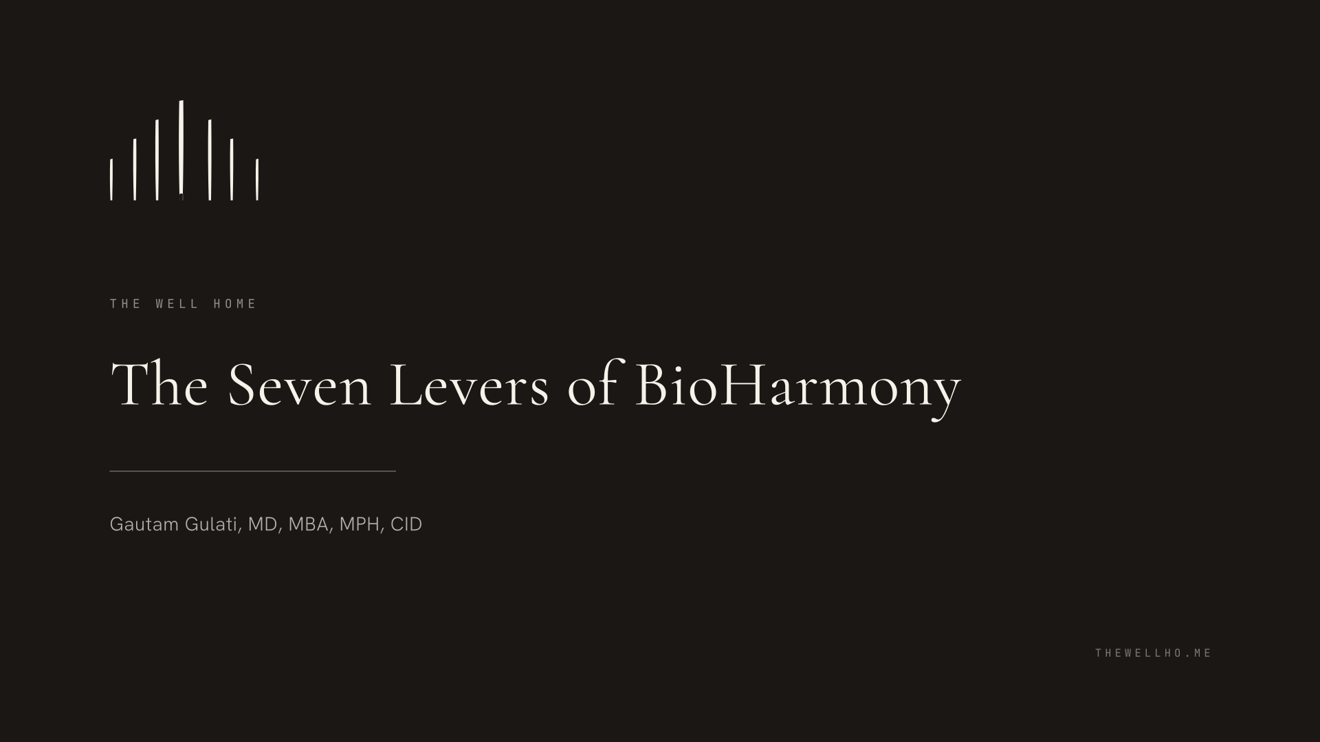
One system, two tools. A keynote built in PowerPoint and the same keynote built in Google Slides should be indistinguishable, and both should look like they came from the same studio as the website. The specification below was taken from the XML of a delivered deck rather than estimated from a render, so the sizes are what was actually shipped and worked in a room.
Canvas
| Item | Specification |
|---|---|
| Reference canvas | 13.333in x 7.5in, 16:9. PowerPoint's standard widescreen default. |
| The delivered deck | 20in x 11.25in. The same ratio at 1.5x scale, so not wrong, but standardise going forward. |
| Google Slides default | 10in x 5.625in. A third absolute size at the same ratio. |
| Why it matters | All three scale proportionally, so this only bites if an element is placed with absolute measurements. Build masters with relative placement and the size stops mattering. |
| Margins | Left and right 6.2% of width, top 8.3% of height, bottom 7.6%. Every component below sits on these. |
Colour
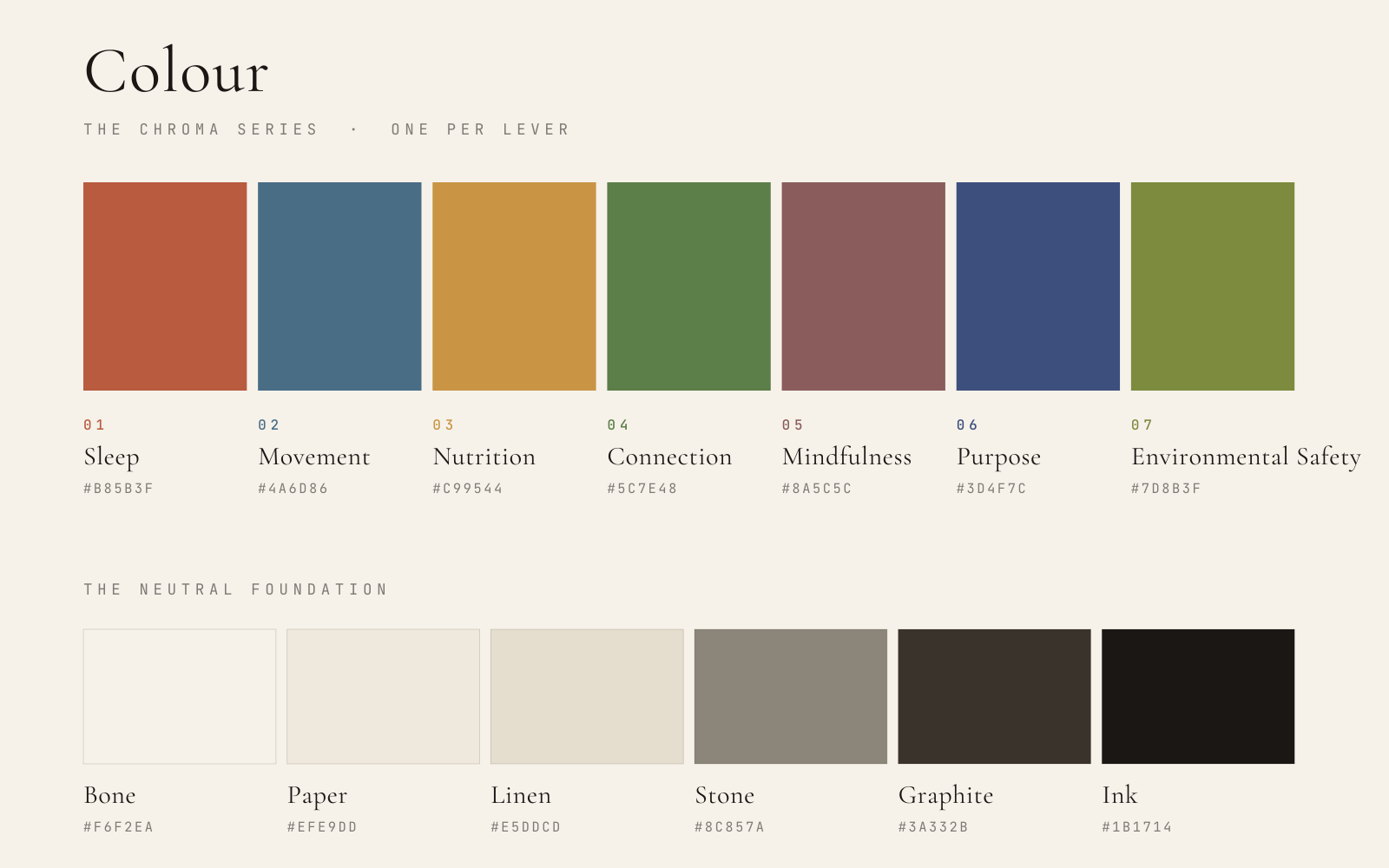
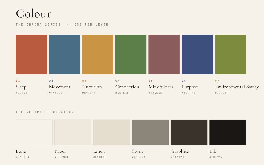
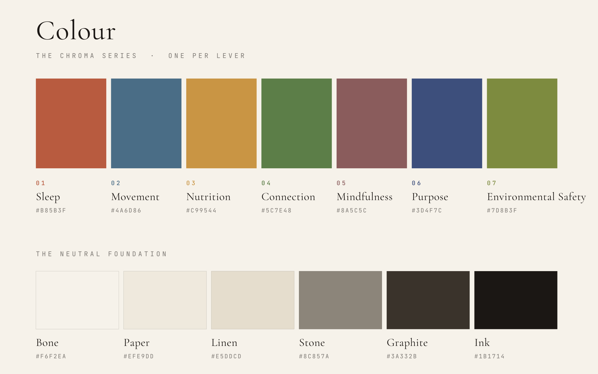
The slide palette is the brand palette, with no additions. Terra is the only accent that appears on a slide.
Typography
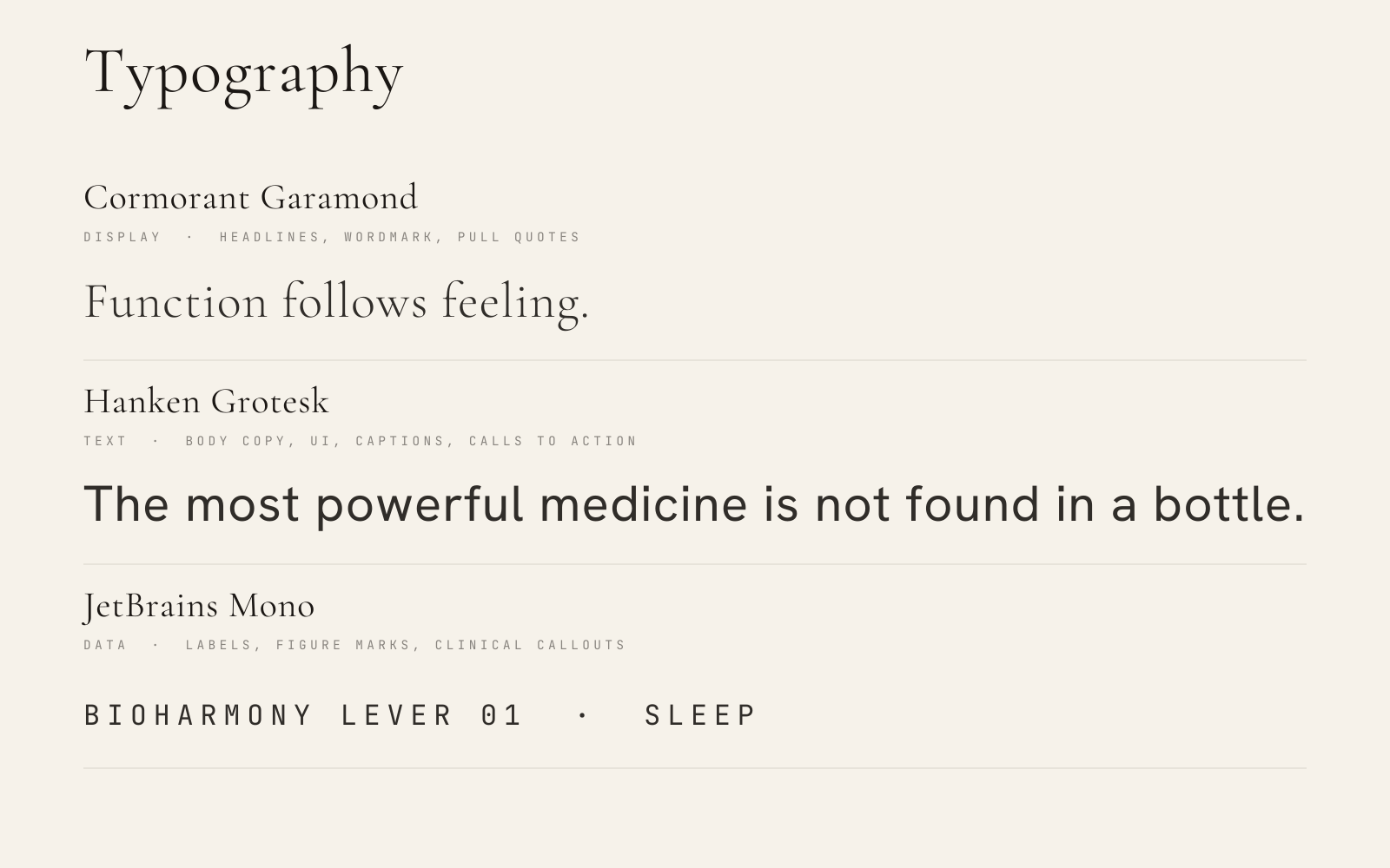
The same three faces already live on the portal, and all three are genuine open source, so they add natively in Google Slides and embed in PowerPoint with no licensing question. This replaces the delivered deck's ad hoc mix of Georgia, Helvetica Neue, Courier New and Arial. Setup is not zero-click, unlike system fonts. See the setup steps below.
| Face | Weights | Role |
|---|---|---|
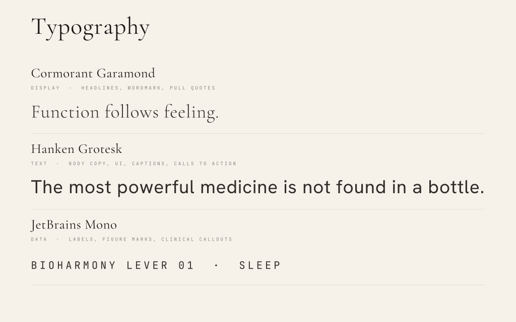
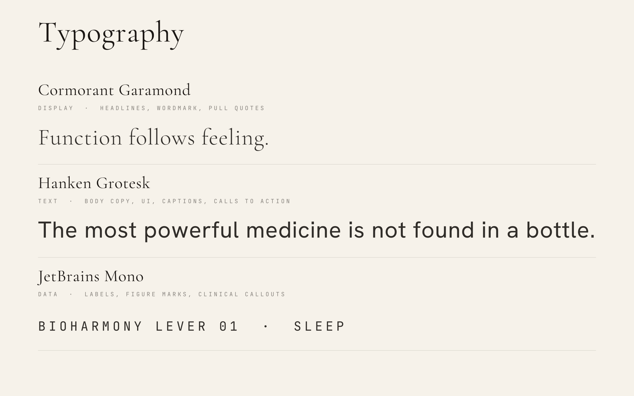
| Cormorant Garamond | Regular and Italic | Headlines, statement copy, stat numerals, section numbers, pagination. |
| Hanken Grotesk | Regular | Body copy, supporting sentences, sub-labels. |
| JetBrains Mono | Regular | Eyebrow labels, footers, citations, pagination context. Always uppercase, always wide-tracked. |
Type scale
Sizes taken from the delivered keynote's XML, not estimated from a render. Only the font names change.
| Size | Font | Role | Example |
|---|---|---|---|
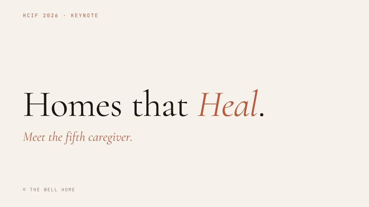
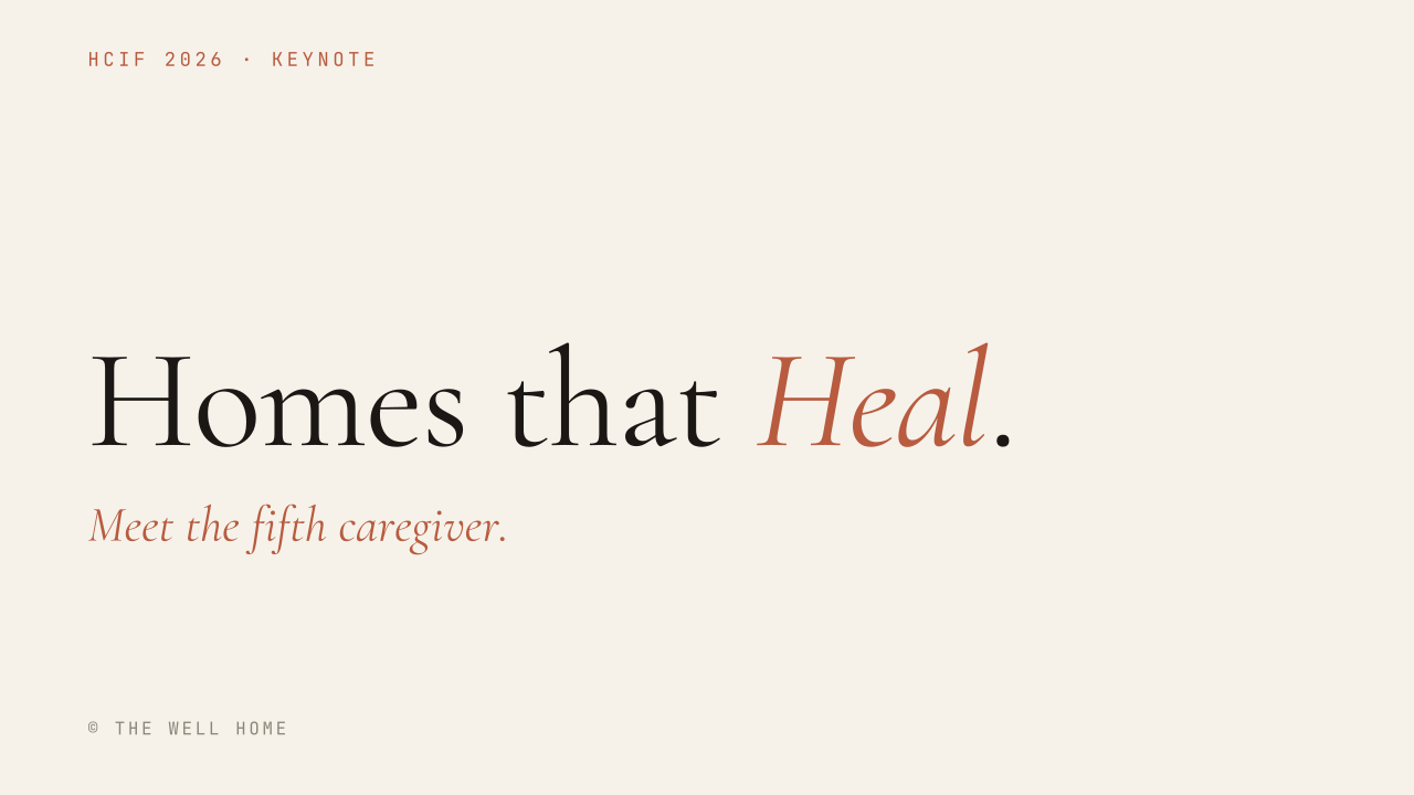
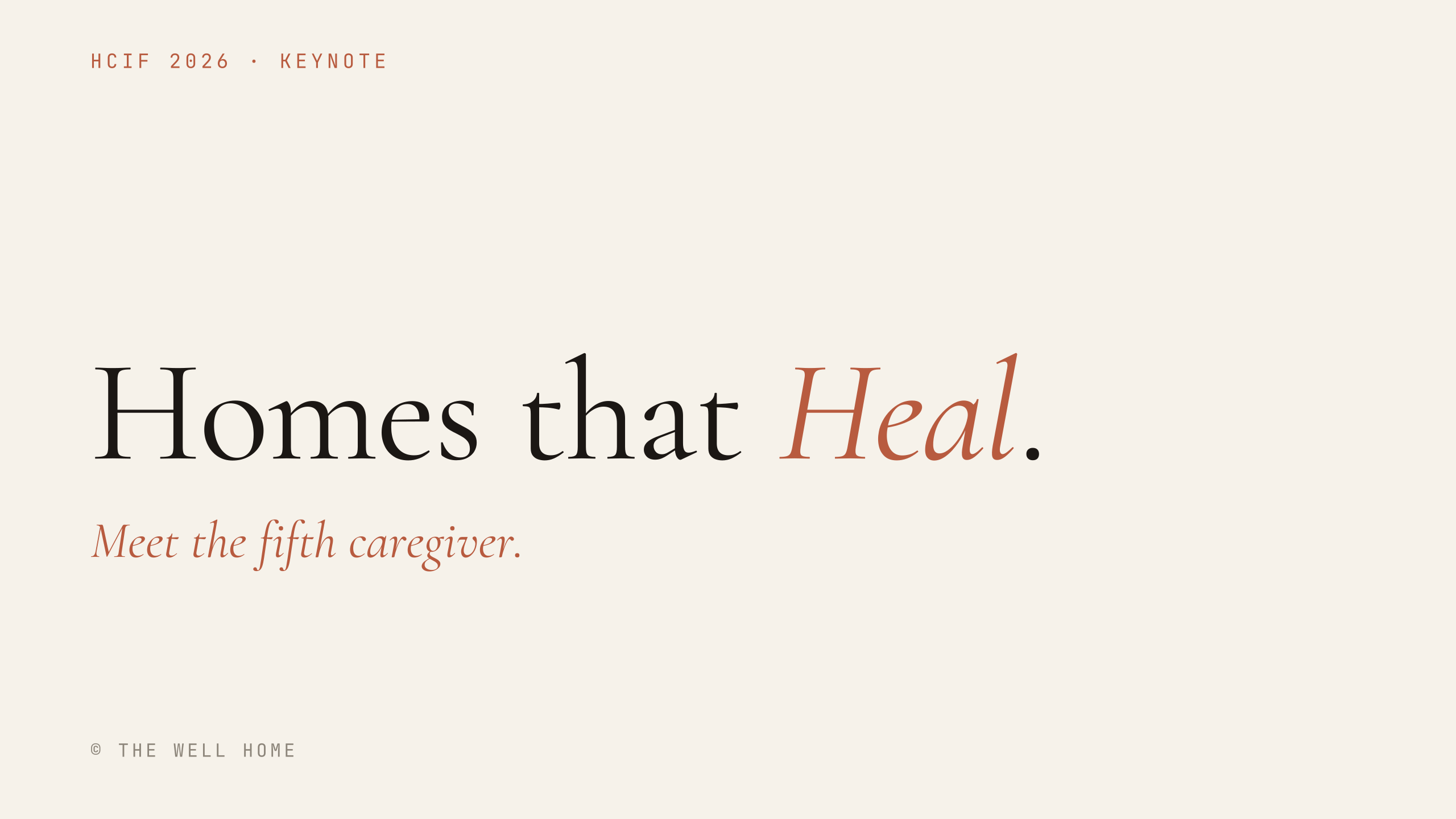
| 130pt | Cormorant Garamond, tracking tightened | Hero title | Homes that Heal. |
| 96-99pt | Cormorant Garamond | Big stat numerals, section statements | 151K |
| 72pt | Cormorant Garamond | Stat numerals, secondary headlines | 771M · 77% |
| 63-66pt | Cormorant Garamond | Section and statement headlines | The Darwinian Evolution of Our Home. |
| 60pt | Cormorant Garamond | Mid-weight statement headline | Six in ten adults live with... |
| 48pt | Cormorant Garamond Italic | Subtitle, editorial voice-over line | Meet the fifth caregiver. |
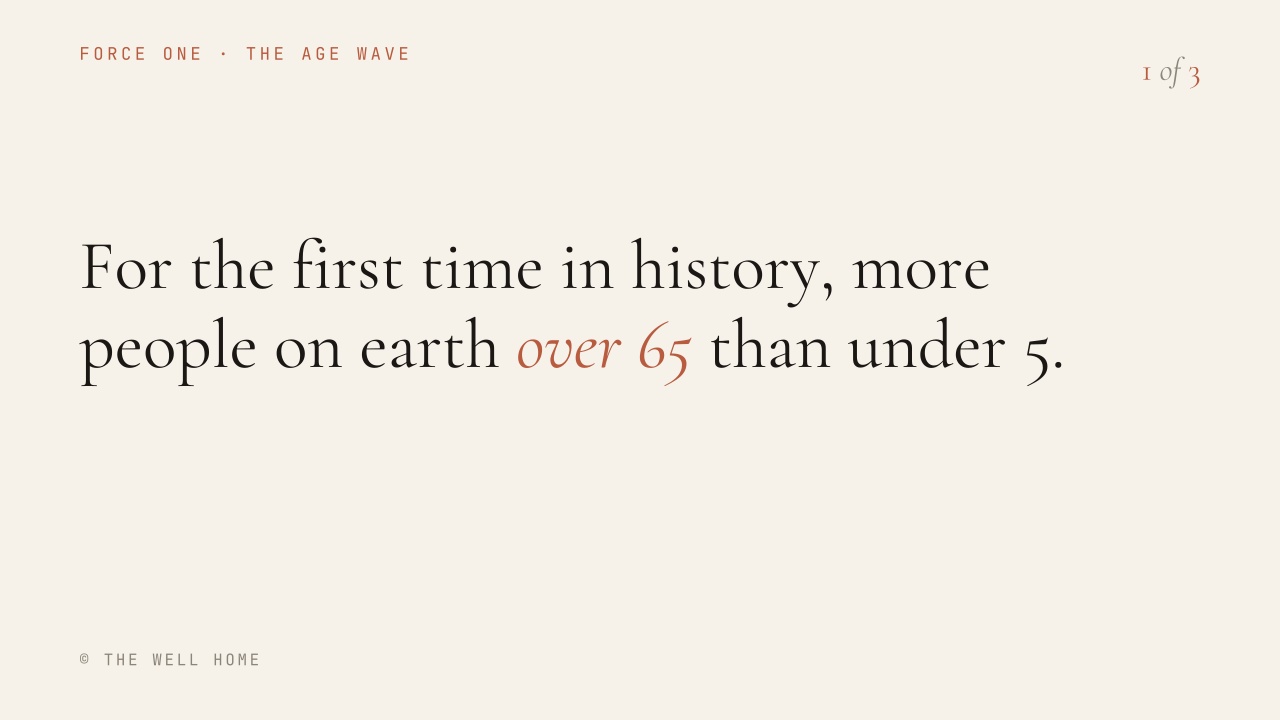
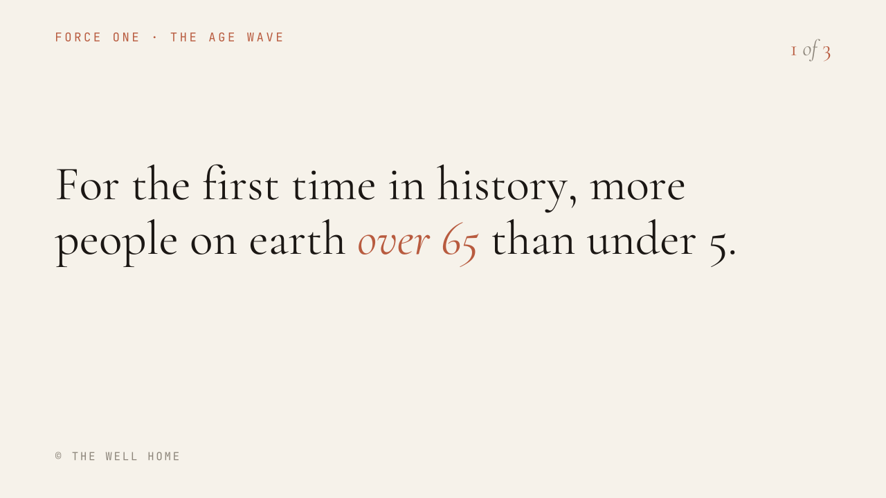
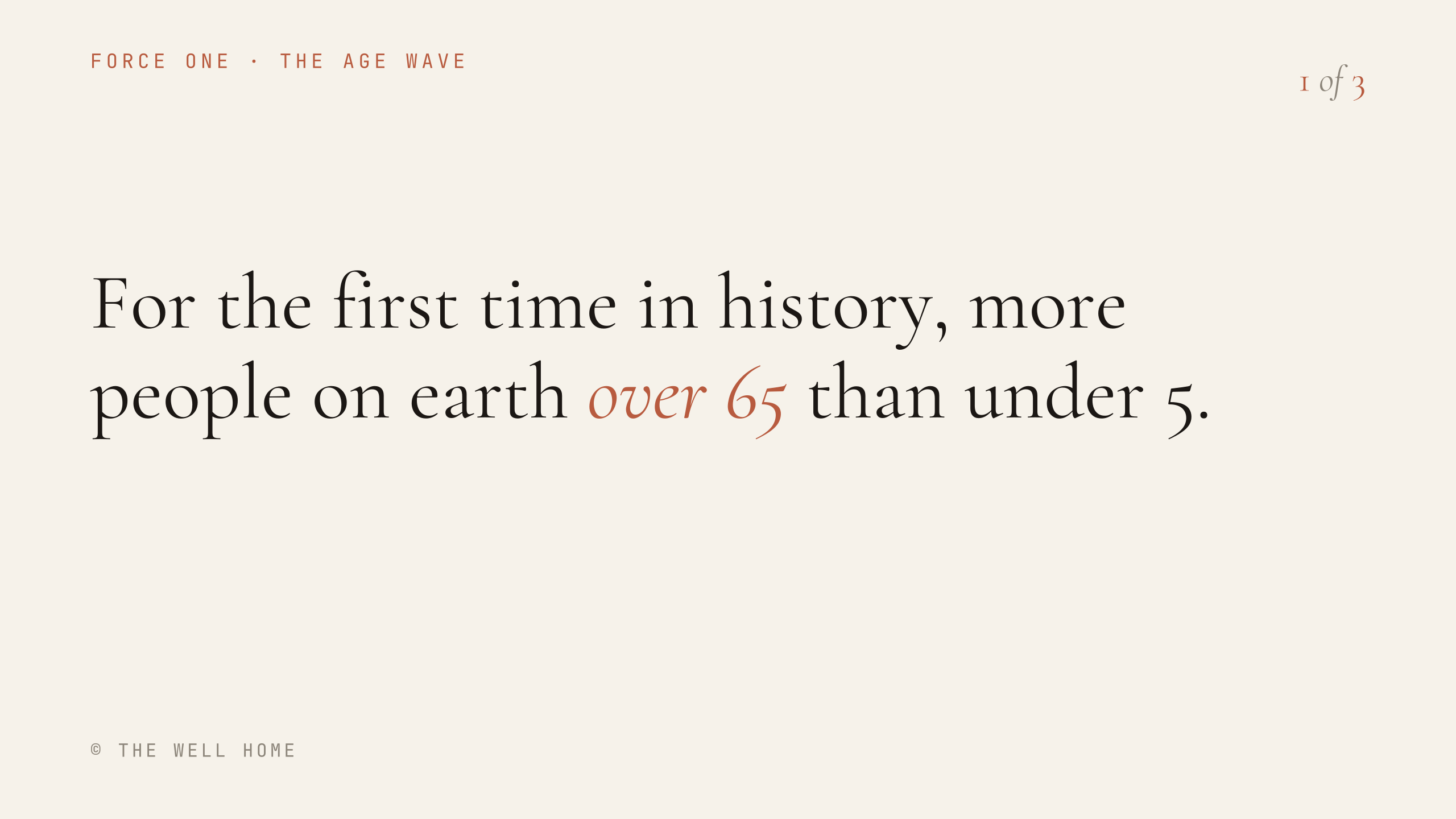
| 44pt | Cormorant Garamond | Pagination digit | 1 of 3 |
| 27-33pt | Cormorant Garamond | Dates, section numerals, pull quotes | 1939 - 2017 |
| 25-28pt | Cormorant Garamond | Speaker credentials, short statements | MD, MBA, MPH, CID |
| 21-26pt | Cormorant (labels) / Hanken Grotesk (body) | Sub-list items, anatomy labels | The Age Wave |
| 18-19.5pt | JetBrains Mono, uppercase, tracking +2.3pt | Eyebrow labels, footer, pagination context | HCIF 2026 · KEYNOTE |
| 14-16.5pt | JetBrains Mono | Citations, smallest captions | AARP · 2024 |
Resolved: Cormorant Garamond's oldstyle figures stay the house style, clearance rule and all. If even figures are ever wanted for stat numerals, Jost, Hanken Grotesk and JetBrains Mono all set lining figures by default, and Jost 300 in particular would give even, geometric numerals from a face already approved in this system. But that stays a fallback, not the default: the delivered keynote used Georgia, which also sets oldstyle figures, so what shipped and worked already had this character.
Text treatment
- Inline emphasis: one word or a short phrase inside a headline, set in Cormorant Garamond Italic and coloured Terra.
- Editorial voice-over: an entire sentence in Cormorant Garamond Italic, in Ink on light or Bone on dark. Used for subtitles, connective lines and pull quotes.
- Tracking: display sizes at 96pt and above get slightly tightened letter-spacing. Mono eyebrow labels get widened. Never the reverse.
- Casing: eyebrow labels, footers and citations are always uppercase. Headlines and body copy are sentence case, never all-caps.
- One emphasis per slide. Two Terra phrases in one headline cancel each other out.
Slide components
| Component | Specification |
|---|---|
| Eyebrow label | Top-left, JetBrains Mono, uppercase, wide-tracked, Terra or Ink. One font, always. |
| Pagination marker | Top-right, digit + italic 'of' + digit. Cormorant, digits in Terra. Multi-part sequences only. |
| Footer | Bottom-left, © THE WELL HOME, JetBrains Mono at roughly 18pt, on every content slide. |
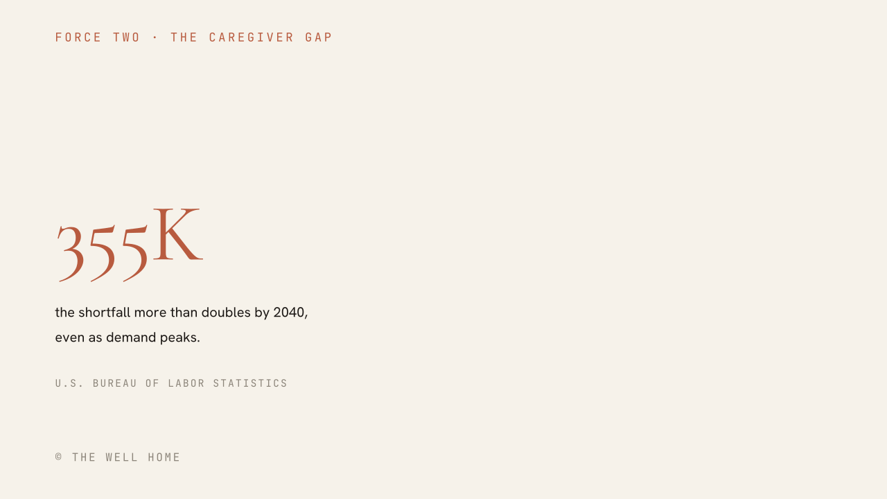
| Stat callout | Cormorant numeral in Terra, one-line Hanken label beneath, JetBrains Mono citation below that. Label and citation sit in fixed vertical slots so they cannot collide. |
| Section divider | Ink full bleed, giant Terra numeral, Bone Cormorant headline, mono sub-items in a row beneath. |
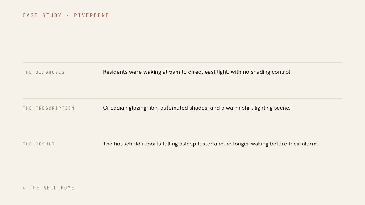
| Case study | The Diagnosis, The Prescription, The Outcome as three ruled rows. The Outcome is qualitative by default, not a manufactured percentage. |
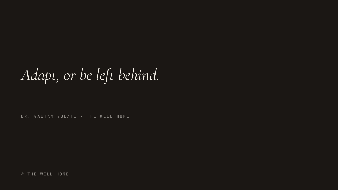
| Editorial line | A full italic sentence on Ink, with a mono attribution beneath. |
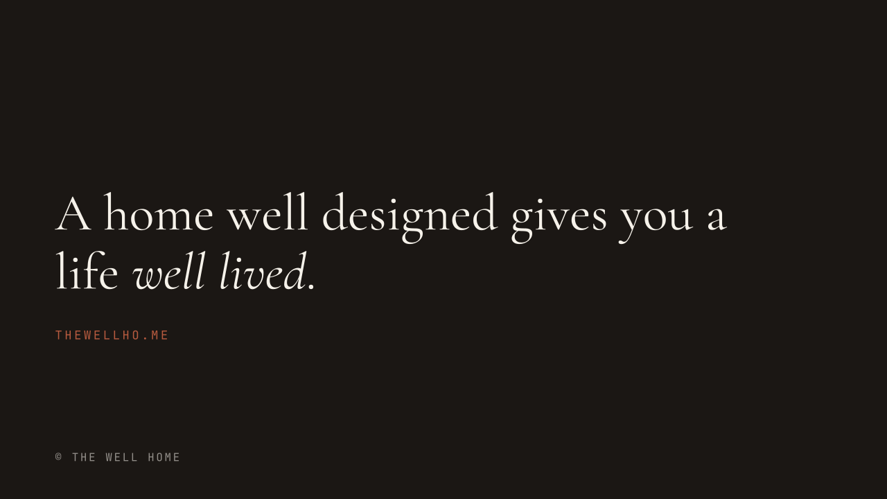
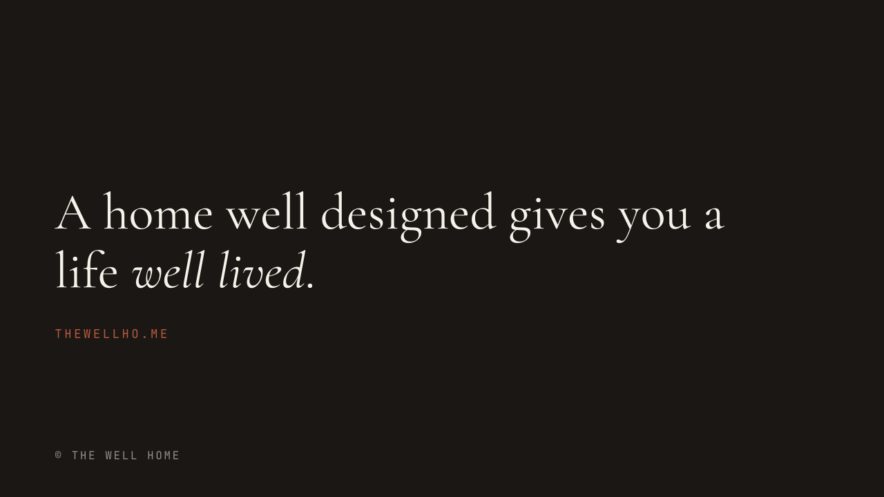
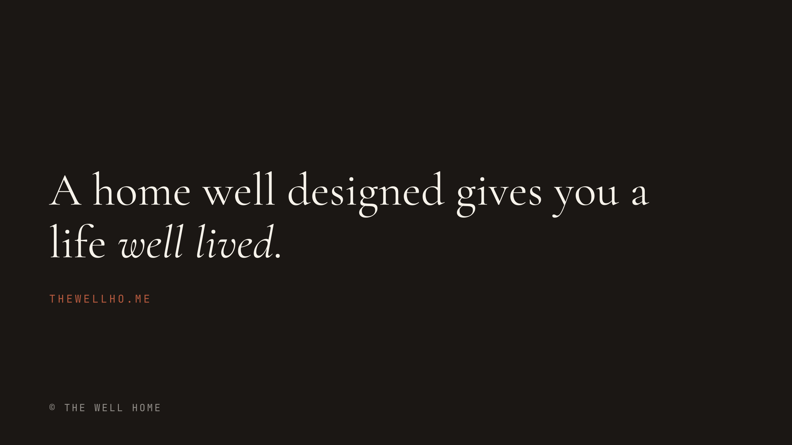
| Closing | The signature line, with the emphasis falling on 'well lived'. |
Component reference
Every layout below is drawn at the reference canvas and downloadable as SVG, PNG and PDF. Use them as position guides when building the master slides.
Starter template
A working .pptx built to this specification. Open it in PowerPoint, or import it into Google Slides via File, then Import slides. Every layout carries its rule in the speaker notes.
Setup · PowerPoint
- Install Cormorant Garamond, Hanken Grotesk and JetBrains Mono from Google Fonts on the machine doing the design work.
- Before distributing: File, then Options, then Save, then tick Embed fonts in the file.
- Choose Embed all characters, not just the characters in use, so anyone editing later has the full set.
- Never hand off a .pptx without this step. Without embedding, a recipient sees Calibri and the deck falls apart.
Setup · Google Slides
- Open the file, then the font dropdown, then More fonts. Search and add all three faces.
- This is once per Google account, not once per file. Once added they stay available.
- There is no embedding step and none is needed. Slides renders from Google's own font library, so any viewer sees the correct faces in the browser.
- The trade is that Slides gives no OpenType control at all, which is why the figure question above cannot be solved there.
Issues this spec resolves
| Issue | Resolution |
|---|---|
| Citation overlapping the stat label | Layout. Resolved here by giving the label and citation fixed vertical slots rather than flowing them under a numeral of variable height. |
| Duplicated words in case-study results | Proofreading, not design. 'more confidence, more more independence' and 'reduction in agitation incidents. incidents.' both need correcting before reuse. |
| Eyebrow label switching fonts mid-deck | Resolved by making JetBrains Mono the only option for that slot. |
| Two near-identical oranges and creams | Resolved by adopting #B85B3F and #F6F2EA as canonical everywhere. |
| A third-party stock infographic | The CDC-style chronic disease graphic breaks the system entirely. Rebuild any such stat in-brand rather than embedding another organisation's design. |
Do and don't
Do
- Terra as the only accent, used sparingly.
- JetBrains Mono exclusively for labels, citations and footers.
- Cormorant Garamond Italic for both inline emphasis and full editorial lines.
- Alternate Bone and Ink grounds at section transitions.
- Embed fonts before sharing a .pptx.
- Rebuild third-party statistics as in-brand slides.
Don't
- Introduce a second accent colour competing with Terra.
- Use a Lever's Chroma colour as a decorative accent on a slide that is not about that Lever.
- Set headlines or body copy in all-caps.
- Embed third-party-branded stock graphics.
- Hand off a .pptx without embedded fonts.
- Place a large numeral by baseline alone and assume it clears what sits beneath it.
Imagery
There is no licensed photography in this kit, and inventing sample imagery would only set a false expectation. What follows is the direction a photographer or a picture editor needs in order to shoot or select correctly, which is the part that actually governs whether an image belongs to this brand.
What to shoot
| Element | Direction |
|---|---|
| Light | One dominant source, ideally daylight, with the fall-off visible. The brand is about what light does to a body, so light should be a subject rather than a condition. |
| Time of day | Early morning or late afternoon. Midday flattens the thing we care about. |
| Space | Rooms with air in them. A wide enough frame to read the architecture, not a detail crop of a cushion. |
| People | Present but unposed, and rarely looking at camera. A room is being lived in, not modelled. |
| Palette in frame | Warm neutrals, timber, stone, plaster, linen. If the room already sits in the Bone to Ink range, the image will sit in the system without treatment. |
| Nature | Real and adjacent: a view, a plant that is clearly cared for, light through a leaf. Never a rendered plant. |
| Detail shots | Materials at touch distance. Grain, weave, edge, joint. These carry the craft argument better than a wide shot does. |
What never to shoot
- Stock wellness clichés: white robes, cucumber water, stacked stones, lotus poses, hands forming a heart.
- Anything clinical: scrubs, stethoscopes, exam tables, a doctor pointing at a screen.
- Rendered interiors passed off as photography. If it is a render, label it as one.
- Third-party-branded infographics. Rebuild the statistic in-brand instead.
- High-key white backgrounds. The brand ground is Bone, never white.
- Heavy vignettes, HDR, teal-and-orange grades, or any filter that announces itself.
- People photographed from above looking up at camera, or any pose that reads as an advertisement.
Treatment
Applied after selection, in this order. The goal is an image that sits inside the Bone-to-Ink range rather than one that has been filtered into it.
| Step | Specification |
|---|---|
| Base grade | Warm, low contrast, lifted blacks. Nothing in the frame should reach pure black or pure white. |
| Black point | Ink, not #000. Bring the darkest value up to roughly Ink. |
| White point | Bone, not #FFF. Bring the brightest value down to roughly Bone. |
| Saturation | Slightly reduced overall, with warmth retained in the skin and timber. |
| Duotone | Only for section grounds and Lever environments. Map shadows to Ink and highlights to the Lever's Chroma at 12 to 20 percent opacity over the ground. |
| Text over image | Only over a solid panel or a Lever environment ground. Never type directly onto an unmodified photograph. |
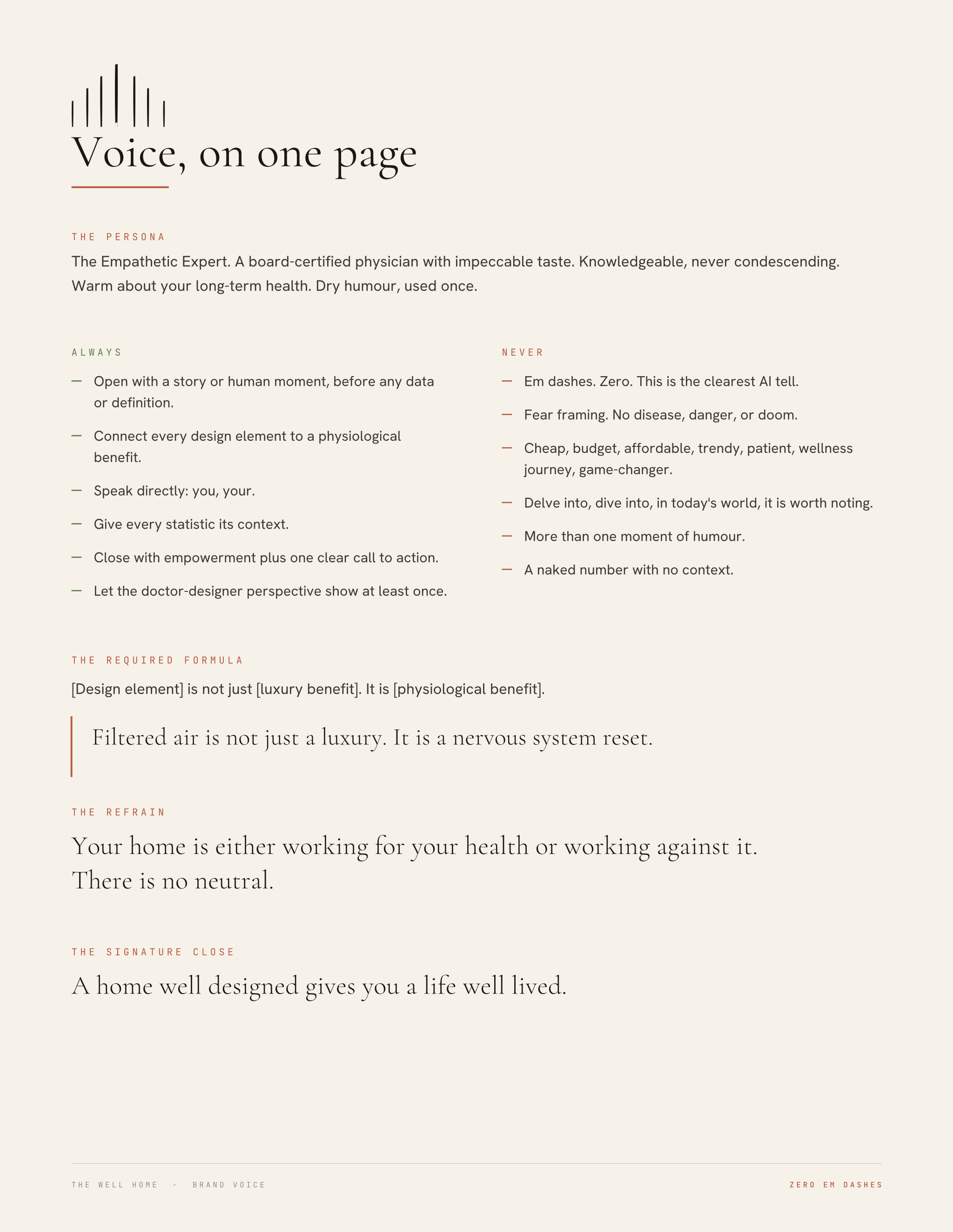
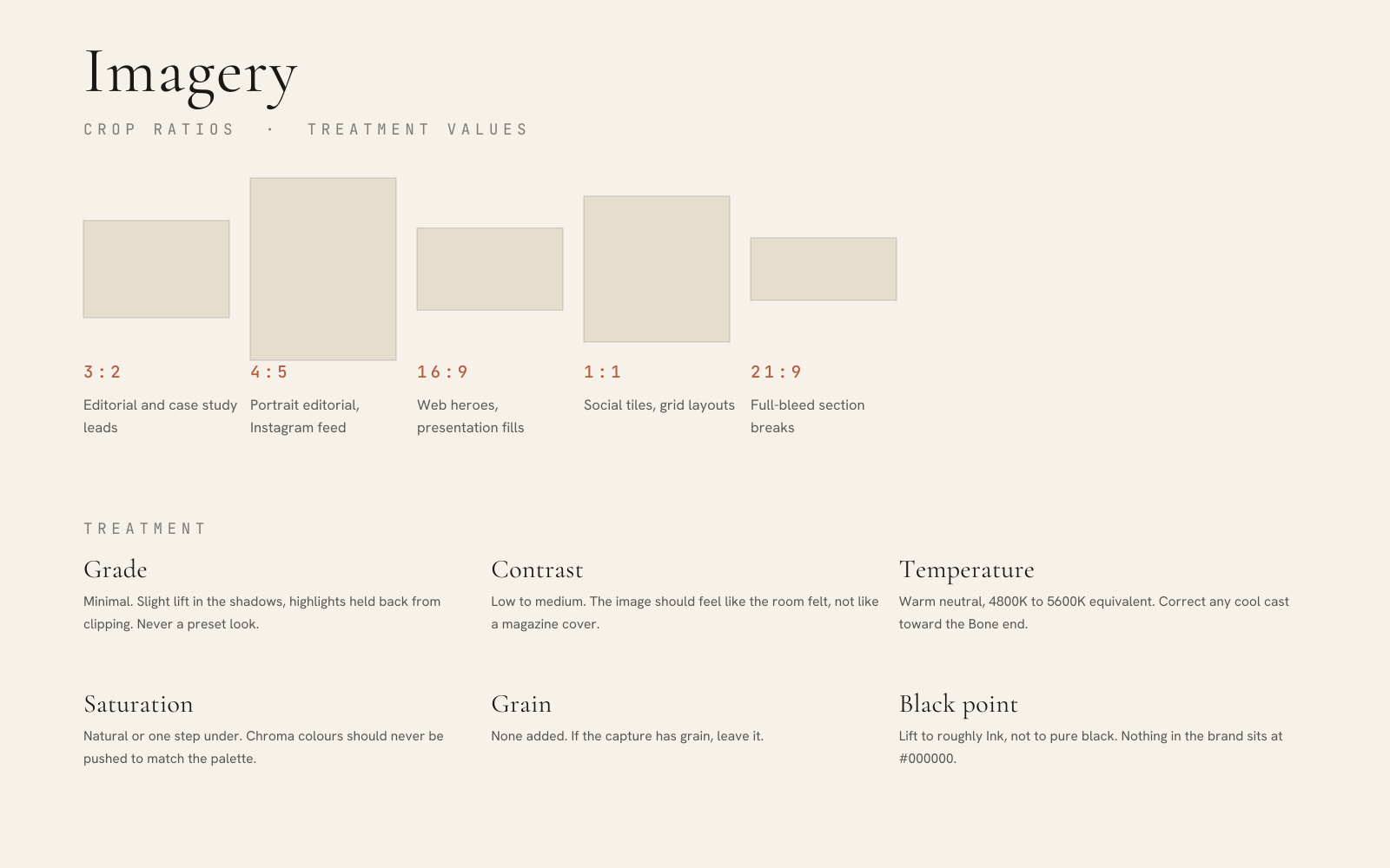
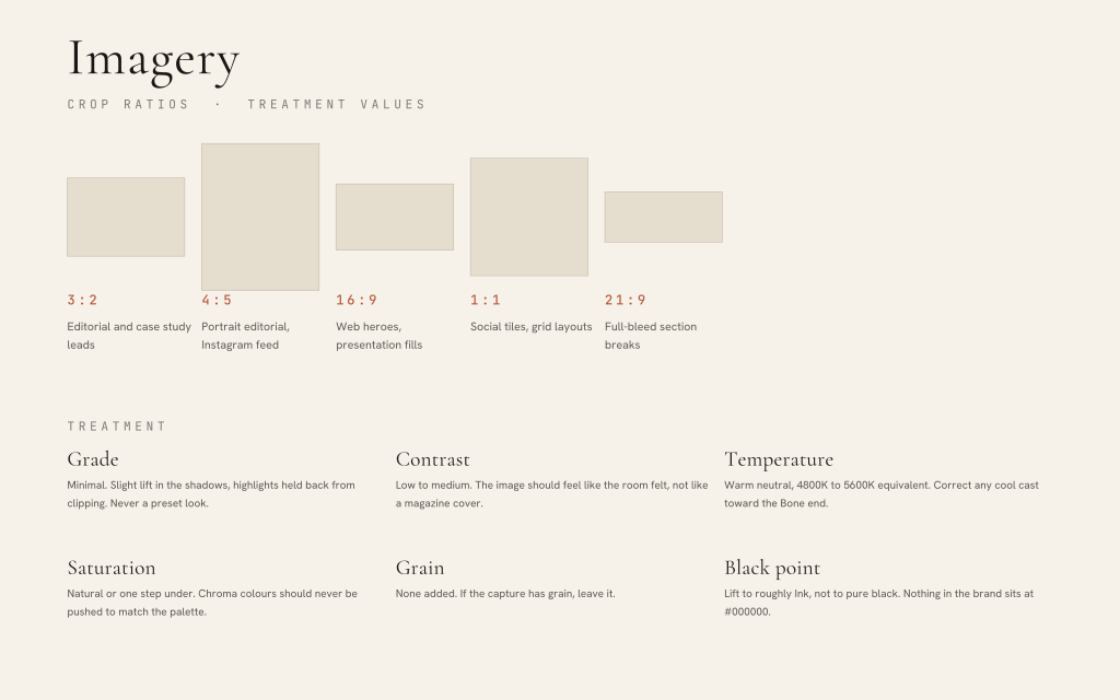
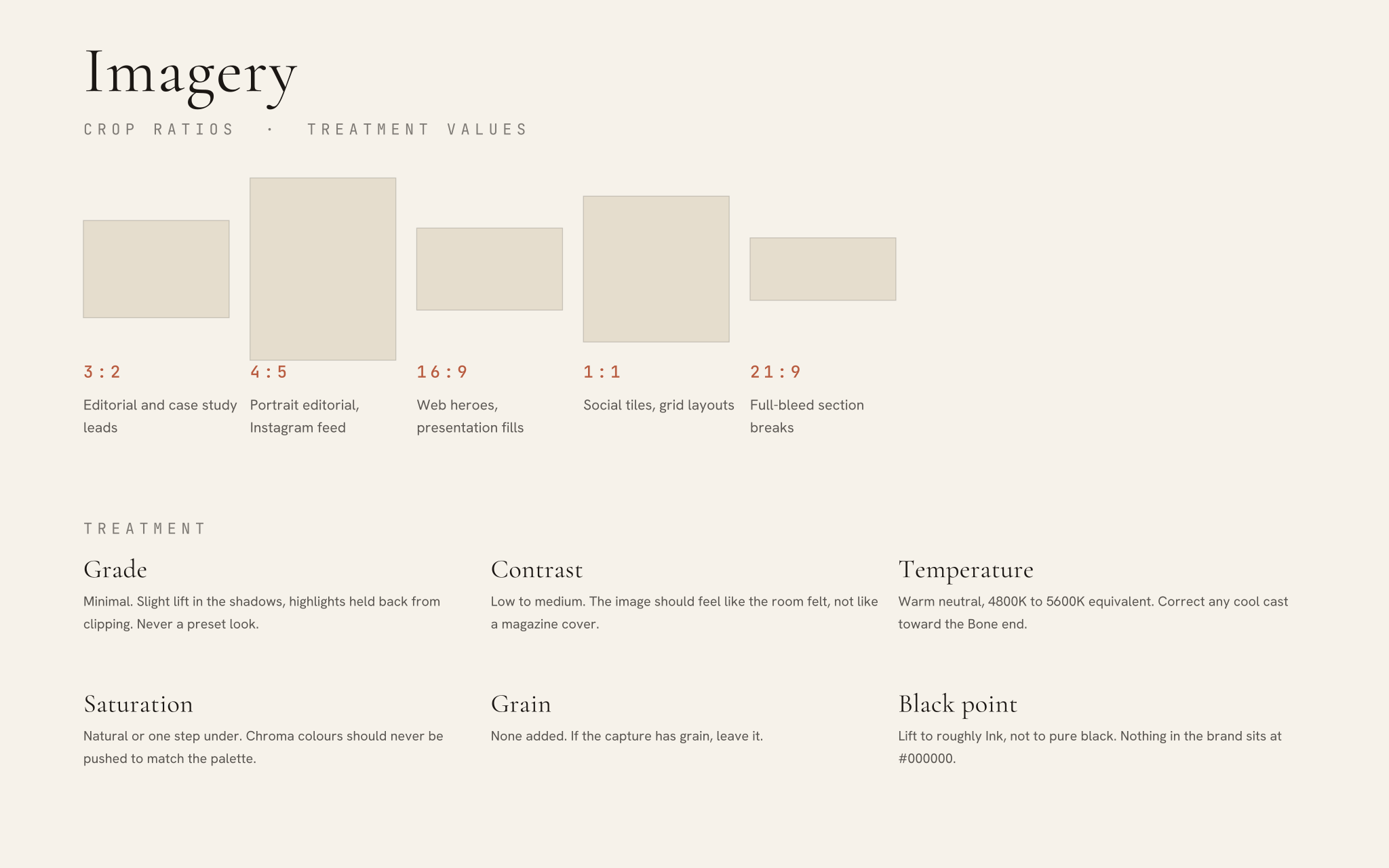
| Crop | Wide or square. Avoid tall portrait crops except in social, where the system already has formats. |
Type and mark over imagery
- Type sits on a solid panel or a Lever environment ground, never directly on an unmodified photograph.
- The mark reverses to Bone over imagery, and only where the underlying value is dark enough to clear 4.5:1. Measure it; do not judge it.
- Where the ground is busy, use the badge. That is what the container exists for.
- Never place the mark over a face, a window, or the brightest area of the frame.
- Clear space applies over imagery exactly as it does on a flat ground. The image edge counts as an intruding element.
Merchandise & Embroidery
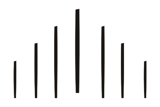
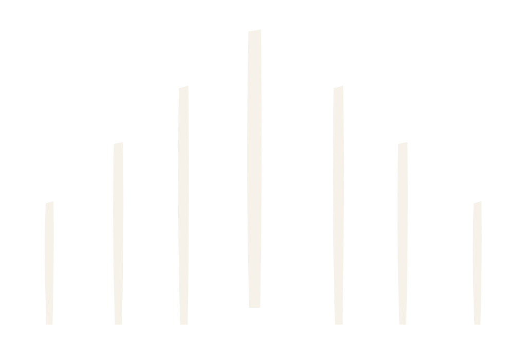
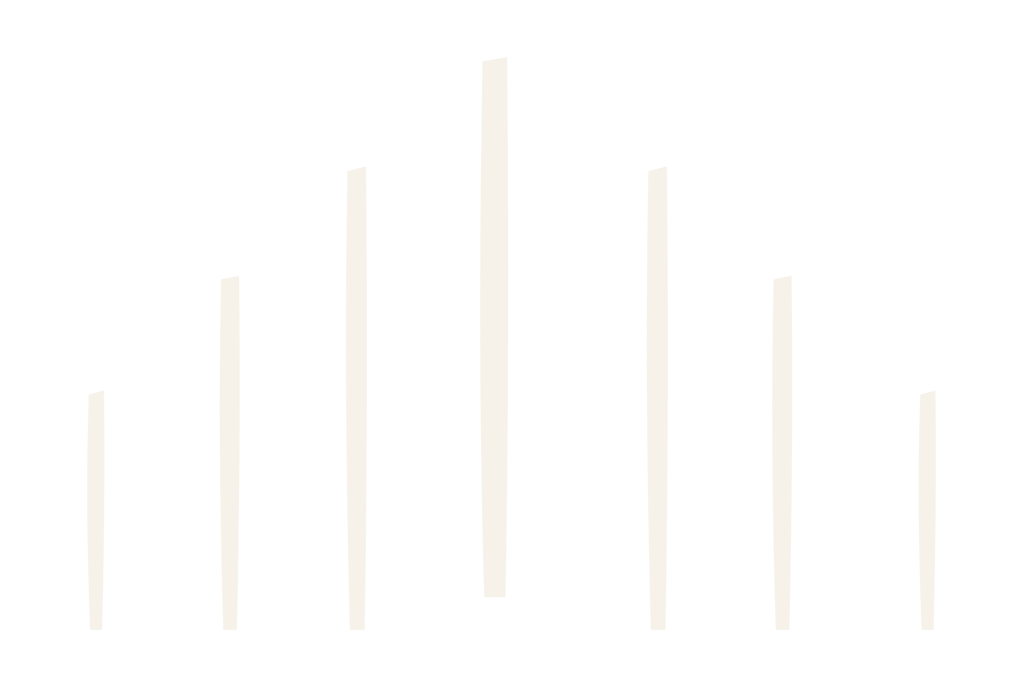
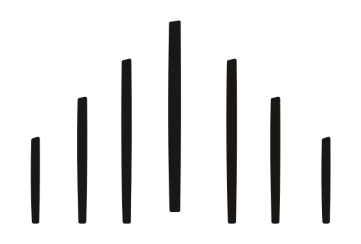
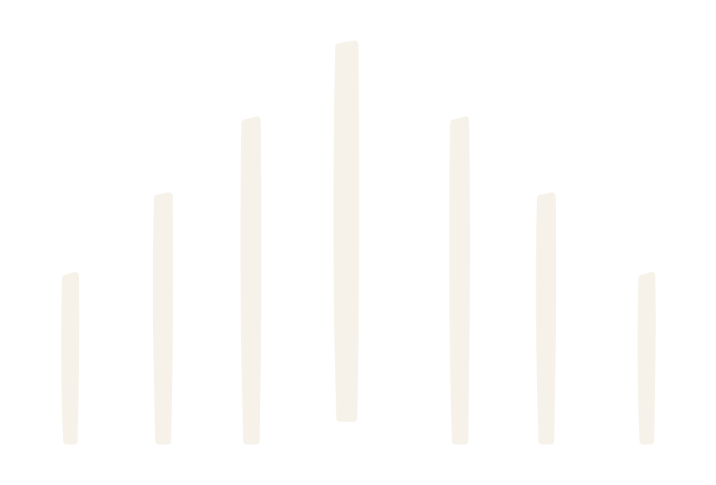
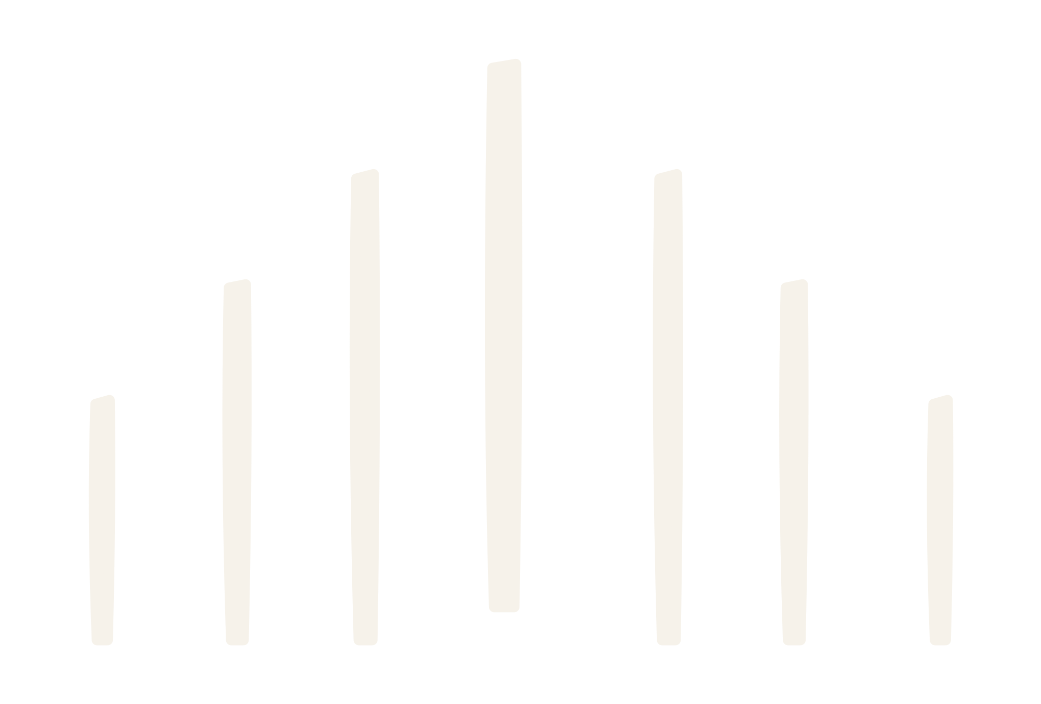
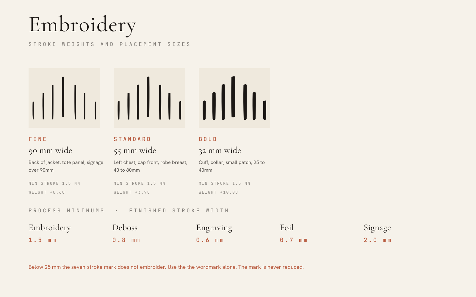
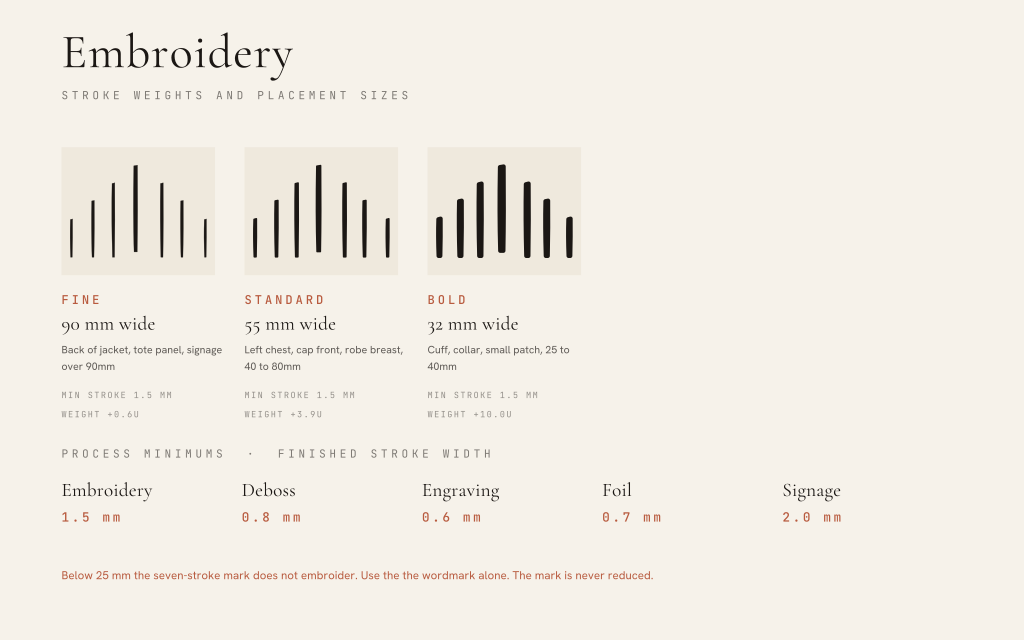
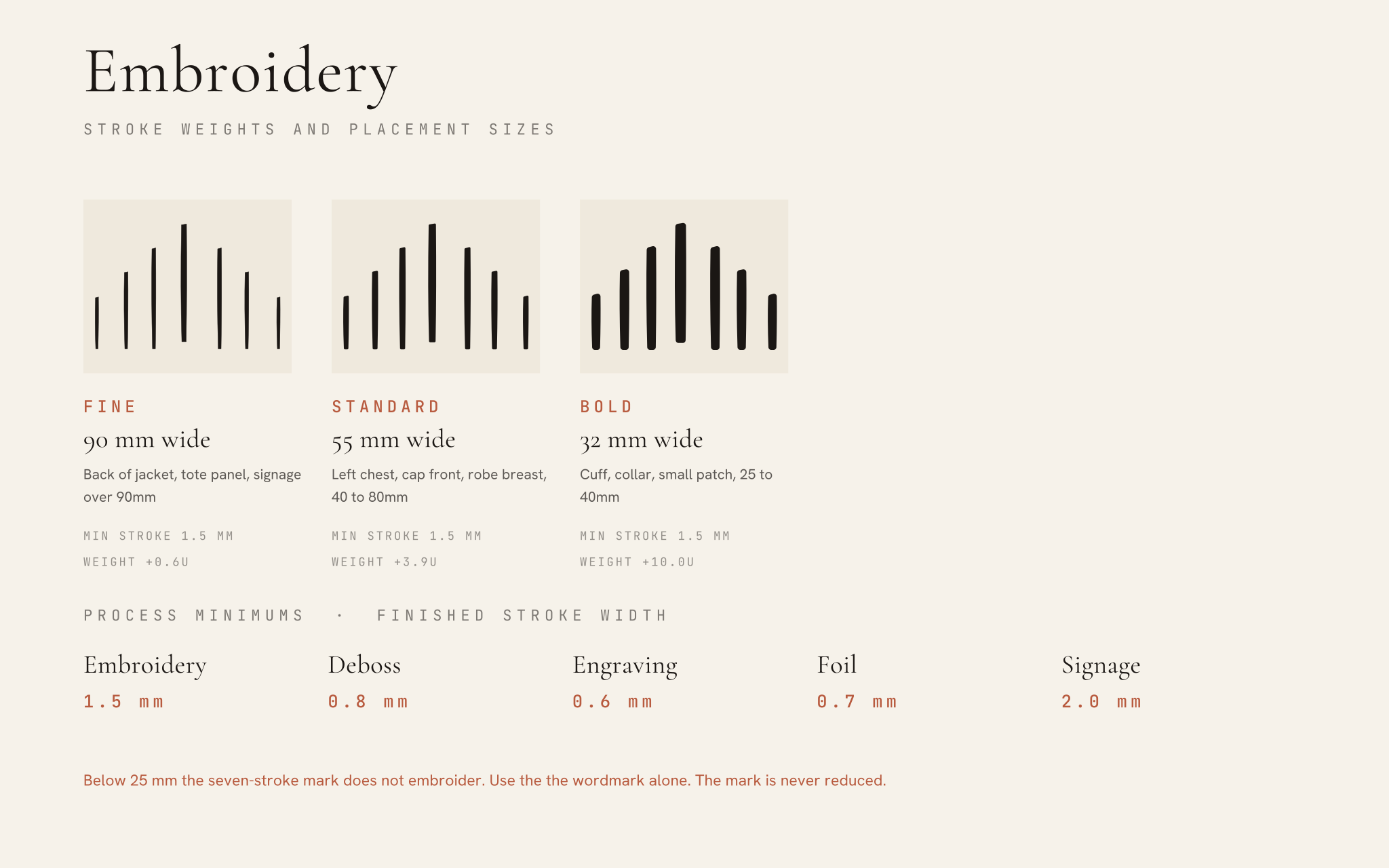
The mark is drawn as a hairline. Thread, engraving burrs, foil spread and cut vinyl all have a minimum width the hairline sits below. Reproducing the standard mark through any of those processes will break the strokes up, pucker the ground, or fill the gaps. Use the weighted variants. They hold the same silhouette with strokes cut for the process.
The weighted variants
Rules
- Pick the weight by finished width, not by taste. Fine at 90mm and above, Standard from 40 to 80mm, Bold from 25 to 40mm.
- Below 25mm the mark does not embroider cleanly. Use the wordmark alone. The mark is always seven strokes; there is no reduced version.
- The centre stroke's open base holds at every weight without modification -- it is part of the drawn geometry, not a separate feature to drop.
- One thread colour. Never embroider the Chroma tints, and never gradient a stroke.
- Satin stitch along each stroke, running with the stroke direction. No fill stitch, no outline-and-fill.
- Use a cutaway backing on knits and a tearaway on wovens. Puckering between strokes is a stabiliser problem, not an art problem.
- Digitising is the supplier's job, but supply the SVG, the finished width in mm, and the thread colour. Never send a PNG to an embroiderer.
Placement sizes
| Placement | Finished width | Specification |
|---|---|---|
| Cap, front centre | 55mm wide | Standard weight. Ink on Bone, or Bone on Ink. |
| Polo or shirt, left chest | 50 to 55mm wide | Standard weight. Keep the full clear space; do not crowd the placket. |
| Robe, breast | 60mm wide | Standard weight. Tonal Bone on Bone reads as the most expensive option. |
| Towel, hem band | 45mm wide | Standard weight, single colour, centred in the dobby band. |
| Tote, centre panel | 110mm wide | Fine weight. This is the one placement large enough for the hairline feel. |
| Jacket, back yoke | 180mm wide | Fine weight, or the horizontal lockup where the width allows. |
| Cuff or collar tab | 28mm wide | Bold weight. Below this, wordmark only. |
| Notebook, deboss | 40mm wide | Blind deboss, no foil. Deboss minimum 0.8mm stroke. |
| Glassware or vessel, engraved | 35mm wide | Engraving minimum 0.6mm. Single pass, no shading. |
| Signage or plaque | 200mm and up | Fine weight, or the standard mark if the process allows a 2mm stroke. |
Tonal is the default
The strongest merchandise application is tonal: Bone thread on a Bone ground, Ink on Ink. It reads as considered rather than branded, which is the whole positioning. Reserve high contrast for items that have to work as identification at distance, like event staff.
















Archive
Retired directions, kept on the table. The arched-window mark and its four framing studies were superseded by Study 37, but they are not withdrawn. They live here as a secondary set, in full download depth, available if a future direction calls for them.