System
Colour, type, motion, and the iconography and schematics built on them.
Colour
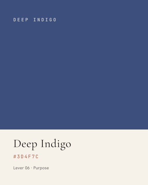
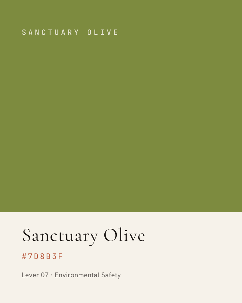
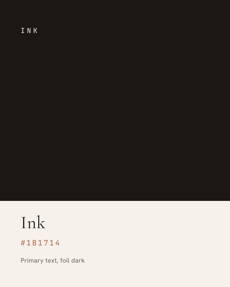
Seven Chroma colours, one per Lever, over a six-step neutral foundation. Bone is the default canvas; Ink is the default text.
The Chroma Series
Chroma Light
The same seven, lifted for Ink and other dark grounds where the originals fall below comfortable contrast. Use these anywhere the ground is dark.
The Neutral Foundation
The Lever environment
Each Lever owns an environment, not just a swatch. Where a section belongs to one Lever, that Lever's Chroma colour takes the full bleed and everything else adapts to it. This is what makes a deck or a brochure read as one system rather than a set of pages that happen to share a logo.
| Element | Treatment |
|---|---|
| Ground | The Lever's Chroma colour, full bleed, no gradient. |
| Imagery | Duotoned to the Chroma colour, 12 to 20 percent opacity over the ground. The photograph sets mood, never detail. |
| Type | Bone throughout. Cormorant for the section title, JetBrains Mono for the lever label. |
| Lever label | “BIOHARMONY LEVER 01” in mono, wide-tracked, with the Lever icon to its left. |
| Rule | A short Bone rule under the title, roughly one sixth of the measure. |
| Body | Bone at 85 percent on the Chroma ground. Never Ink on Chroma; the contrast fails. |
| Adjacent pages | Return to Bone. The Chroma environment is an event, not a default. |
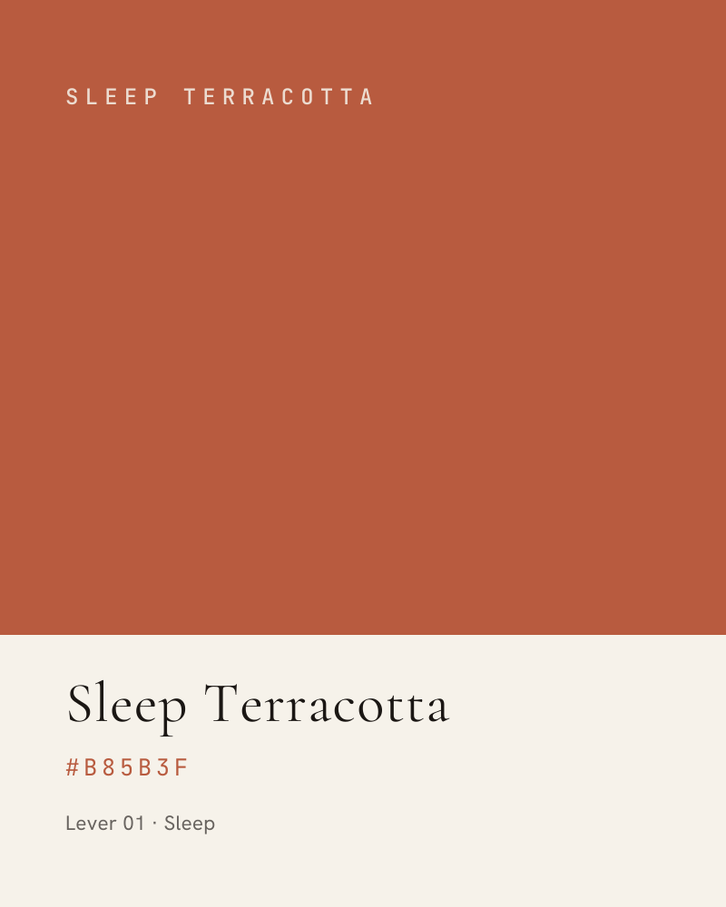
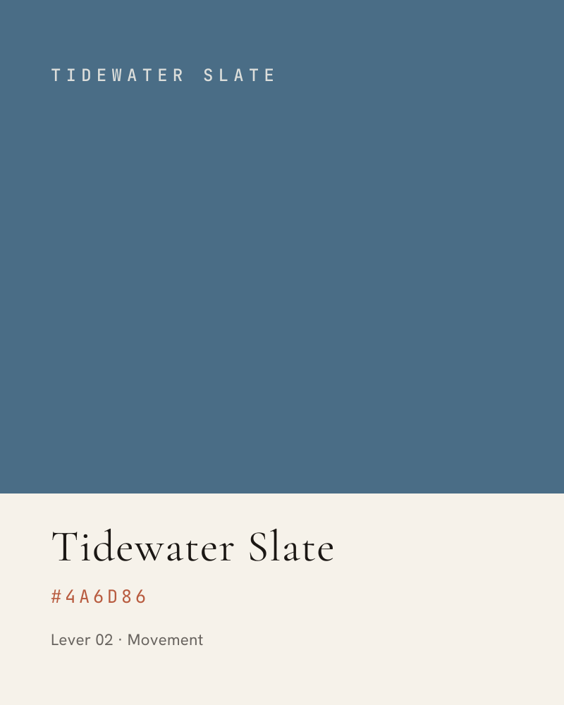
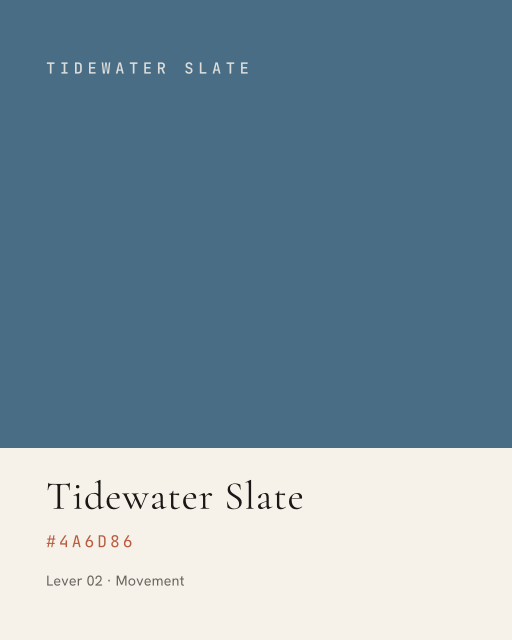
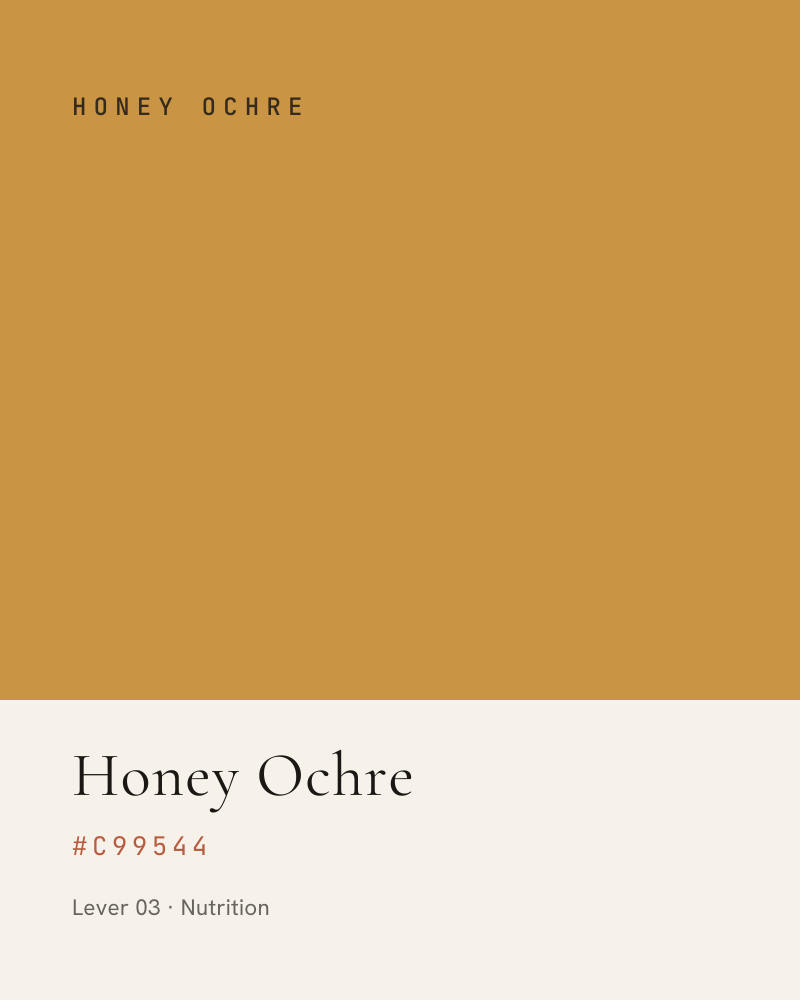
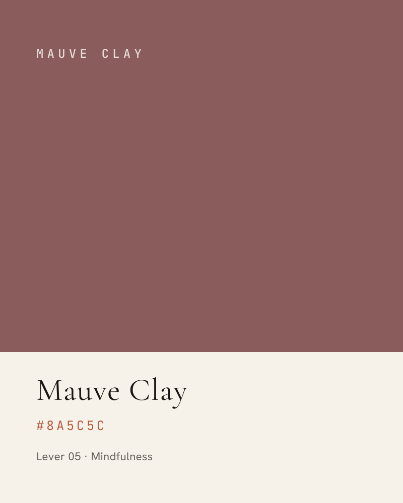
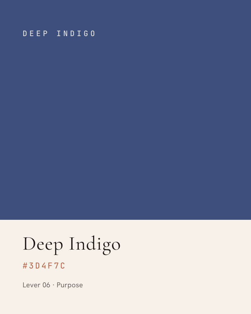
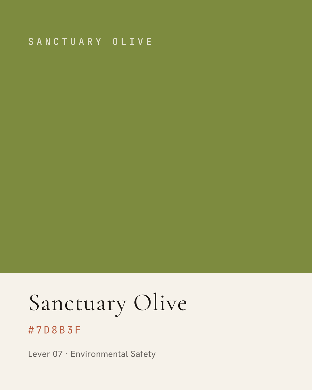
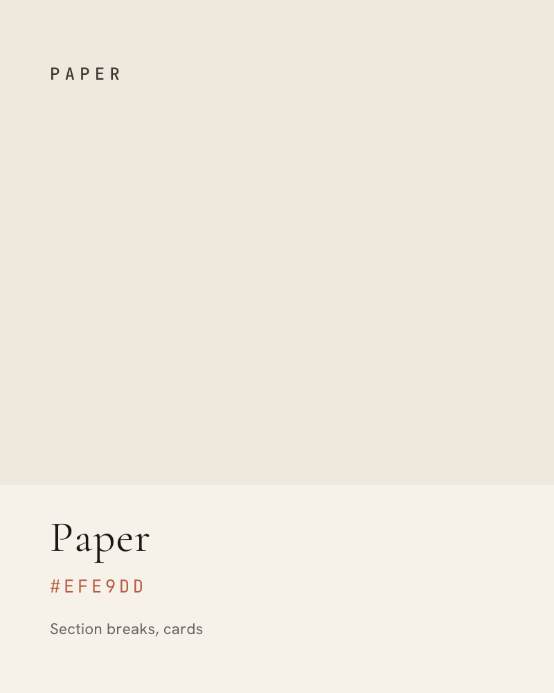
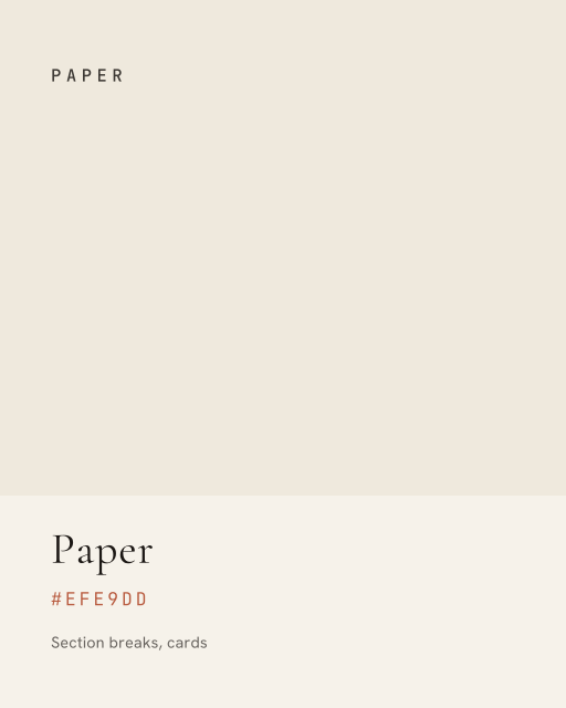
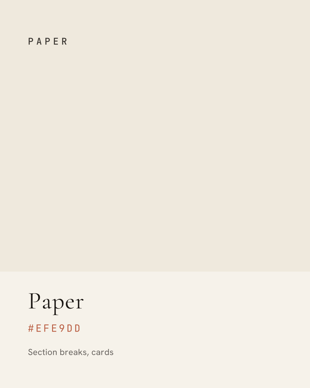
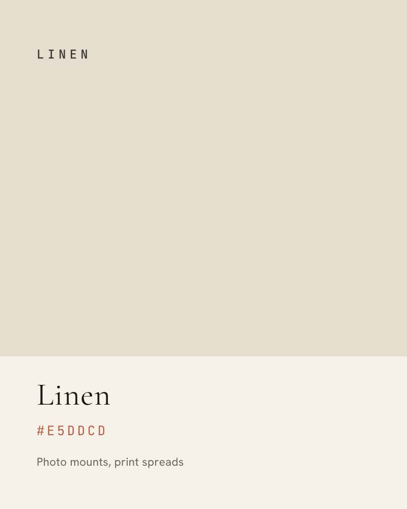
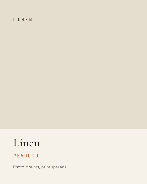
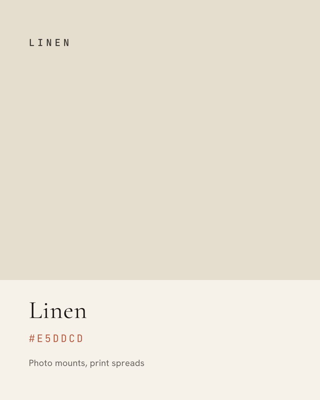
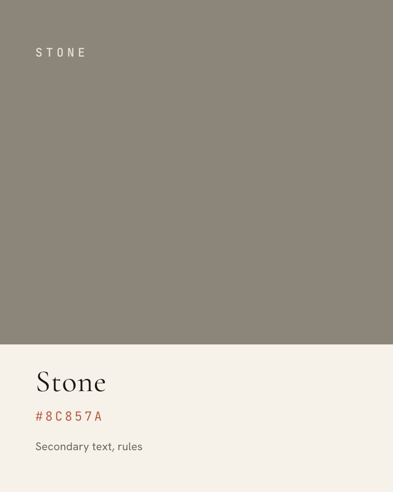
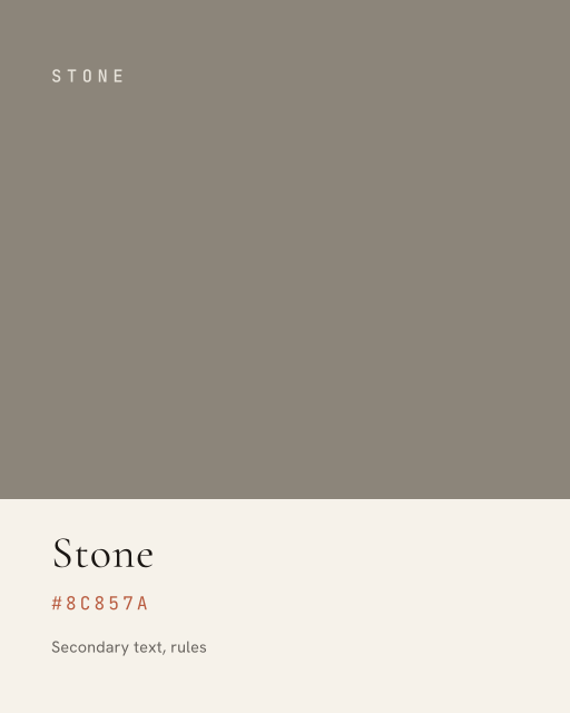
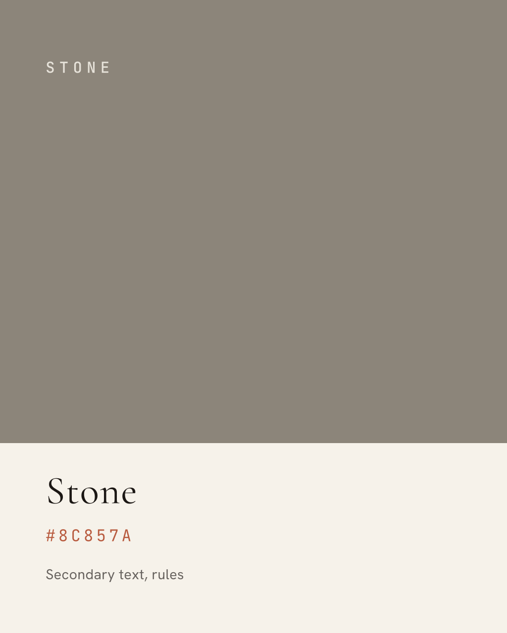
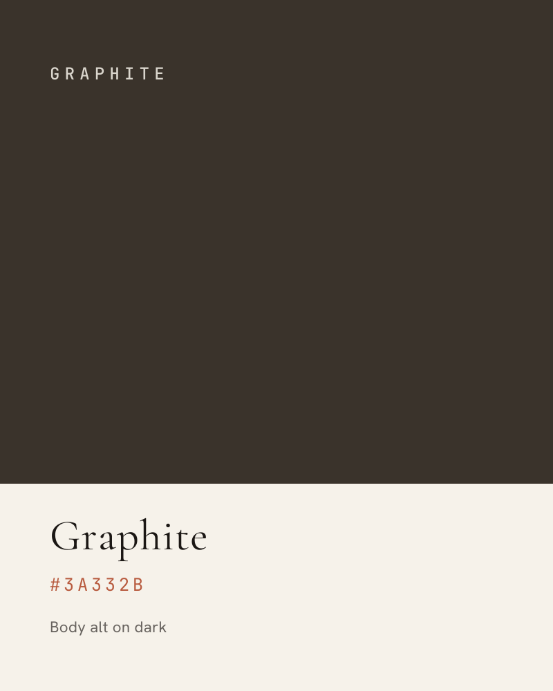
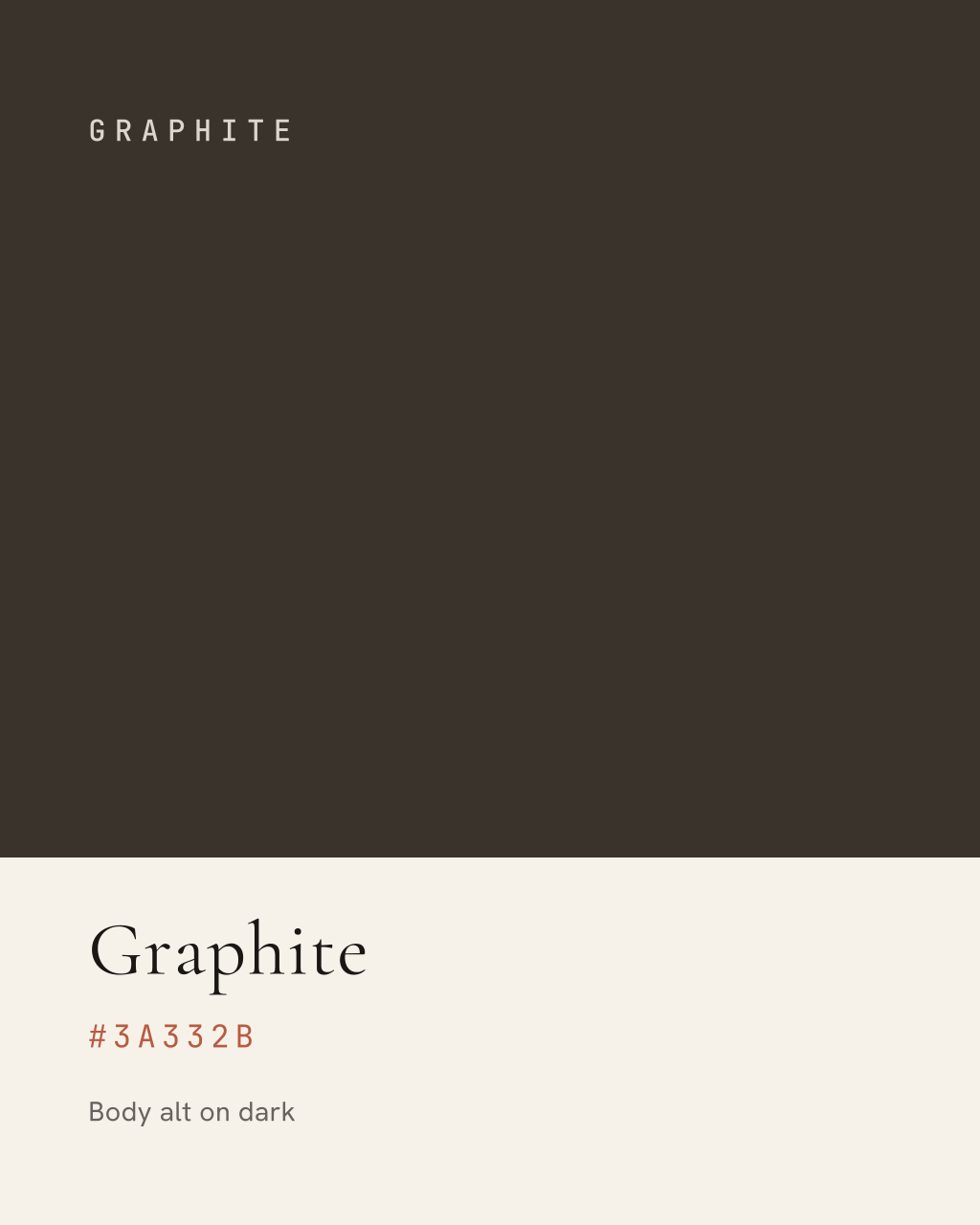
Downloadable swatch cards
Contrast & Access
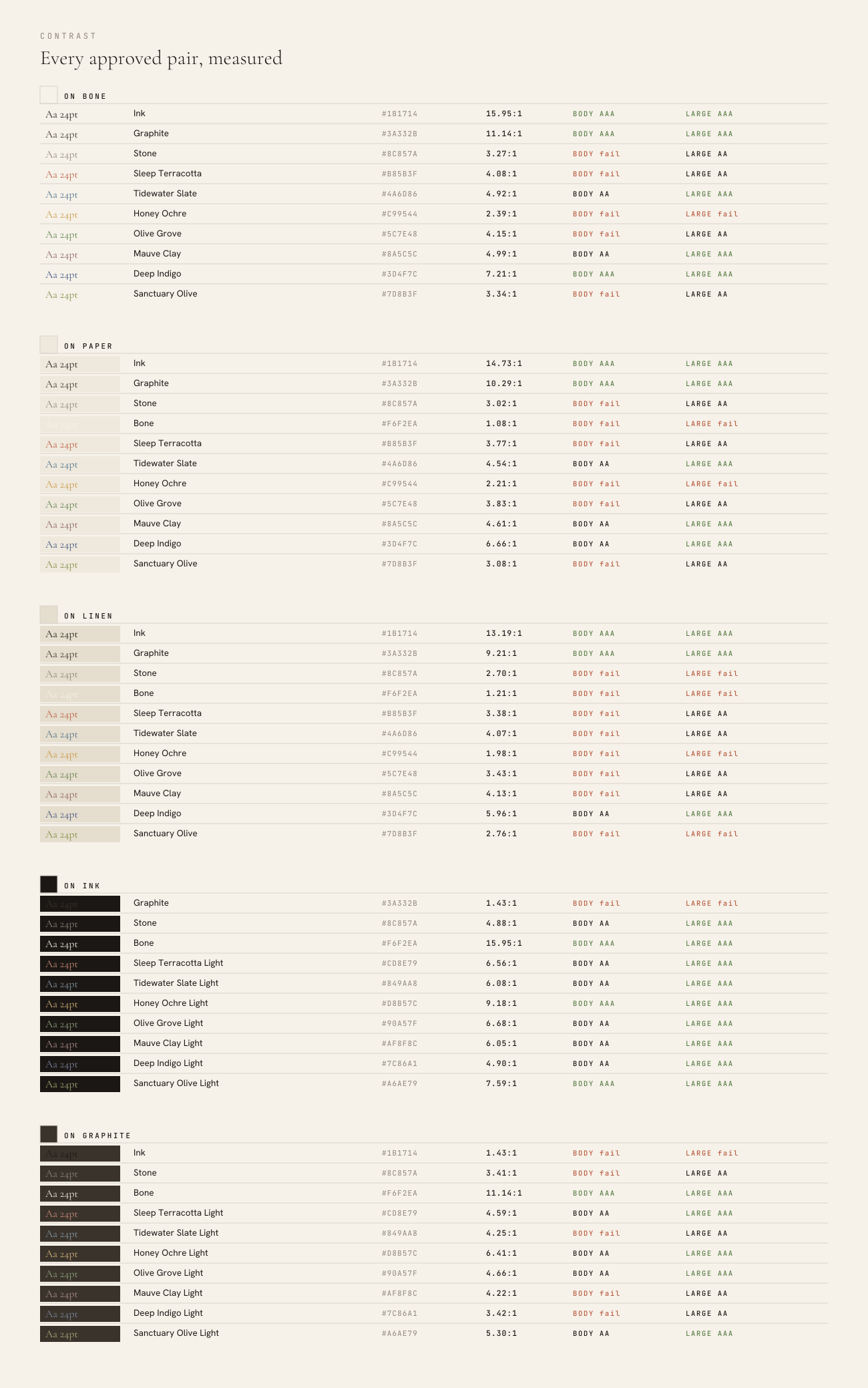
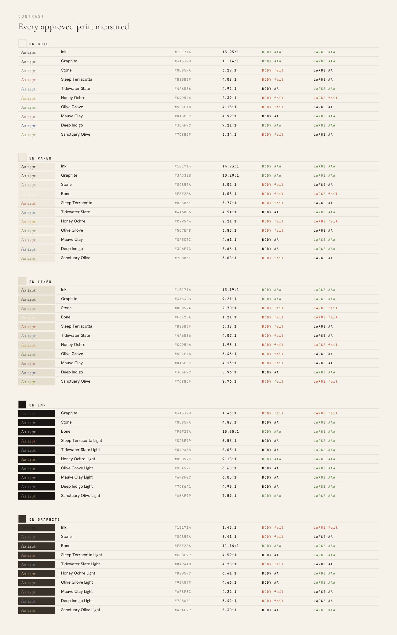
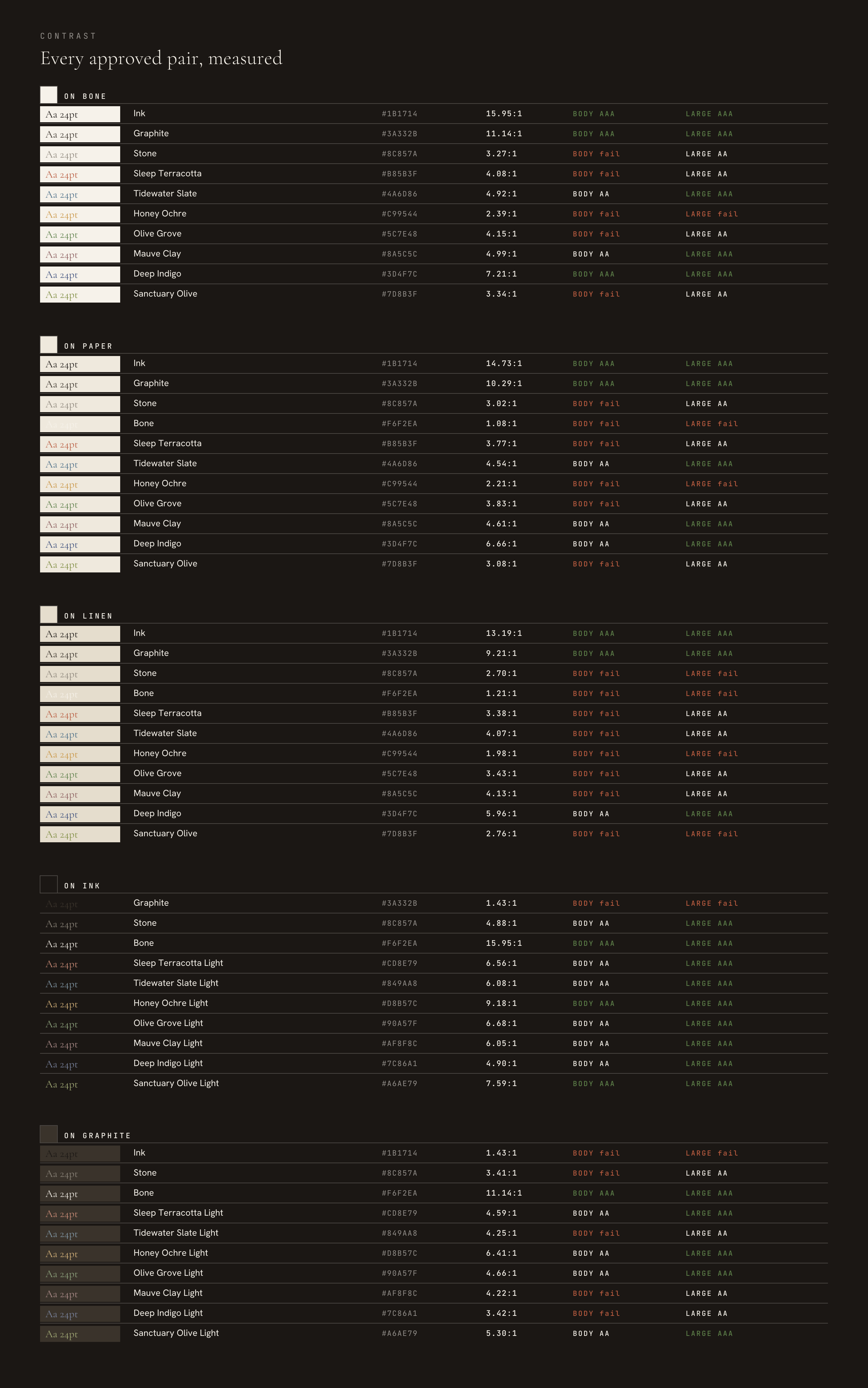
Ratios here are computed, not judged. Relative luminance per WCAG 2.1, then the standard formula. AA needs 4.5:1 for body text and 3:1 for large text, where large means 18pt and up, or 14pt and up bold. AAA needs 7:1 and 4.5:1. Every approved pair in the system is listed with its measured ratio, including the ones that fail.
What the numbers say
Terra on Bone is 4.08:1
It fails AA for body text and passes for large. Terra is correct for headlines, stat numerals, eyebrow labels and the Chroma Period, which are all large or non-essential. It is not correct for body copy, and it is not correct for a link inside a paragraph unless that link is also underlined.
Stone on Bone is 3.27:1
Also fails AA for body. Stone is a captions-and-rules colour, not a reading colour. Where Stone is currently carrying a full sentence, Graphite at 11.14:1 is the replacement.
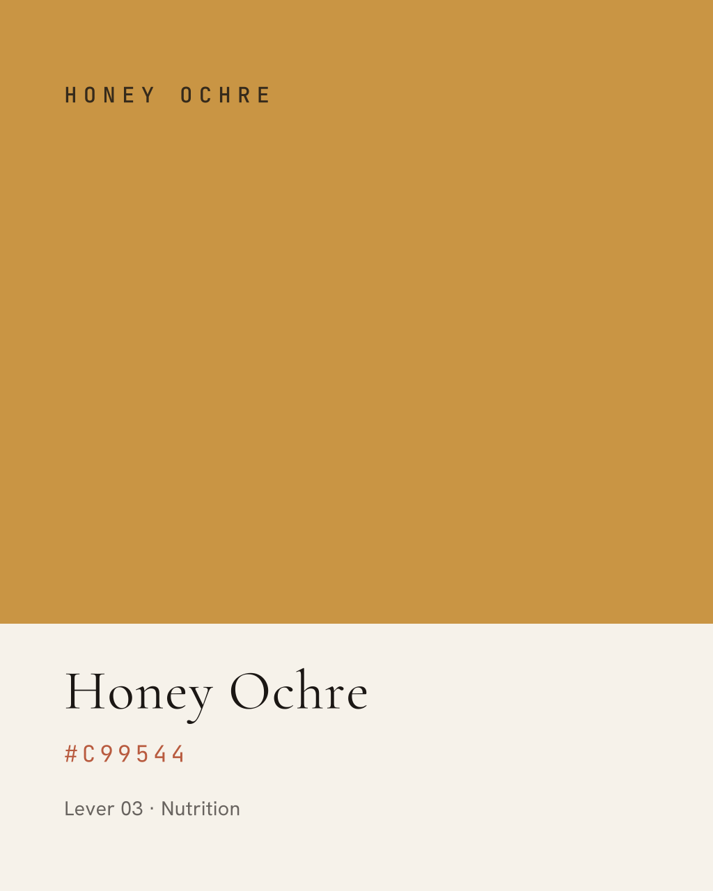
Honey Ochre fails everywhere on light
2.39:1 on Bone, 2.21:1 on Paper, 1.98:1 on Linen. It fails large text too on all three. Lever 03 labels must sit on Ink, or use Honey Ochre as a fill with Ink type over it, never as type on a light ground.
Graphite on Ink is 1.43:1
Effectively invisible. The dark neutrals are not a pair; use Bone or Stone on Ink.
Chroma Light exists for exactly this
Every Chroma Light value clears AA for large text on Ink or Graphite, which the original Chroma values do not. That was the reason for the set, and this table is the evidence.
The measured sheet
Rules
- Body copy uses Ink on Bone, Ink on Paper, or Bone on Ink. Nothing else clears AAA at reading size.
- Terra is a display and accent colour. Never set a paragraph in it.
- Any link inside body copy that is coloured rather than underlined must clear 4.5:1 against its ground.
- Never place a Chroma value as type on Linen. The tertiary surface is for panels and dividers, not for coloured text.
- Chroma on light grounds is for large text and fills. Chroma Light on dark grounds is for the same.
- When a pairing is not on this sheet, it is not approved. Measure it before using it.
Typography
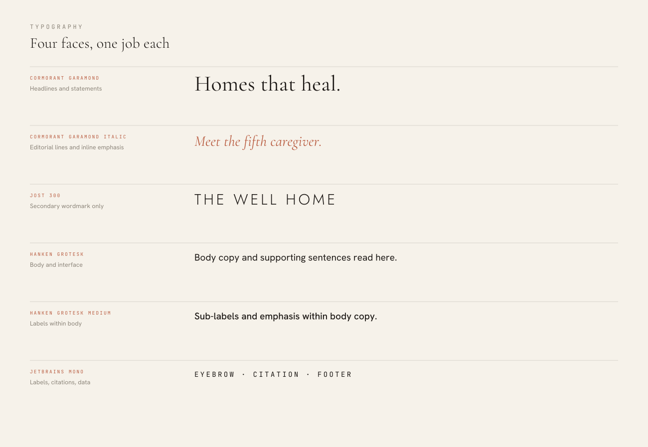
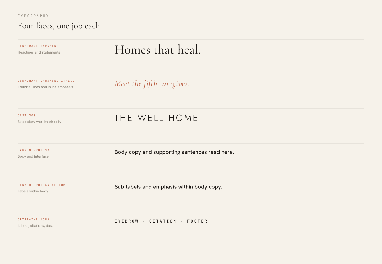
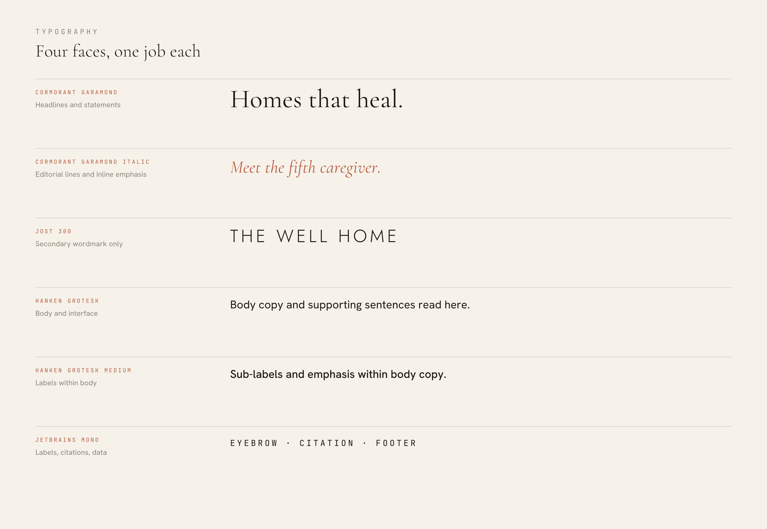
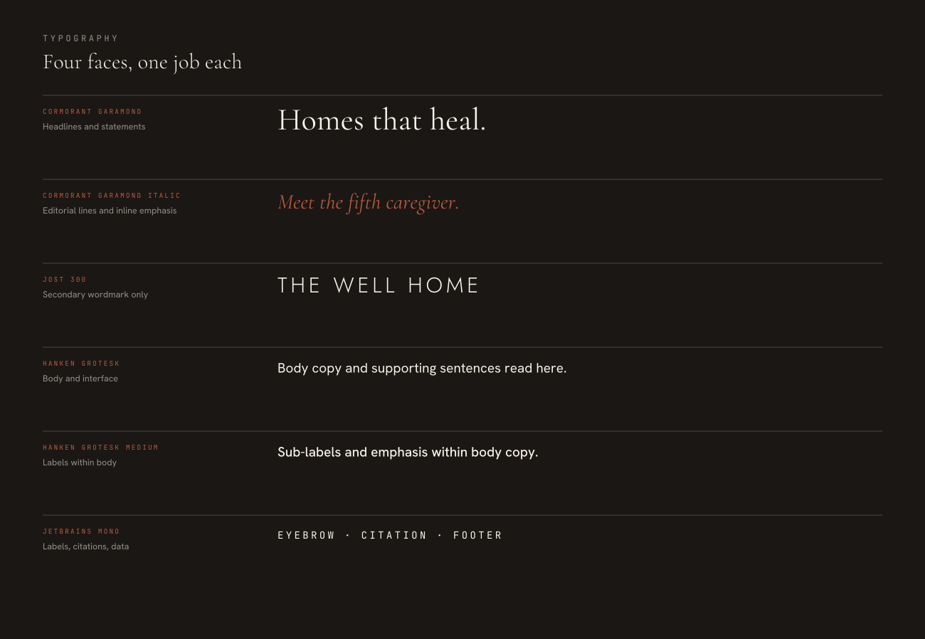
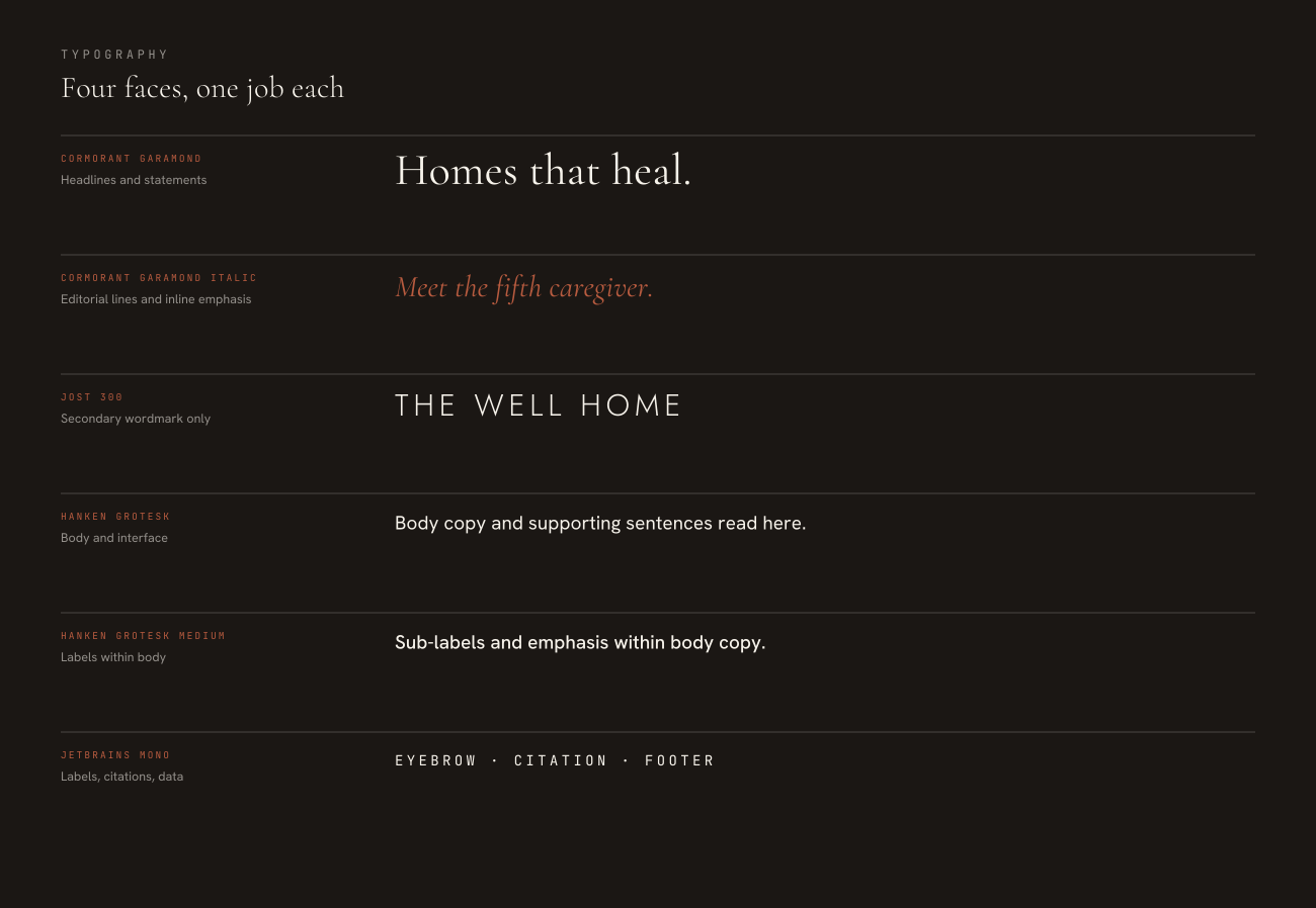
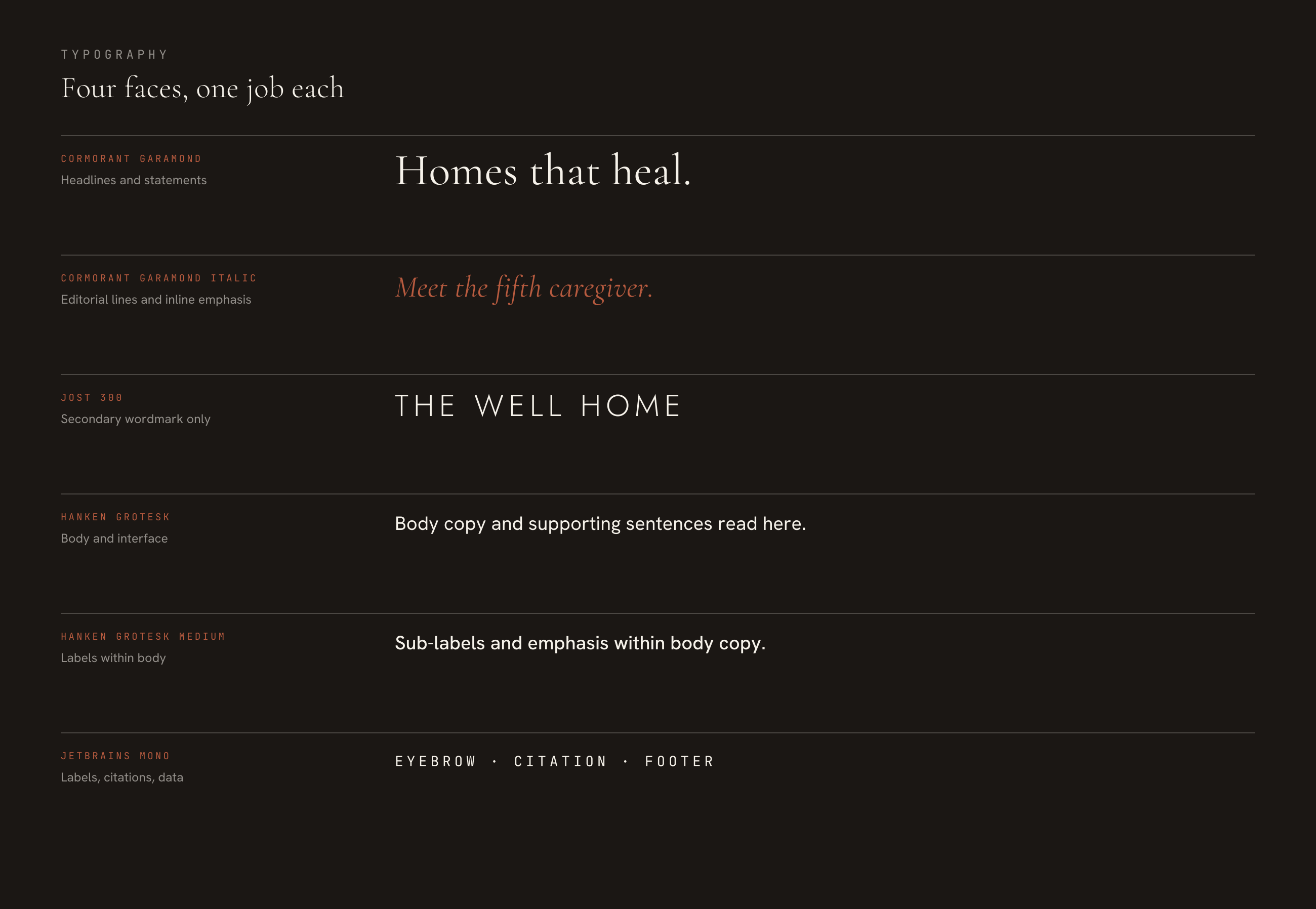
Four faces, one job each. Cormorant Garamond is the identity voice, Jost is its technical counterpart, Hanken Grotesk carries every sentence, and JetBrains Mono labels without ever speaking.
Specimen
The faces
| Face | Weights | Role |
|---|---|---|
| Cormorant Garamond | Regular and Italic | Headlines, statement copy, stat numerals, section numbers, pagination. |
| Hanken Grotesk | Regular | Body copy, supporting sentences, sub-labels. |
| JetBrains Mono | Regular | Eyebrow labels, footers, citations, pagination context. Always uppercase, always wide-tracked. |
Canonical scale
One scale, three media. Print sizes are points, screen sizes are pixels, deck sizes are the verified points from the Presentations section. Where a row is blank, that role does not exist in that medium.
| Role | Screen | Deck | |
|---|---|---|---|
| Display / hero | — | clamp(40, 6vw, 76)px | 130pt |
| Section title | 34pt | 34px | 63-66pt |
| Statement | 24pt | 26px | 60pt |
| Editorial italic | 18pt | 22px | 48pt |
| Subhead | 16pt | 19px | 27-33pt |
| Body | 10.5pt | 16px | 21-26pt |
| Small body | 9pt | 14px | — |
| Label / eyebrow | 7.5pt | 11px | 18-19.5pt |
| Caption / citation | 6.5pt | 10px | 14-16.5pt |
Rules
- Cormorant is never set below 16px on screen or 9pt in print. Below that its modelling disappears and it reads as a generic serif.
- Hanken Grotesk carries every paragraph, in all three media. Cormorant is for display and editorial lines only.
- JetBrains Mono is always uppercase and always wide-tracked, from 0.16em to 0.34em depending on size. It never carries a sentence.
- Jost appears only in the secondary wordmark. It is not a body face and not a heading face.
- Line length caps at 72 characters for Hanken and 60 for Cormorant. Beyond that, split the column.
- Tracking is negative only above 96pt, and never below zero at reading size.
- Cormorant sets oldstyle figures. Expect large numerals to sit unevenly, and leave 0.275 of the point size as clearance beneath them.
Motion
The mark is seven strokes at seven heights. That is the entire animation brief. They arrive centre-out, because the tallest stroke is the ridge and everything else resolves around it, and they arrive staggered because a roofline is built, not switched on.
Specification
| Property | Value |
|---|---|
| Sequence | Centre out: stroke 4, then 3 and 5, then 2 and 6, then 1 and 7. |
| Stagger | 60ms between each arrival. |
| Duration | 420ms per stroke. |
| Total | 780ms from first pixel to settled. |
| Easing | Ease-out cubic. cubic-bezier(.22, 1, .36, 1). |
| Transform | Opacity 0 to 1, with a rise of 16 percent of the mark's height. Nothing scales, nothing rotates. |
| Rest state | Fully settled. The mark never loops, pulses, breathes or shimmers. |
| Exit | If it must leave, it fades as one object over 240ms. It does not disassemble. |
Ready-made
A self-contained animated SVG, under 1.5KB, no JavaScript. It already honours reduced-motion preferences.
Rules
- The mark animates on arrival only: a page load, a title card, a section transition. Never on scroll, never on hover.
- Once per view. A mark that rebuilds every time it enters the viewport reads as a loading state.
- The wordmark does not animate stroke by stroke. It fades as one object, 240ms, starting 200ms after the mark completes.
- Nothing else in the system moves on its own. No drifting backgrounds, no parallax on the schematics, no counting-up stat numerals.
- Honour prefers-reduced-motion. The supplied SVG already does: the strokes appear fully formed with no animation.
- In video, the same timing applies at 24 or 30fps. Do not re-time it to the edit.
- Never animate a Chroma colour transition. Colour changes are cuts, not fades.





Iconography
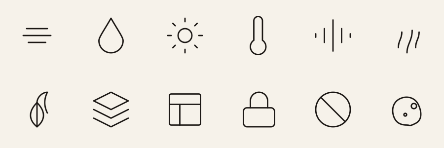
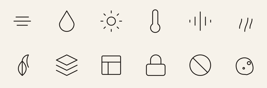
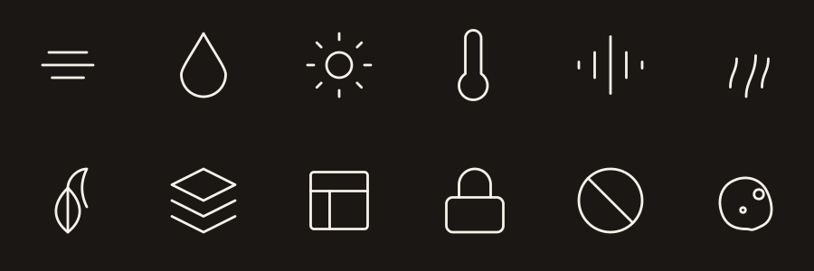
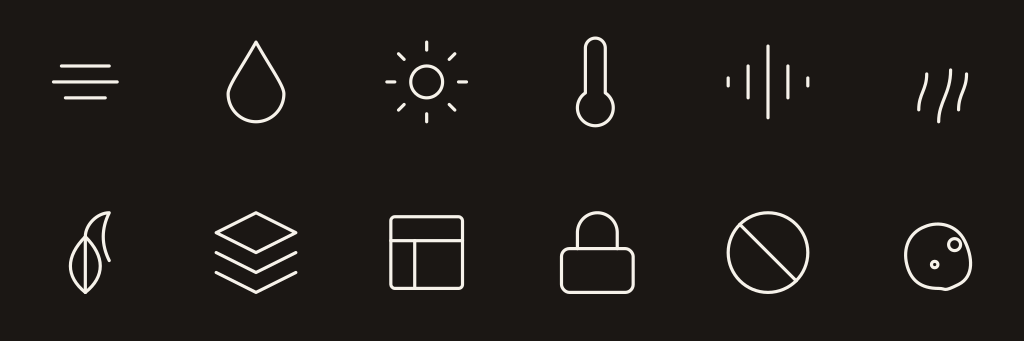
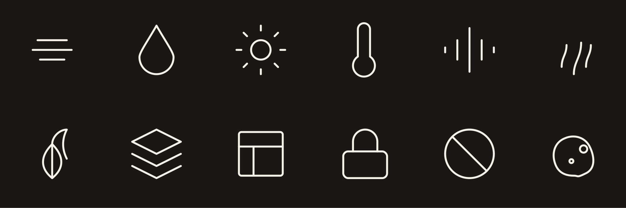
The established icon set, drawn on a 24pt grid with a hairline stroke. These are the glyphs used across the brand guide and inside both schematics. They are the reference set; nothing here has been redrawn.
The Seven Levers of BioHarmony™
Each available in Ink, Bone, its Chroma colour, and Chroma Light for dark grounds.
Home Determinants of Health™
Each available in Ink, Bone, and Terracotta.
Full sheets

































































































































































































































































































Schematics
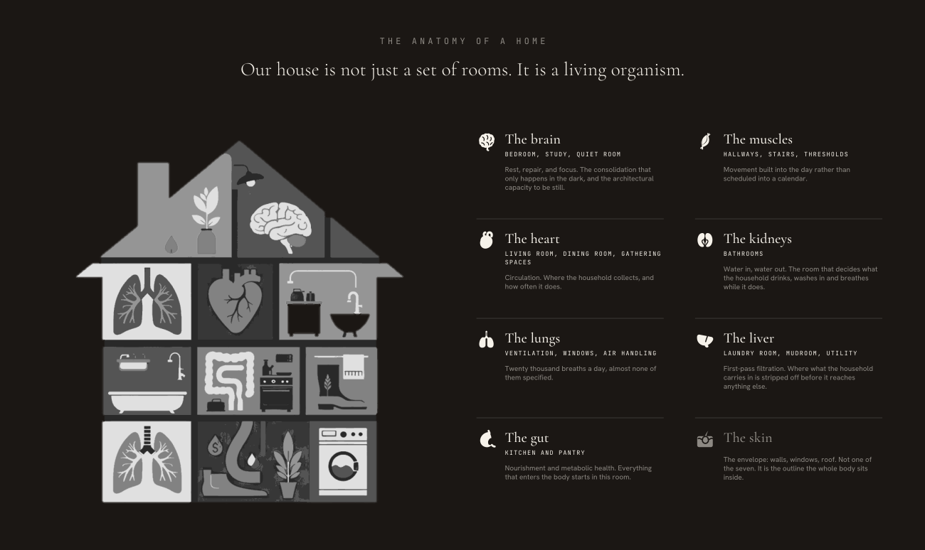
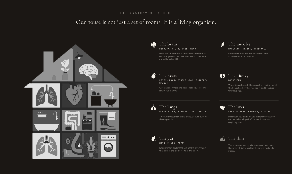
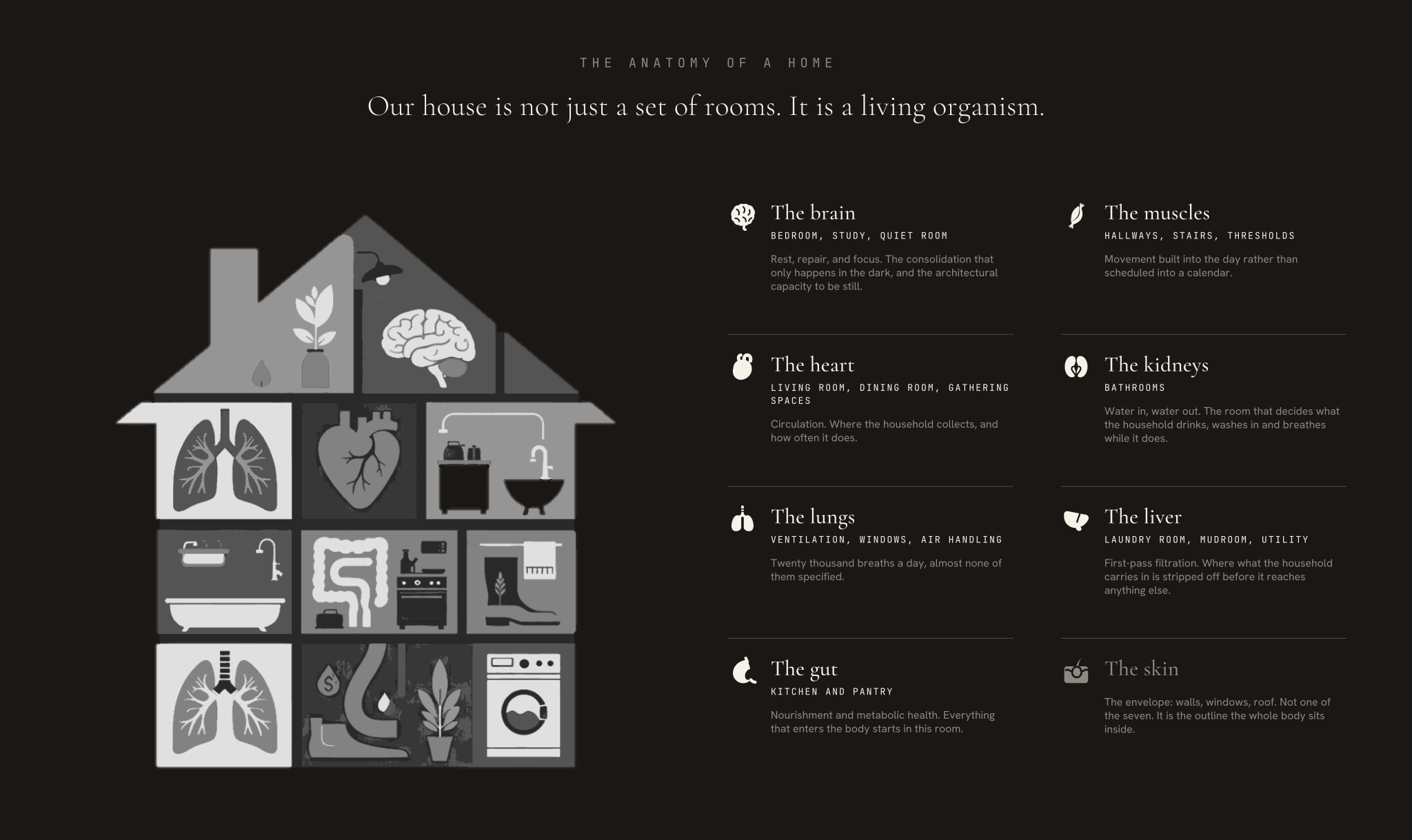
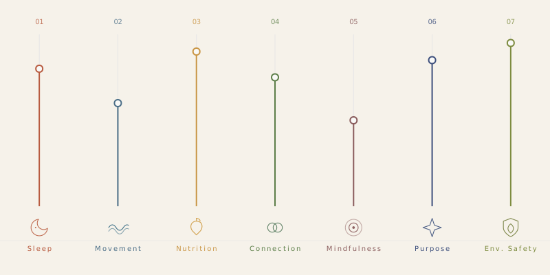
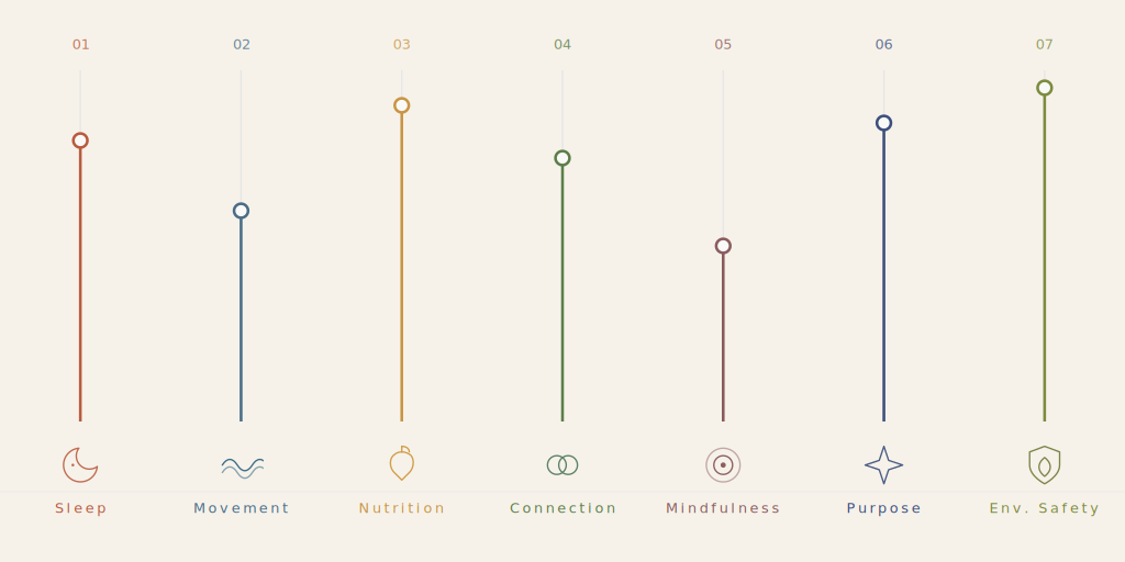
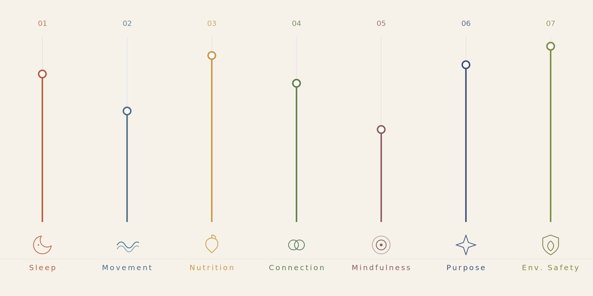
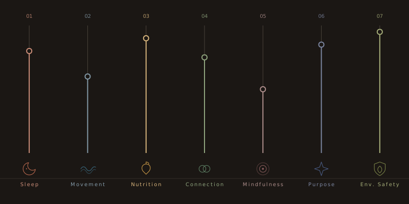
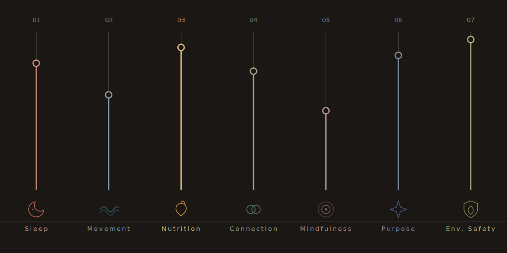
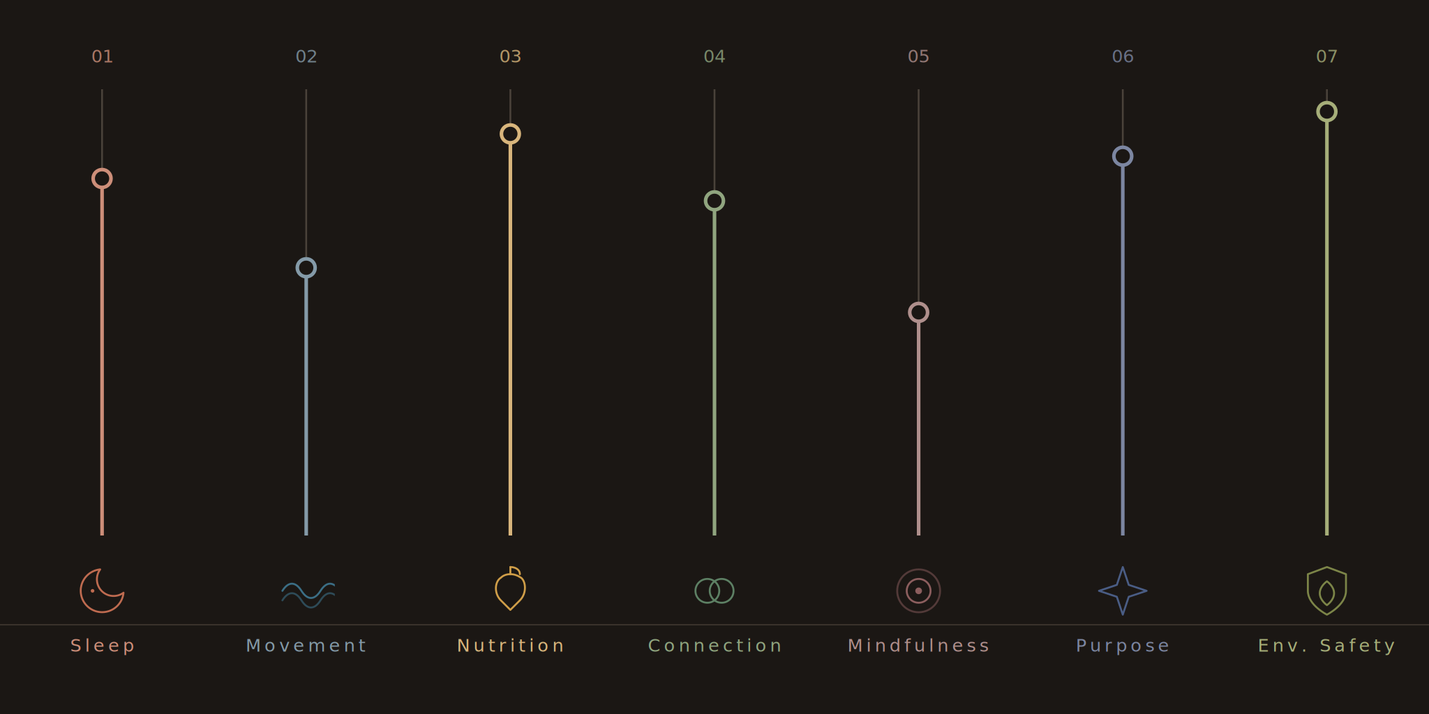
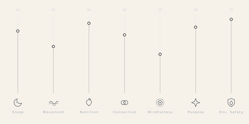
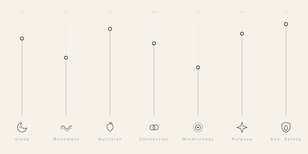
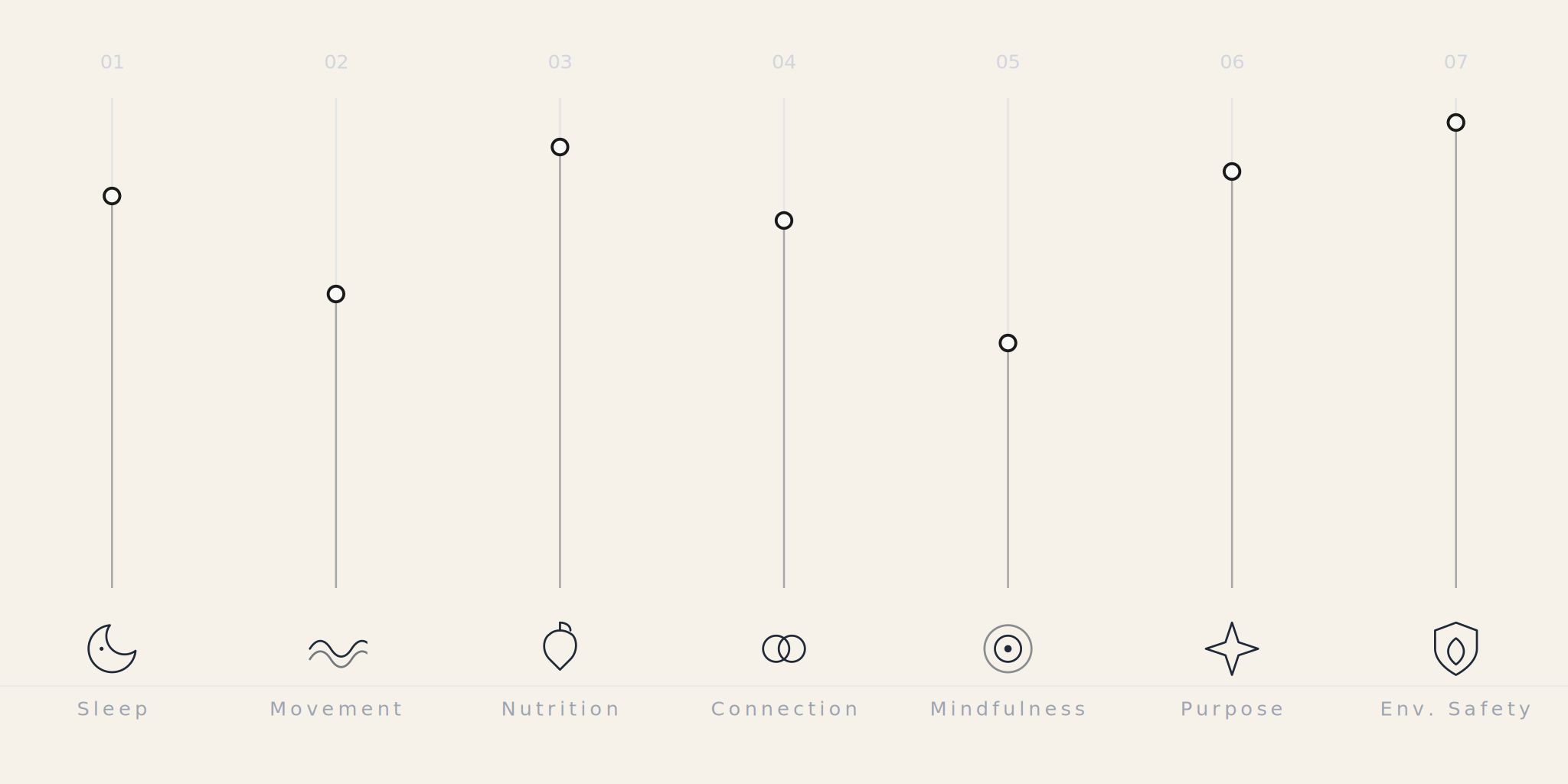
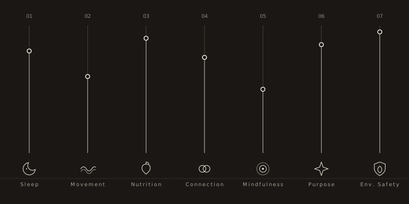
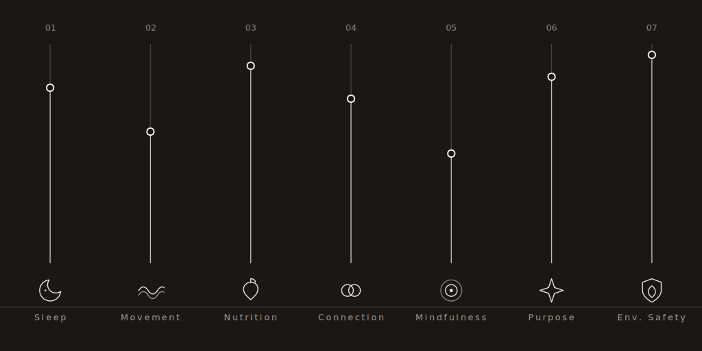
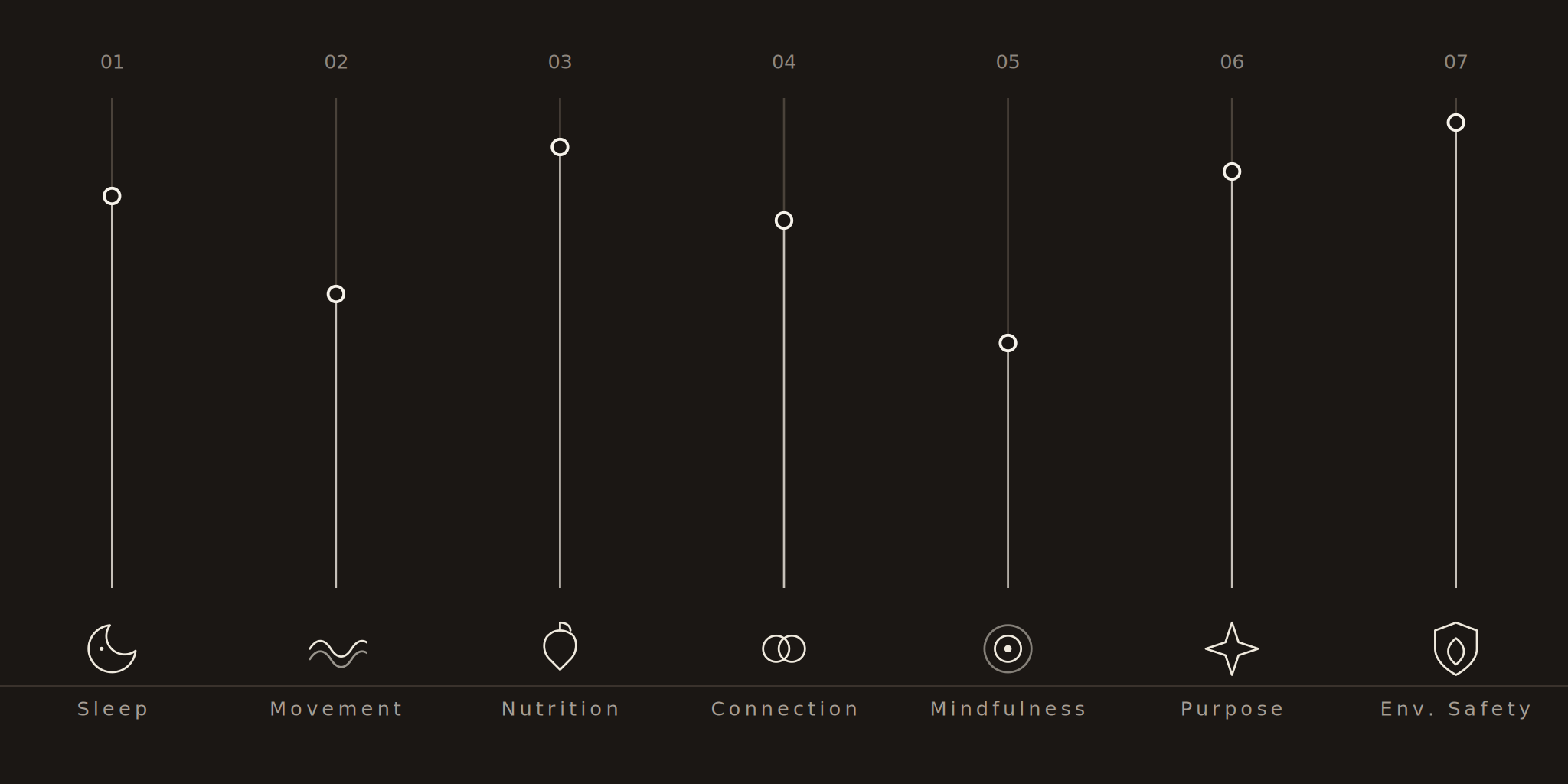
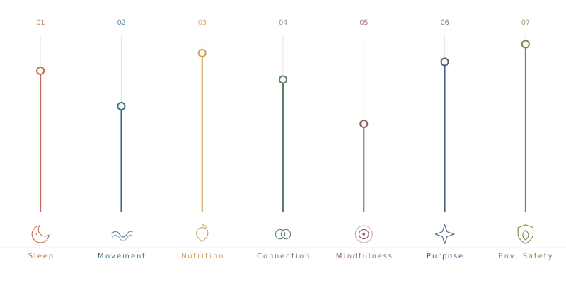
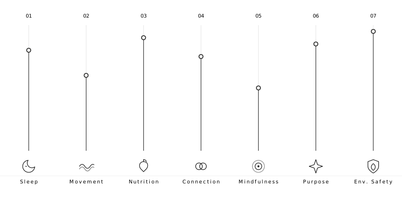
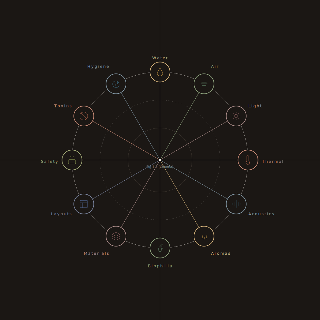
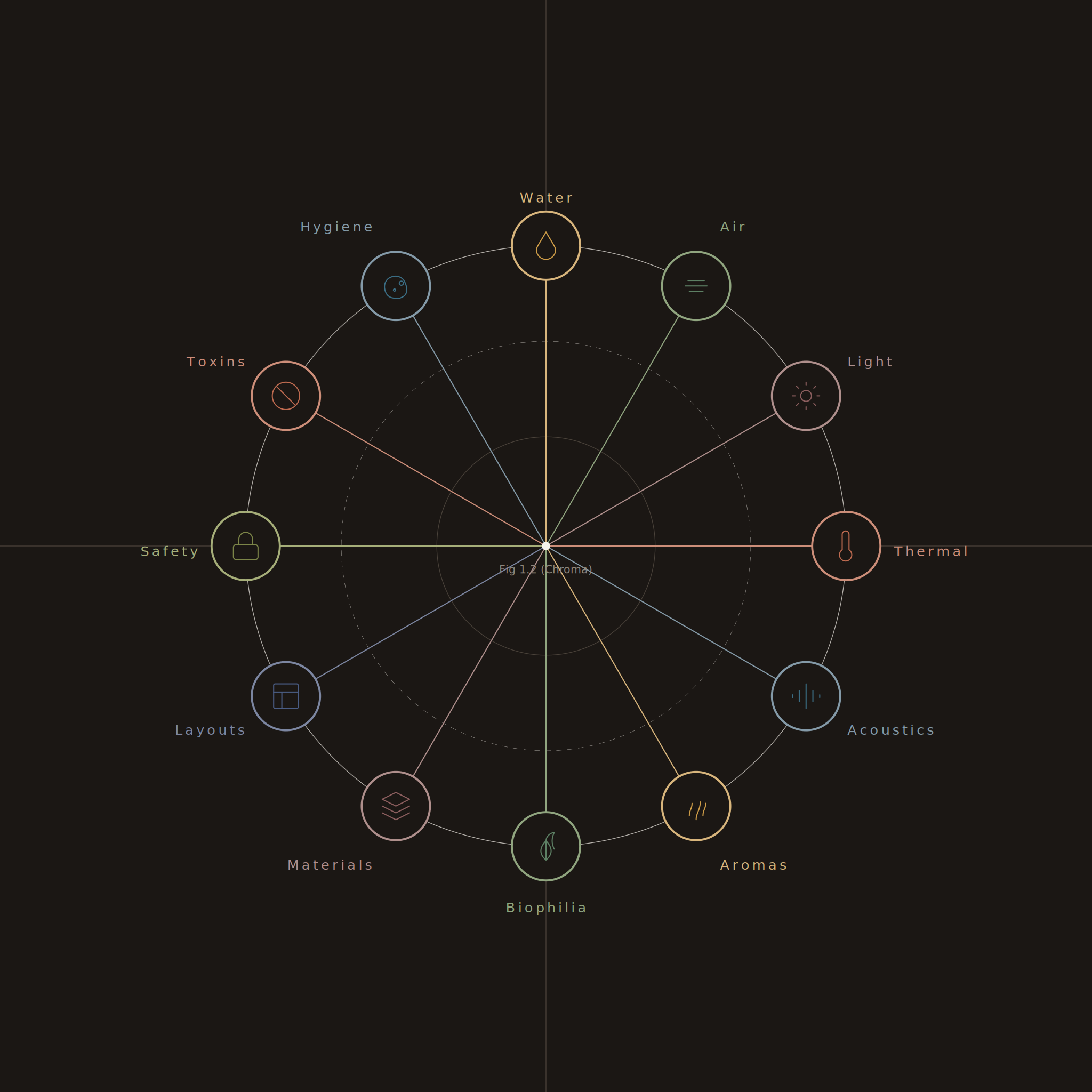
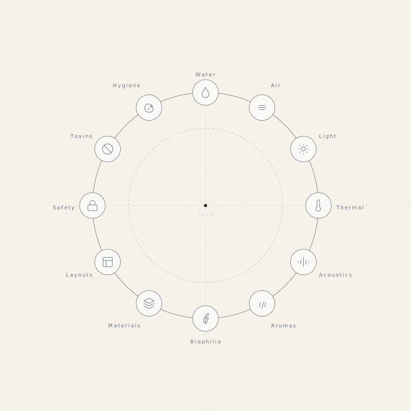
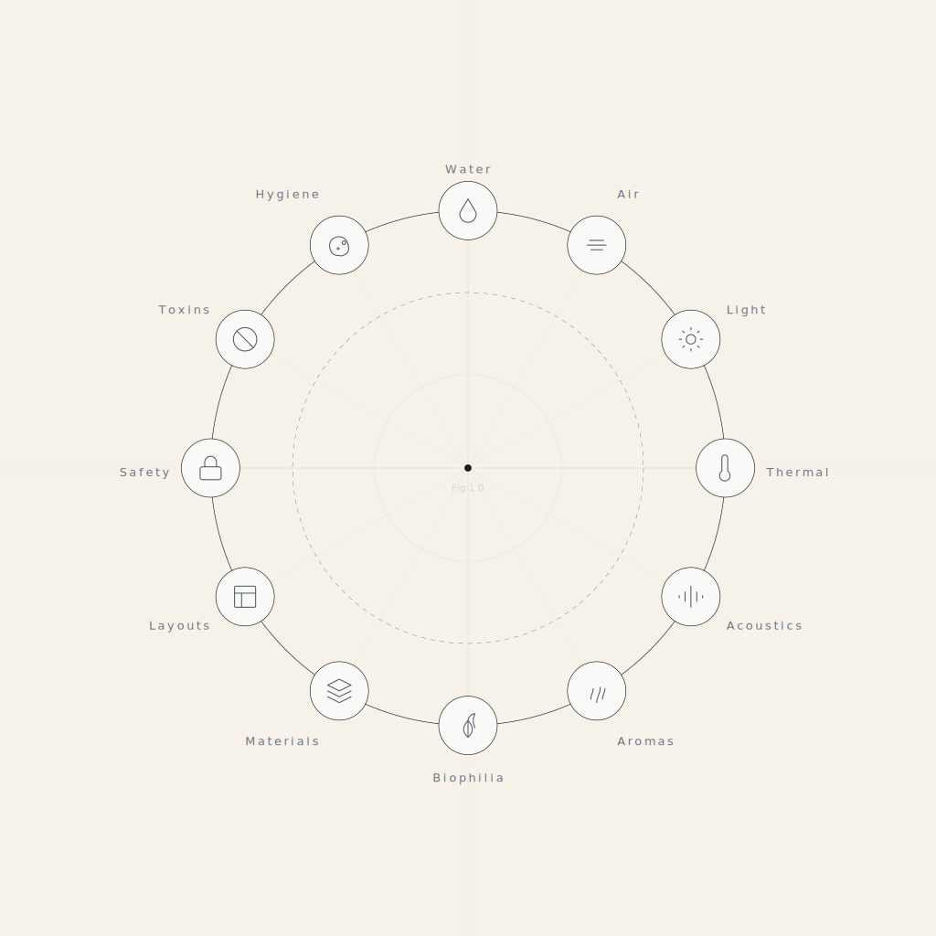
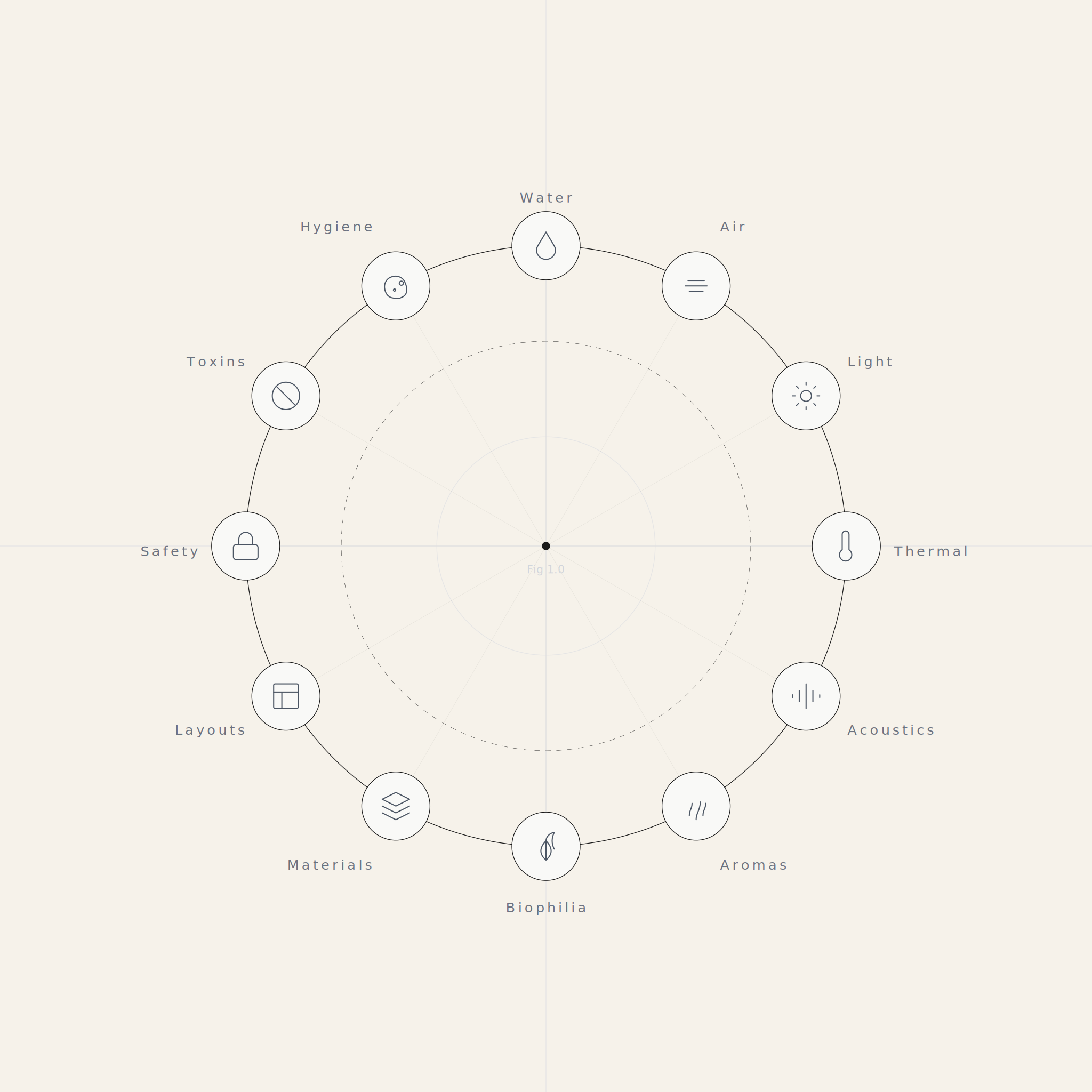
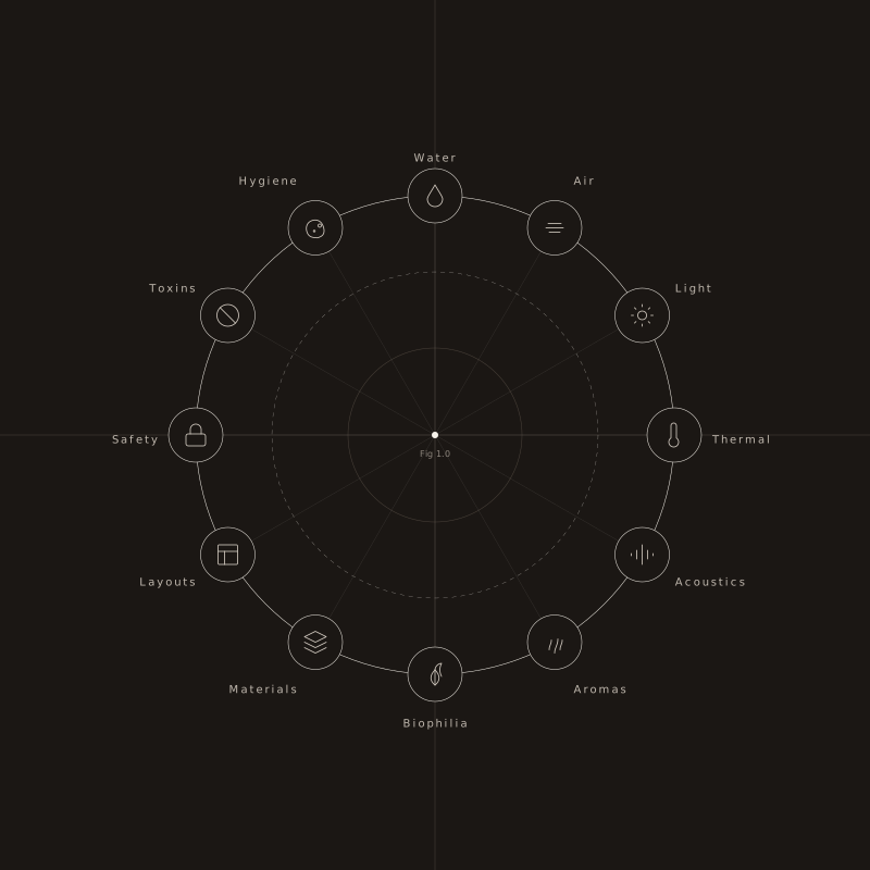
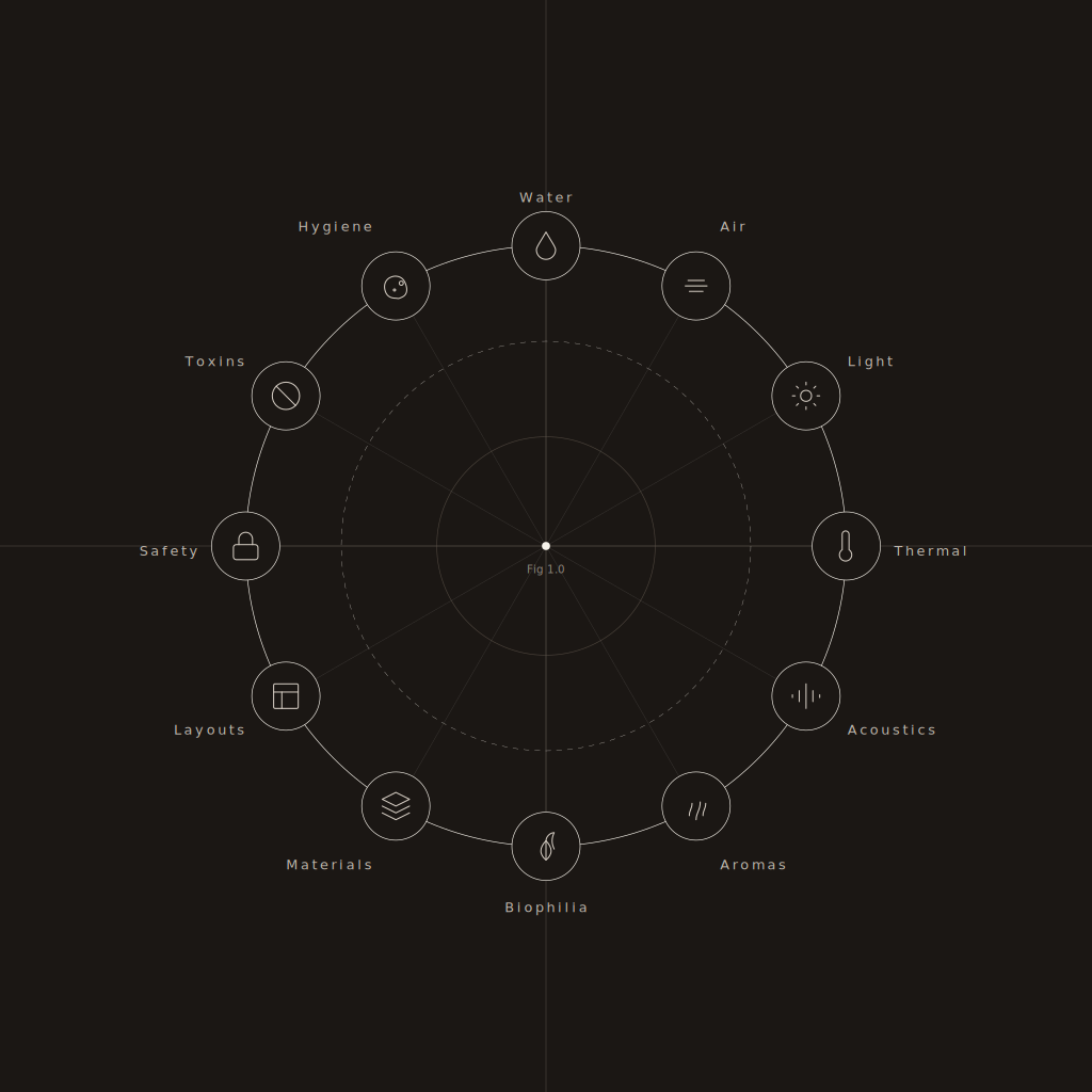
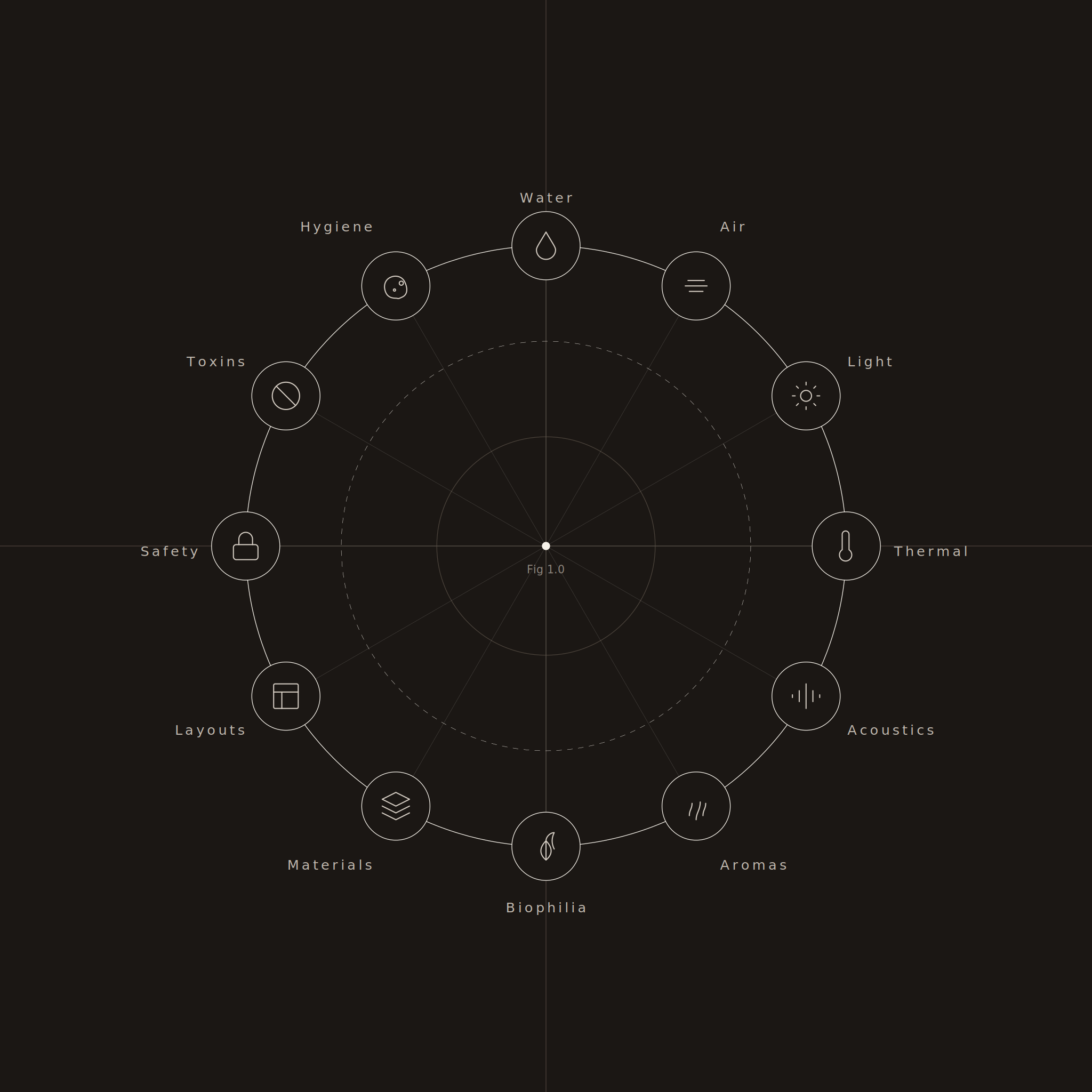
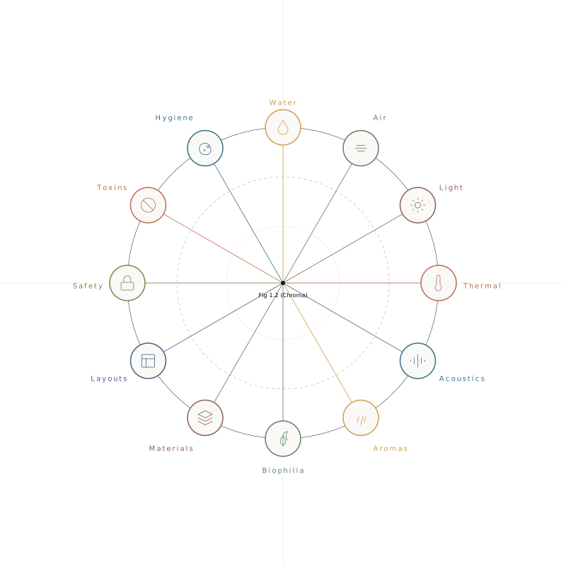
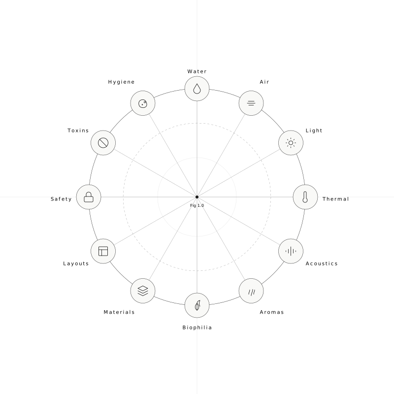
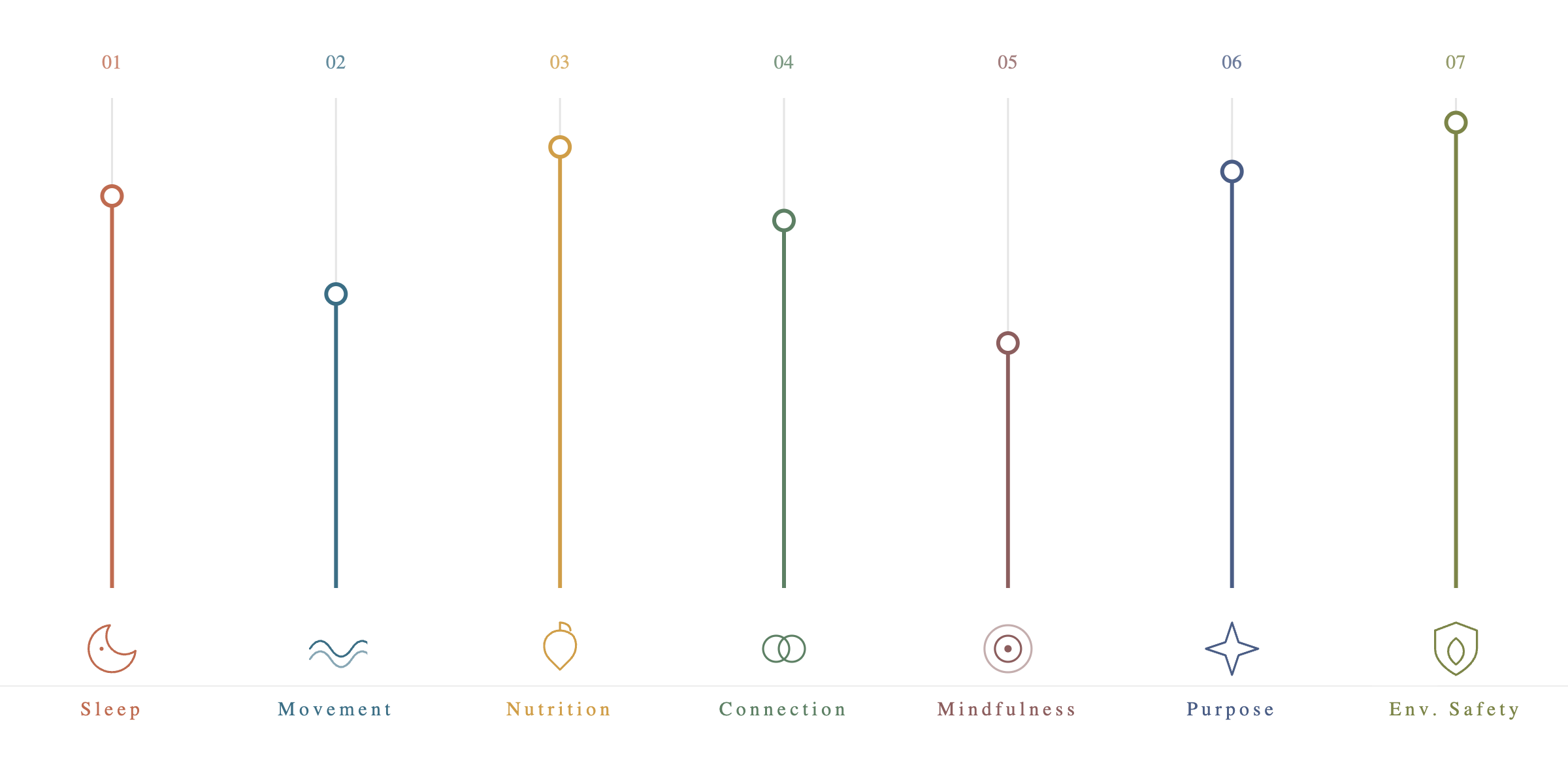
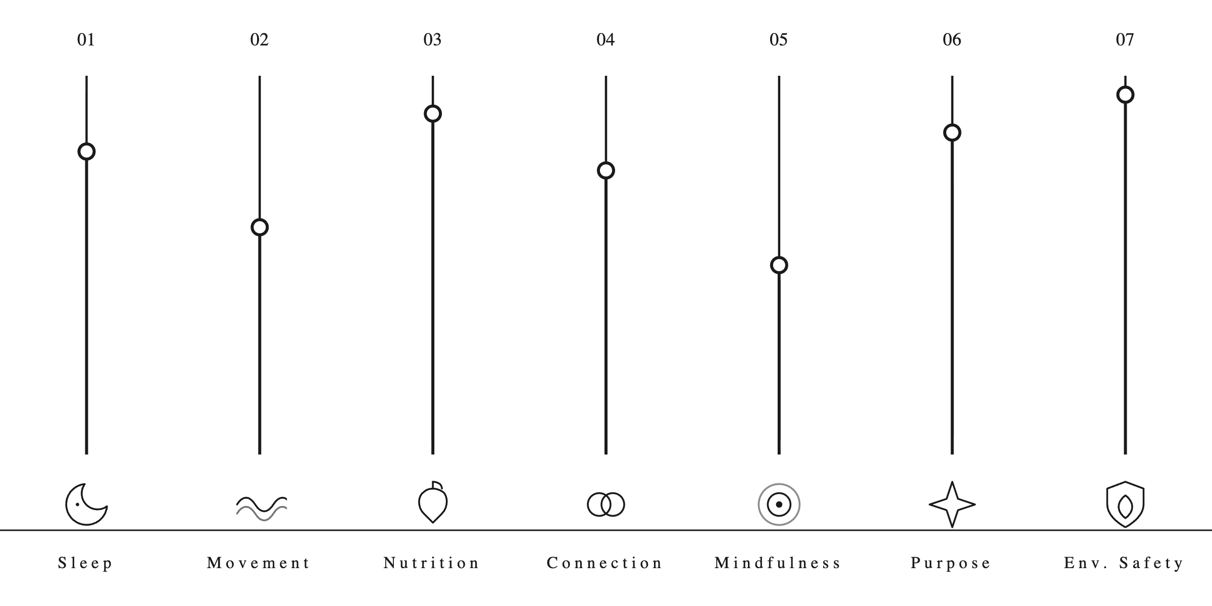
Three framework diagrams. Colour and monochrome, on light and dark grounds. The layout, icons and palette of the first two are the originals; only the ground and the resolved styling differ between variants.
The Seven Levers of BioHarmony™
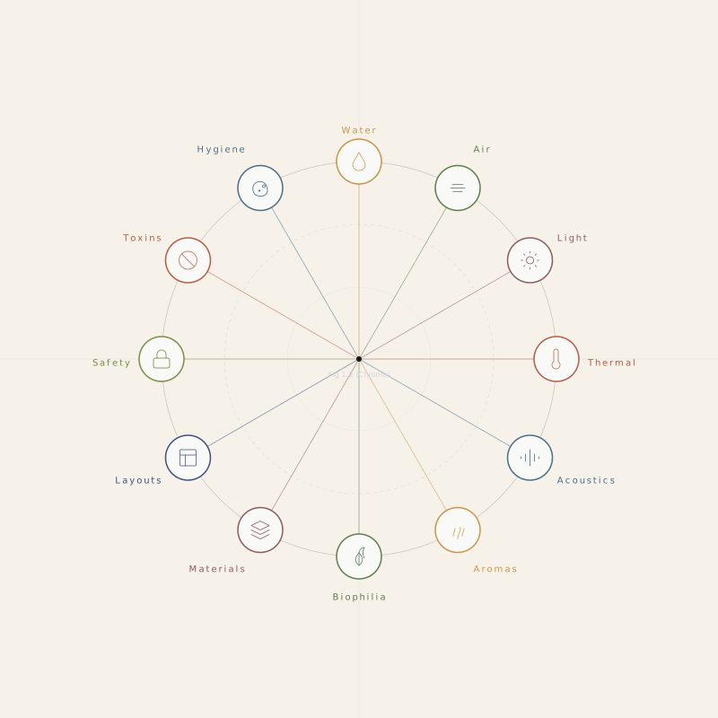
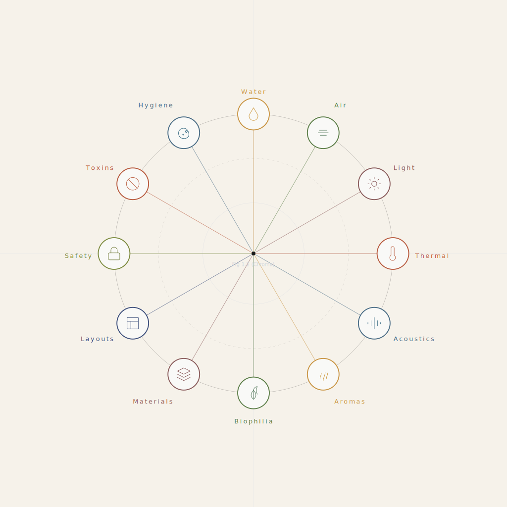
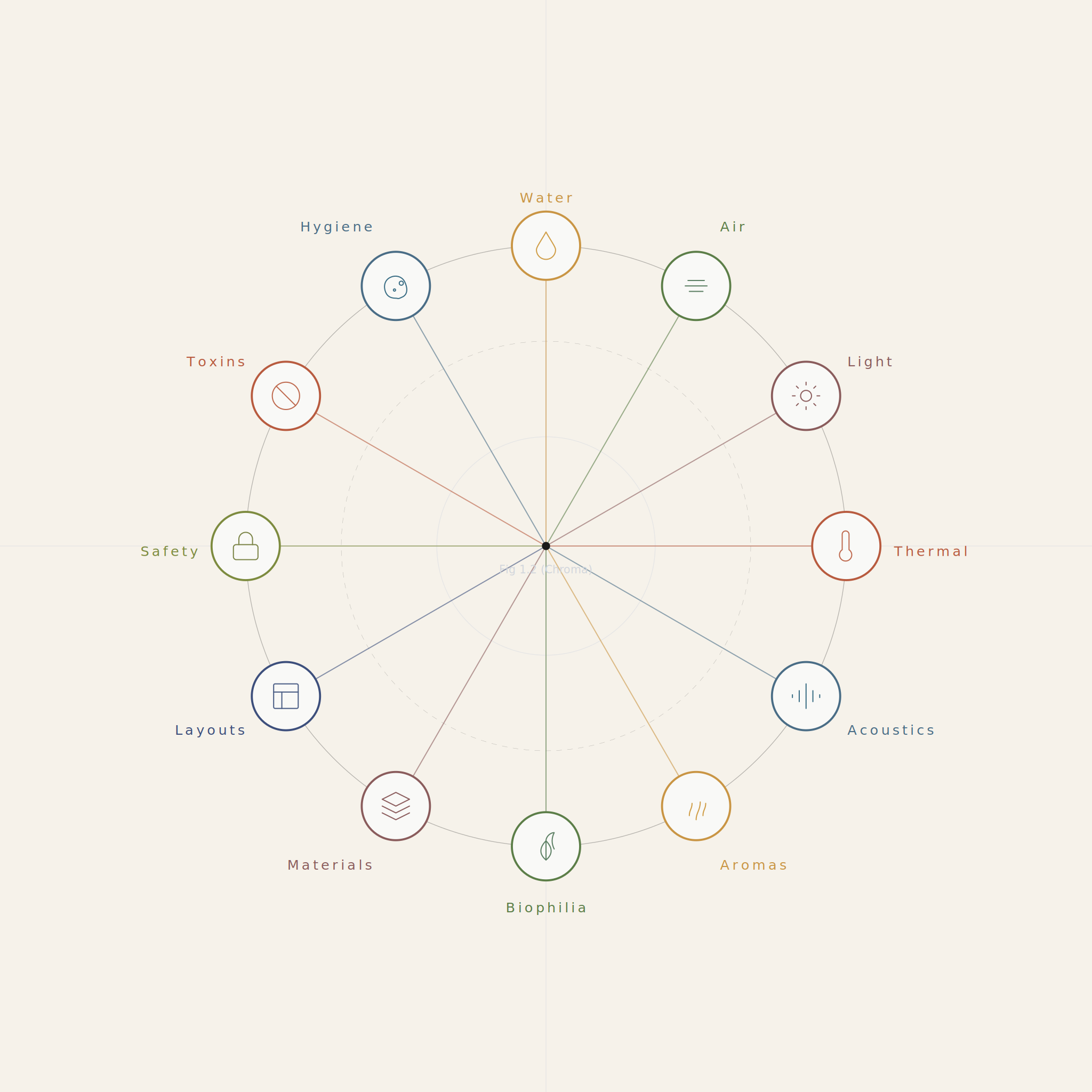
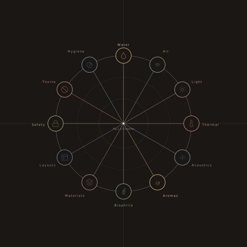
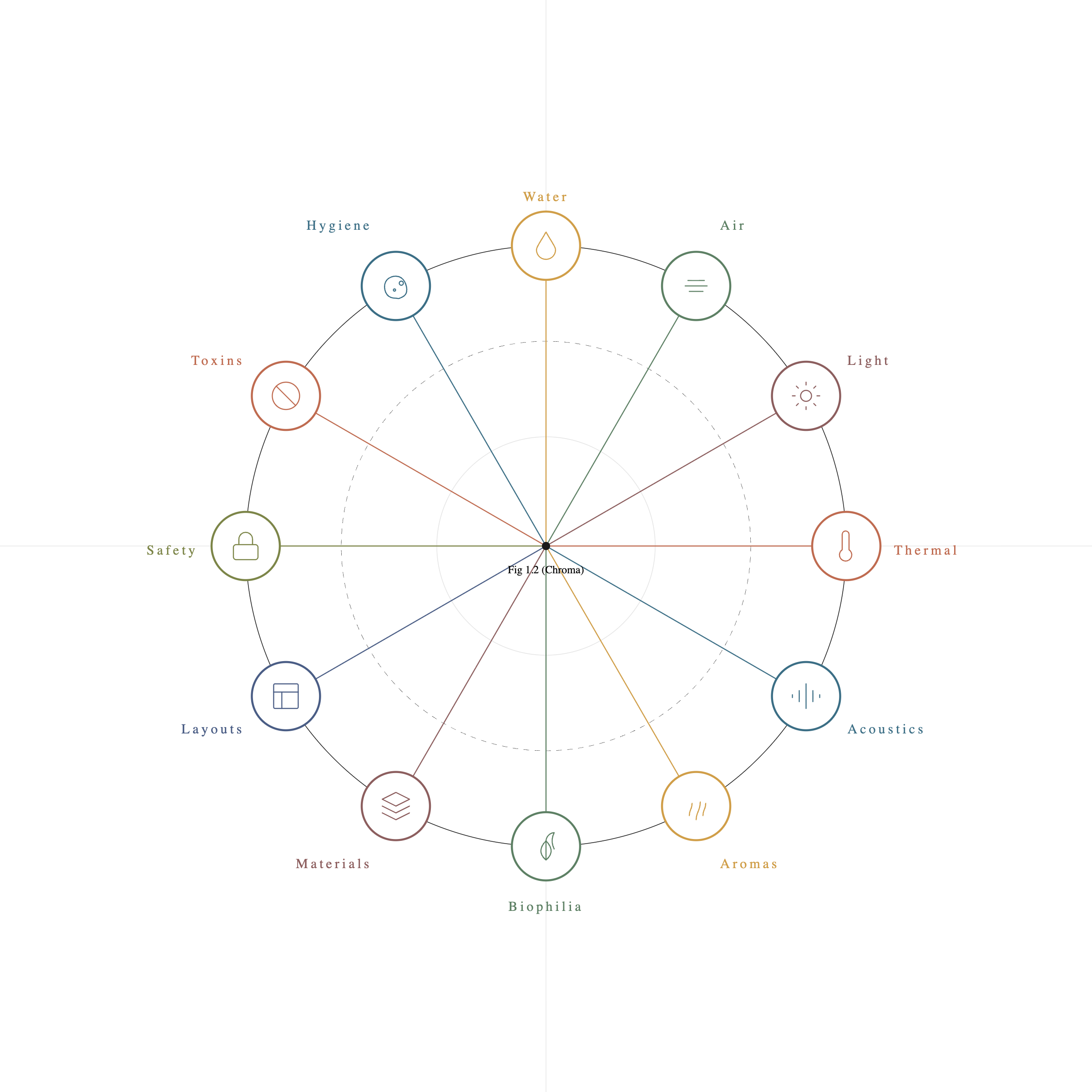
The Oculus™ — the Twelve Home Determinants of Health
The Oculus is the framework, drawn as a single diagram: the twelve Home Determinants of Health it assesses. One name for one thing, same as the Seven Levers.
Labelled reference rasters
As supplied, for design and development reference.
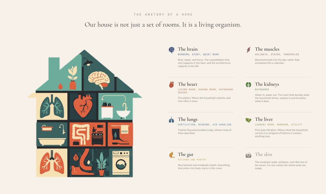
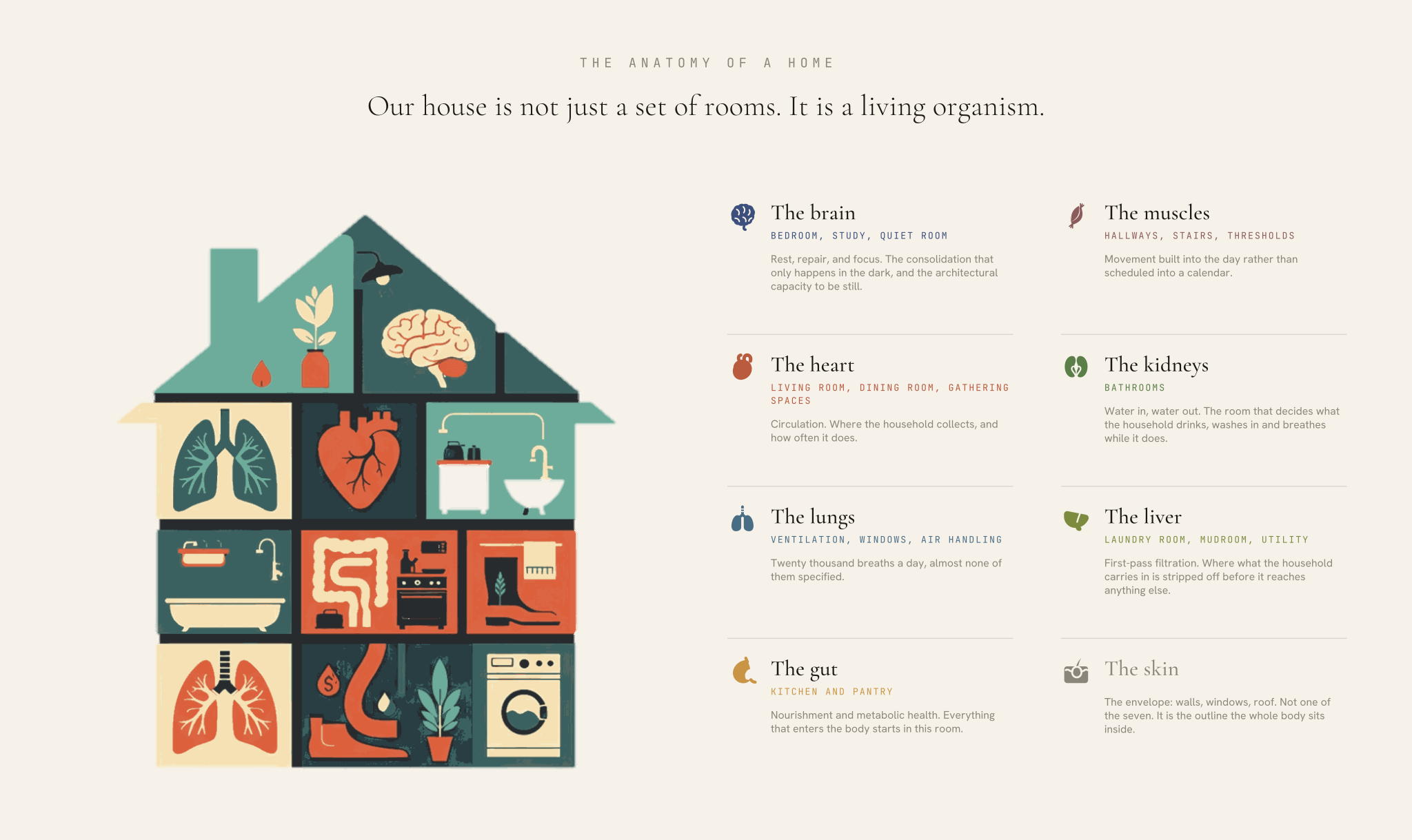
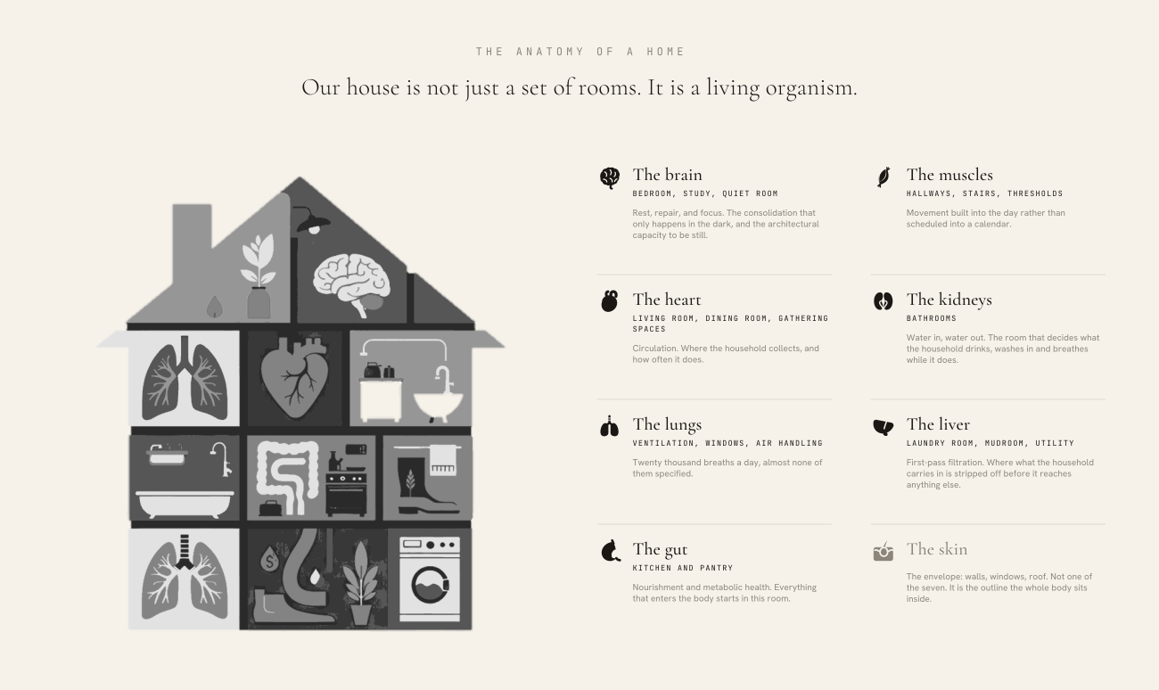
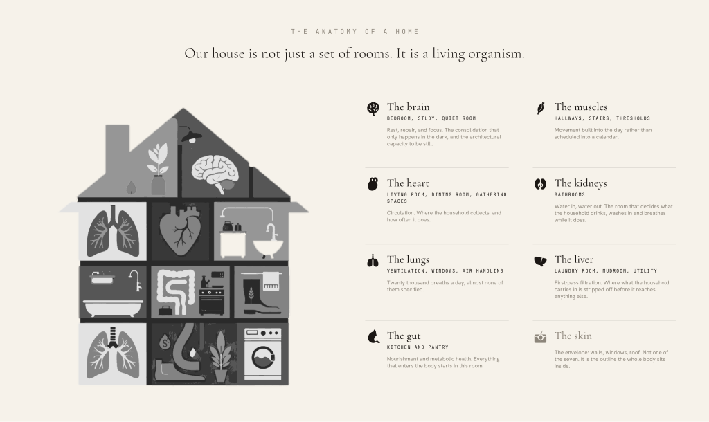
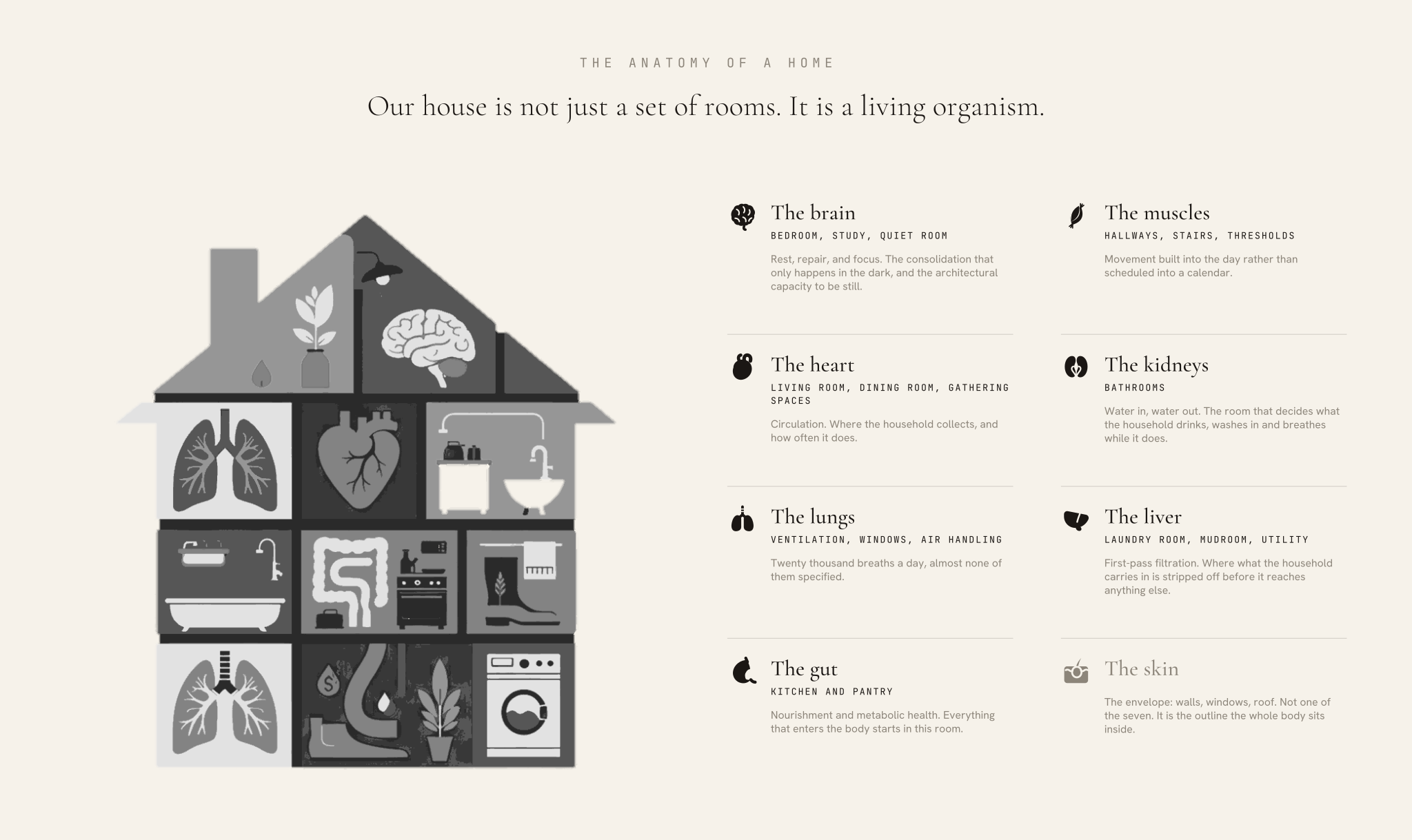
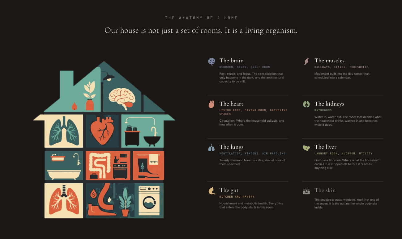
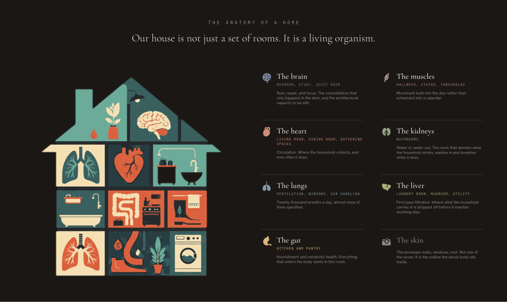
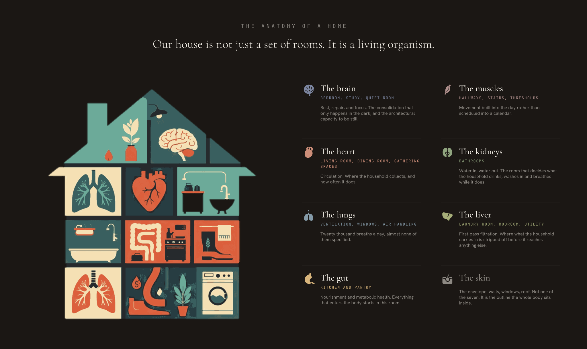
The Anatomy of a Home
A house is not a set of rooms. It is a living organism. The living room is the heart, the kitchen is the gut, the hallway is the muscle nobody uses, and the ventilation is a pair of lungs working twenty thousand times a day whether anyone specified them or not. Once a client sees the house this way, they stop shopping for features and start thinking about systems, which is the only way this work makes sense.
The seven organs
| Organ | In the house | What it stands for |
|---|---|---|
| The brain | Bedroom, study, quiet room | Rest, repair, and focus. The consolidation that only happens in the dark, and the architectural capacity to be still. |
| The heart | Living room, dining room, gathering spaces | Circulation. Where the household collects, and how often it does. |
| The lungs | Ventilation, windows, air handling | Twenty thousand breaths a day, almost none of them specified. |
| The gut | Kitchen and pantry | Nourishment and metabolic health. Everything that enters the body starts in this room. |
| The muscles | Hallways, stairs, thresholds | Movement built into the day rather than scheduled into a calendar. |
| The kidneys | Bathrooms | Water in, water out. The room that decides what the household drinks, washes in and breathes while it does. |
| The liver | Laundry room, mudroom, utility | First-pass filtration. Where what the household carries in is stripped off before it reaches anything else. |
Lines
A house is not a set of rooms. It is a living organism. We treat it like one.
Every home has a heart, lungs and a gut. Most of them are unwell.
The living room is the heart. The kitchen is the gut. The hallway is the muscle you never use.
Your home has a pulse. We keep it beating.
We do not renovate rooms. We treat systems.
“Your home has a pulse. We keep it beating.” already sat in the wit bank as a Straight Line. It now has an entire system behind it, which is what turns a good line into a position.
Where it earns its keep
| Where | How to use it |
|---|---|
| The walkthrough | Structure a site visit organ by organ. It gives a tour a spine and stops it becoming a list of upgrades. |
| Homeowner copy | Clients think in rooms, not determinants. Lead with the organ and the determinant arrives painlessly. |
| The discovery session | Seven organs is seven conversations. It is a ready-made agenda for the Vision Blueprint. |
| Social | A series of seven, one per organ. The only place the full anatomy should appear in short form. |
| Press and keynote | The fastest way to make an invisible argument tangible in under a minute. |
| Proposals | Use as section architecture, not as copy. The organ names title the sections; the body stays technical. |
Where to stop
The metaphor is strong, which is exactly why it needs a fence around it.
- Seven organs, one skin. An organ can cover more than one room; a room does not have to have an organ. Do not invent an eighth to make a point, and do not split one to fill a layout.
- Seven organs is not the Seven Levers. The count is a coincidence and there is no row-by-row mapping between them. If someone draws a line from an organ to a Lever, correct it: the Levers are functions, the Anatomy is a place, and the two are different lenses on the same house.
- The metaphor explains, it never diagnoses. A home is not sick, does not have a disease, and never needs surgery.
- Nothing grotesque. No bowels, no bladder, no organ anyone would rather not picture over dinner.
- It is a way in, not the framework. The Seven Levers remain the framework. The Anatomy is how you explain a Lever to someone standing in their hallway.
- One organ per short piece. The full anatomy belongs to a walkthrough, a tour, or a long feature, never a caption.
- Never present the mapping as physiology. It is a teaching metaphor. The science lives in the Levers and the Determinants, and that is where proof belongs.
- Resist the pun. “Heart of the home” is already a cliché in real estate. Ours works because it is followed by an actual system, not because it sounds warm.