Identity
The mark, wordmarks, lockups, and the rules that keep them intact.
The Logomark
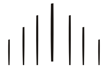
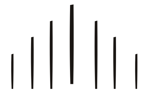
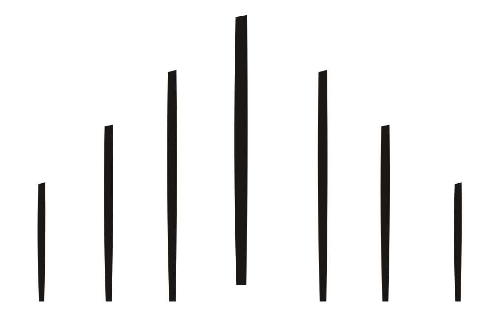
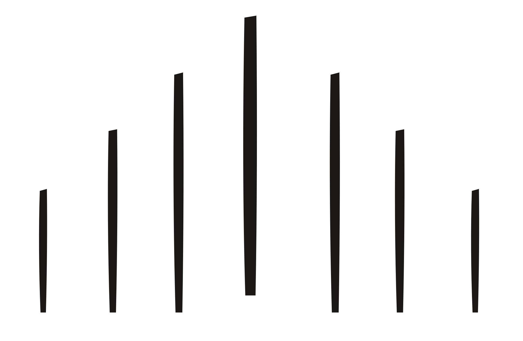
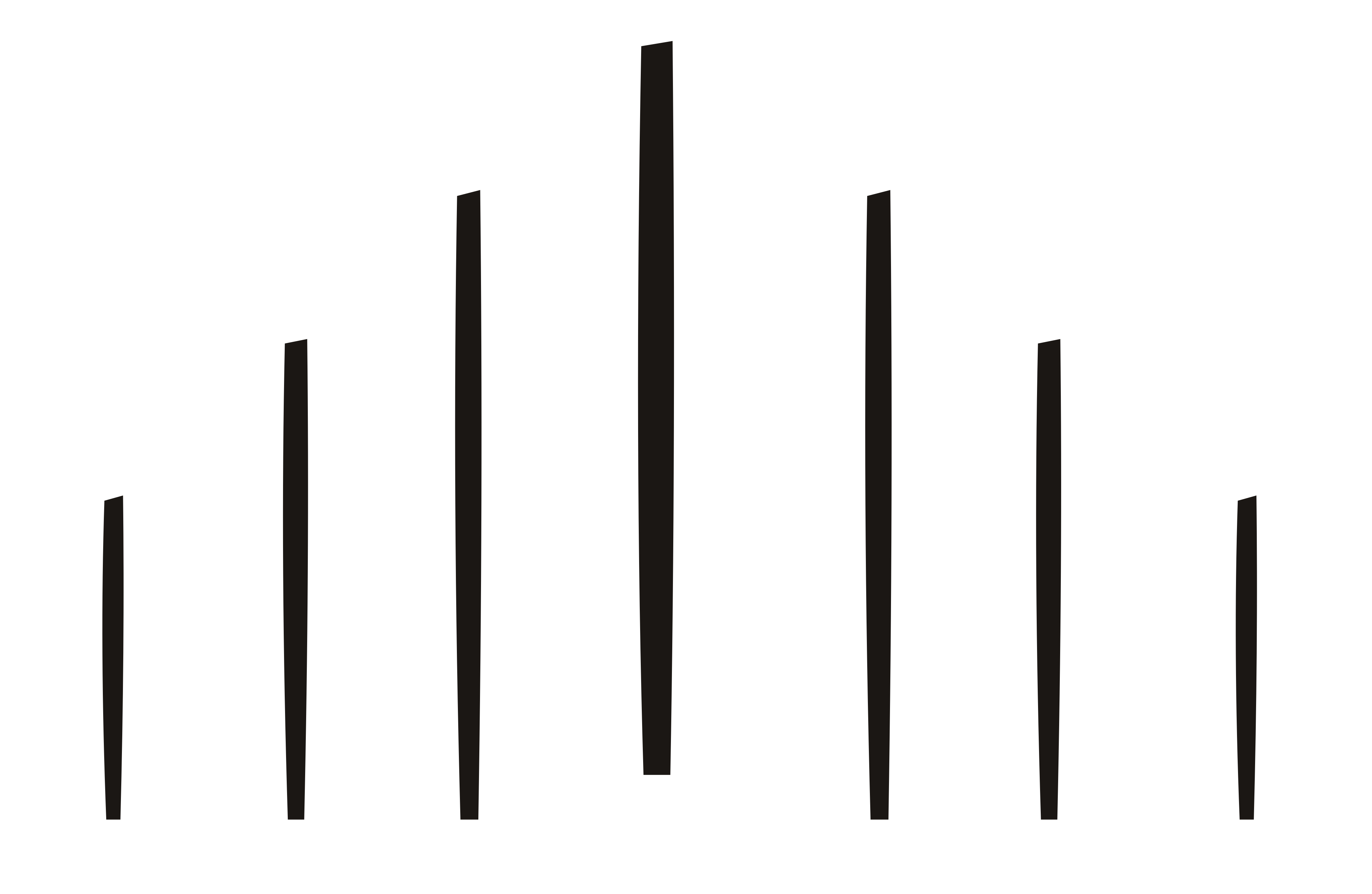
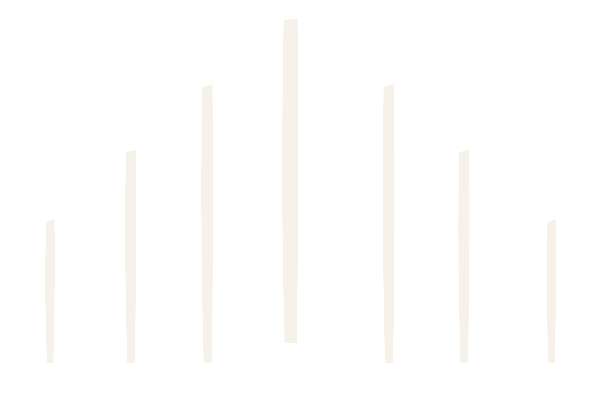
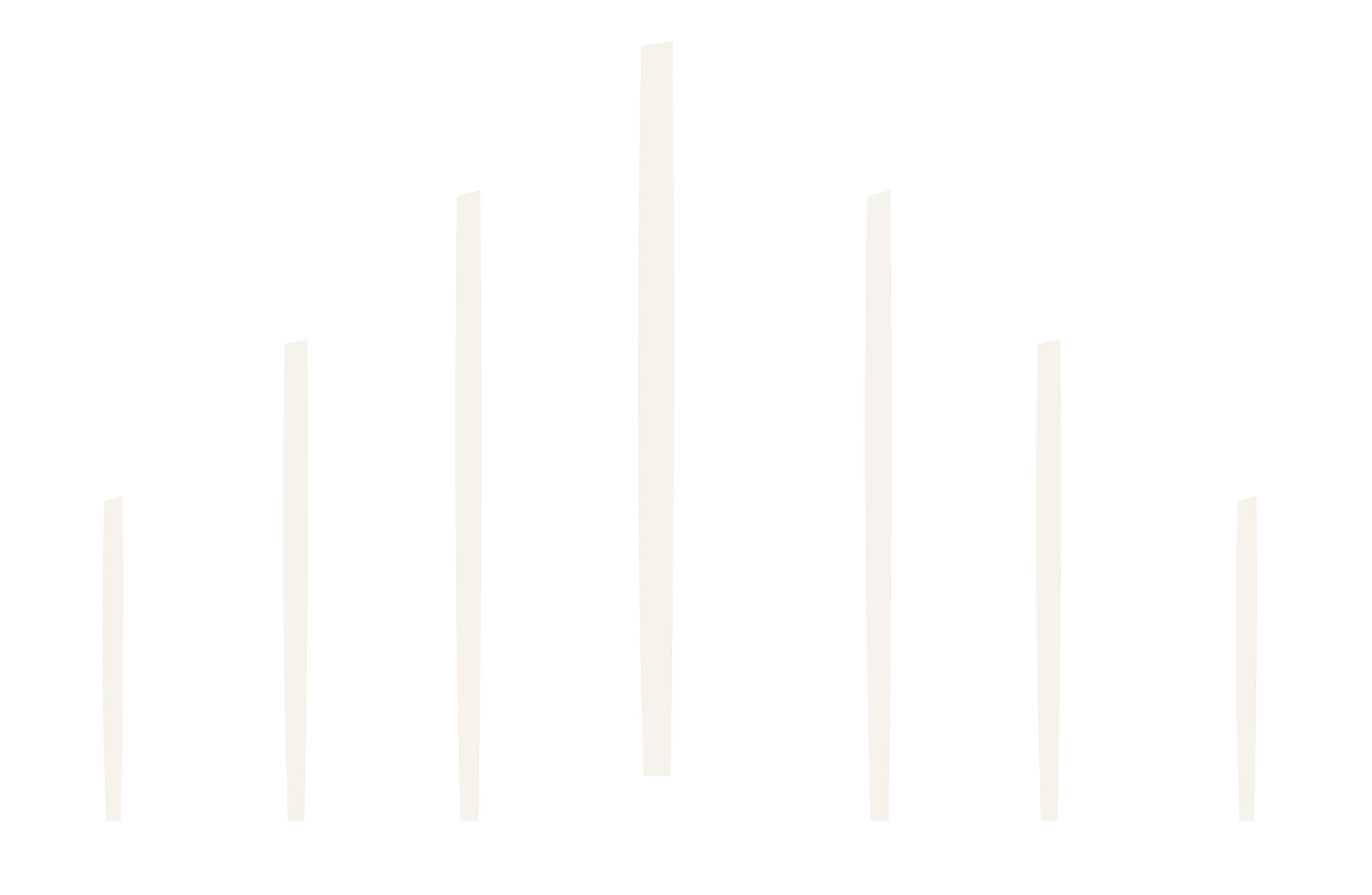
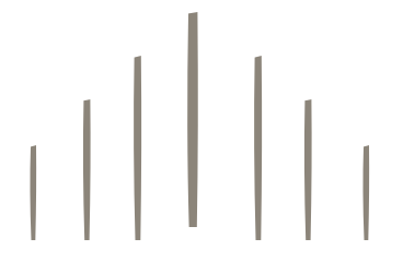
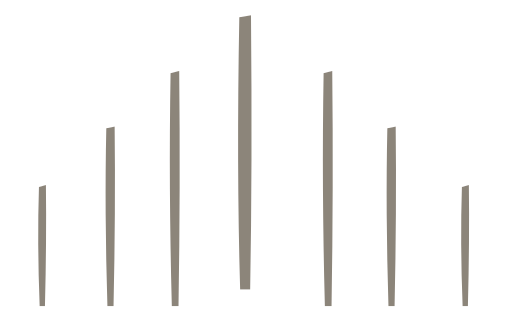
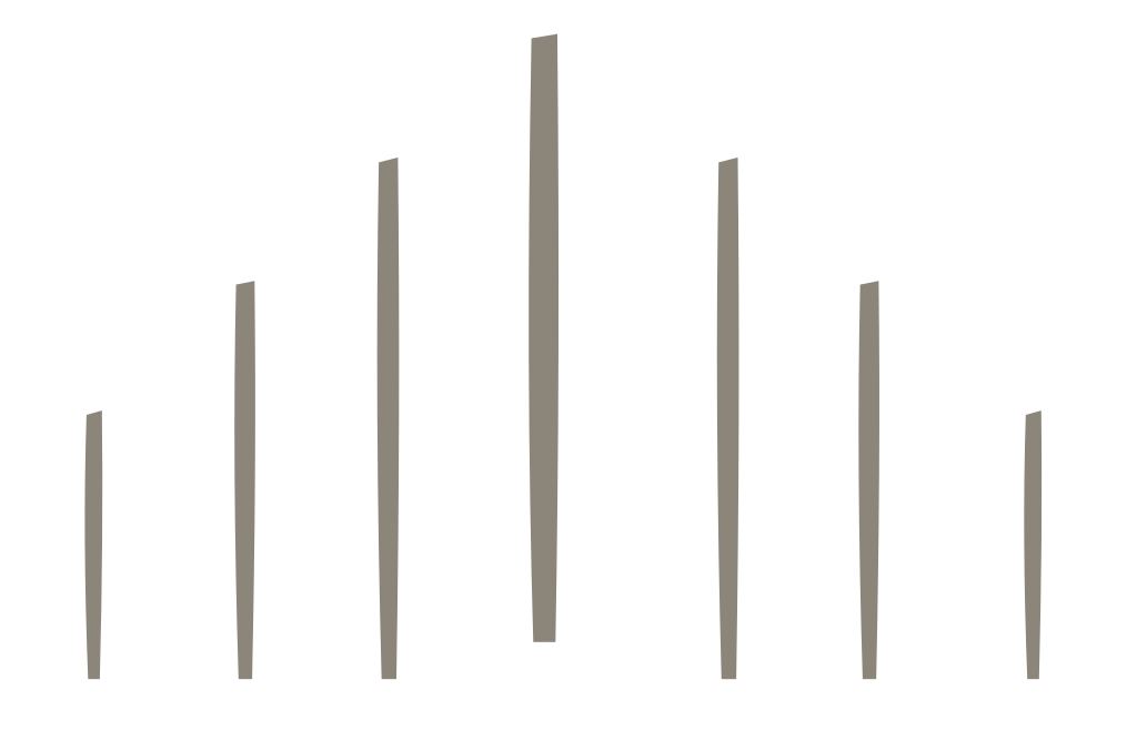
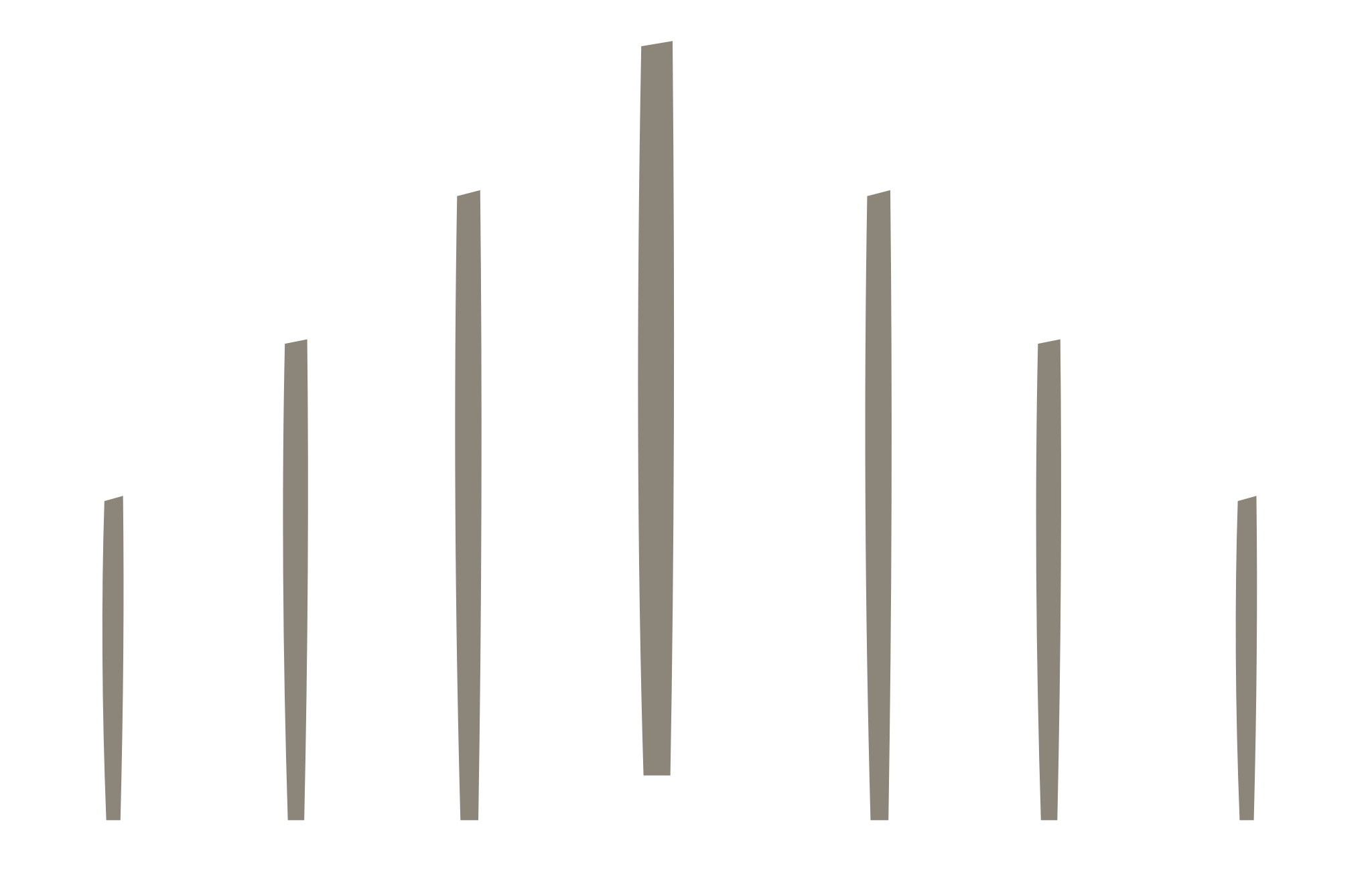
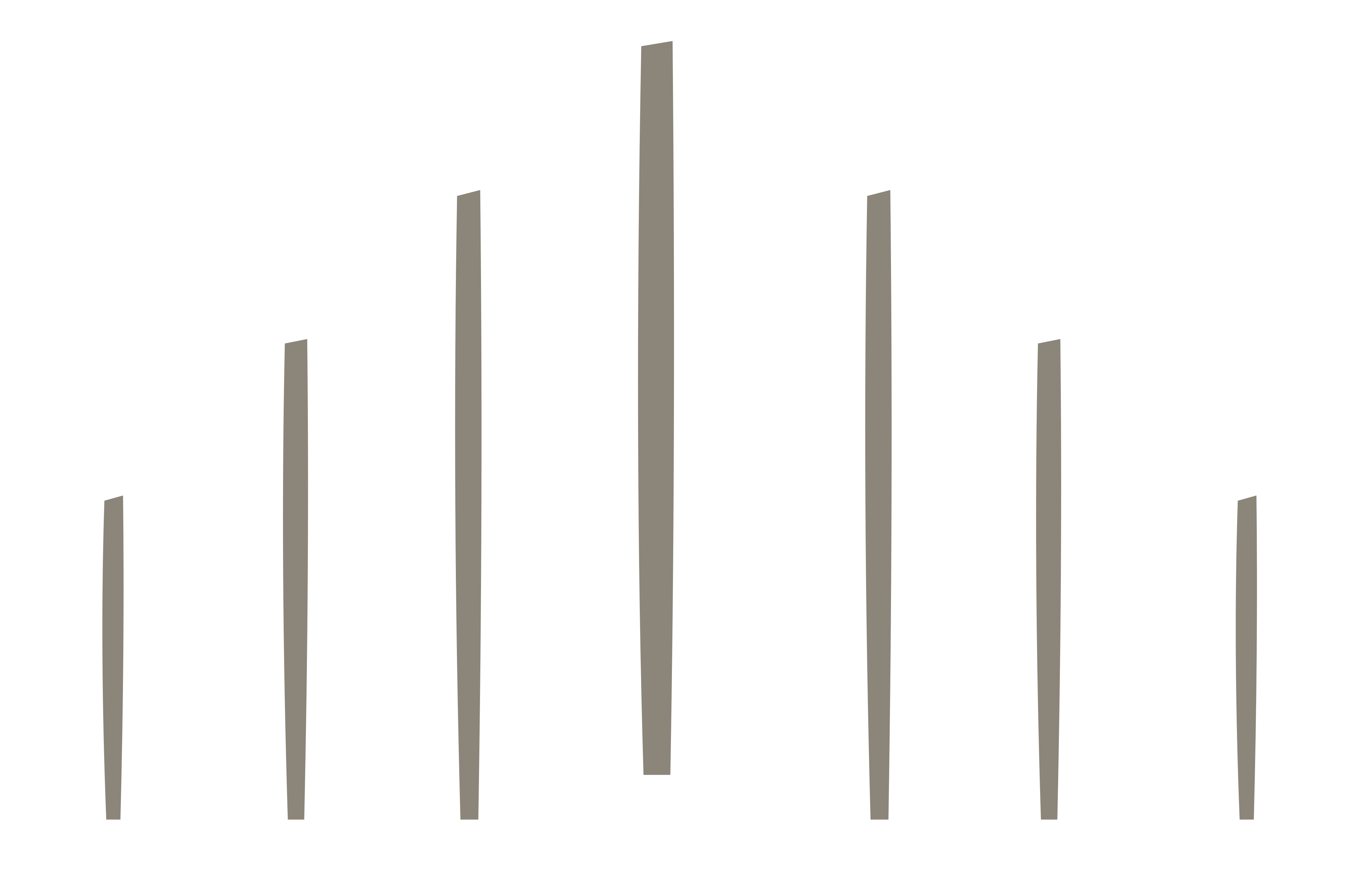
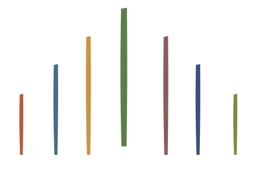
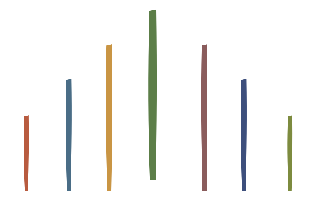
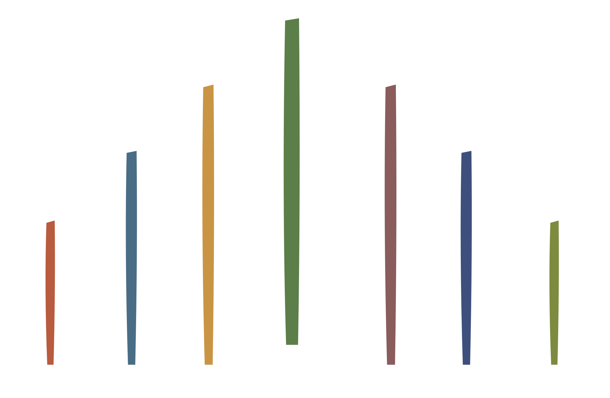
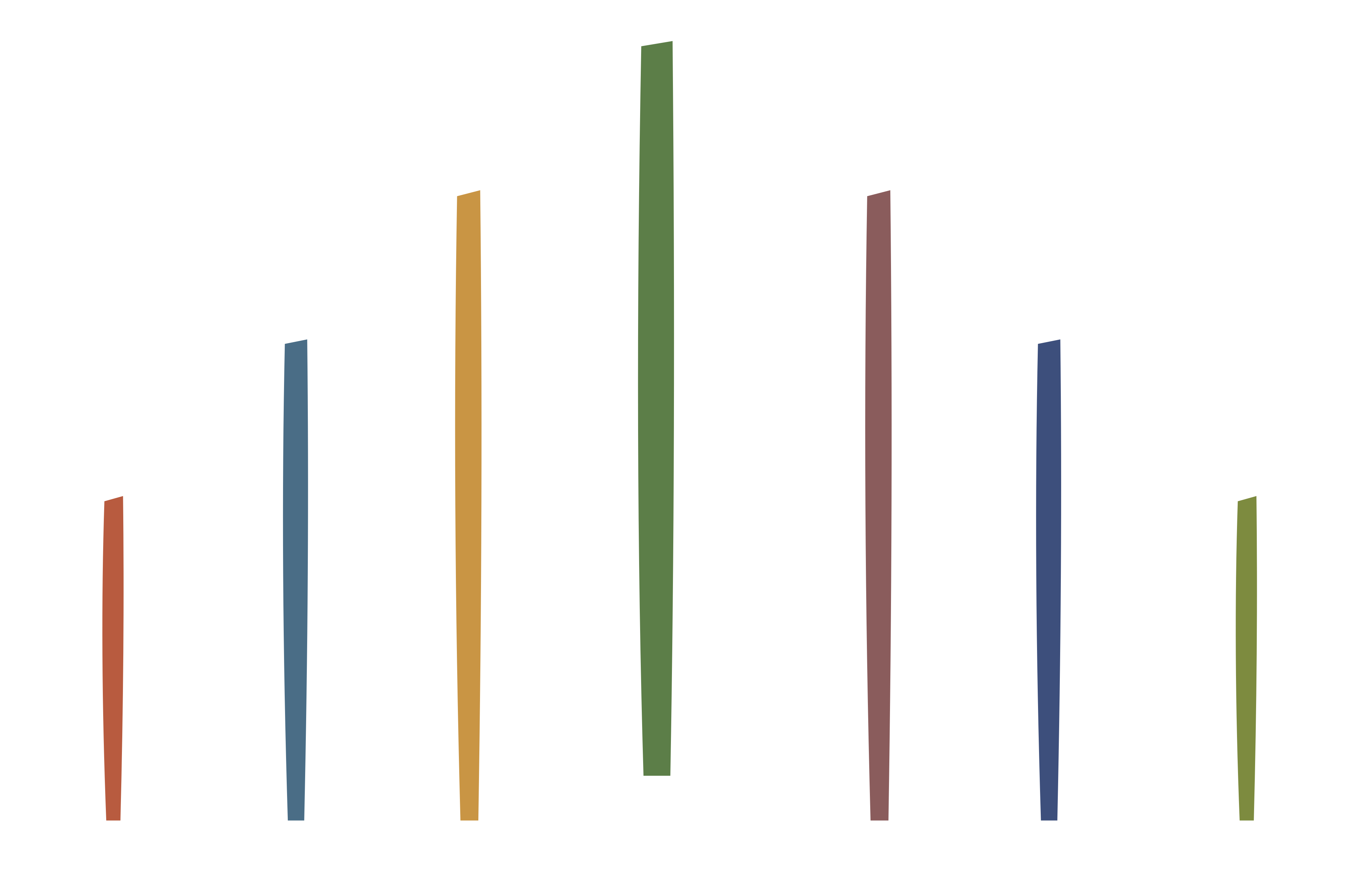
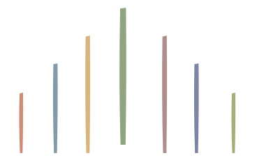
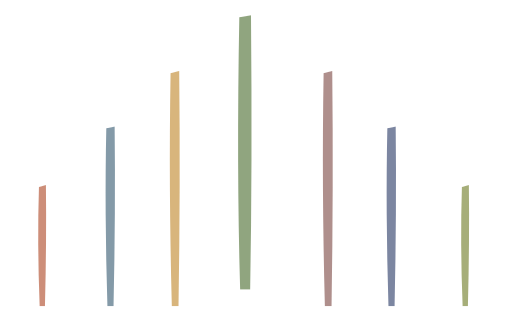
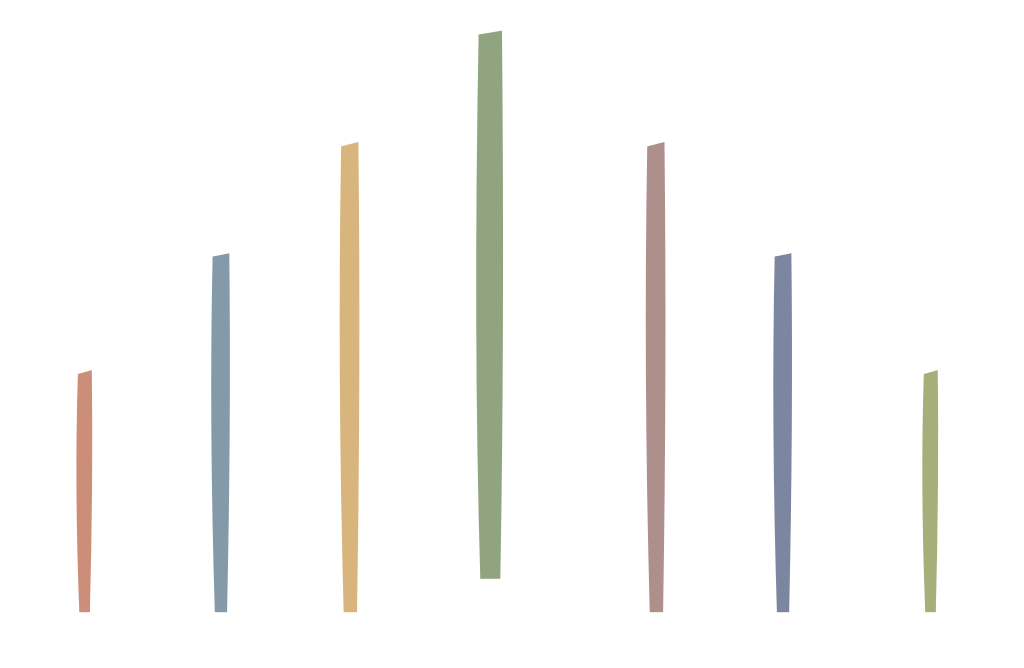
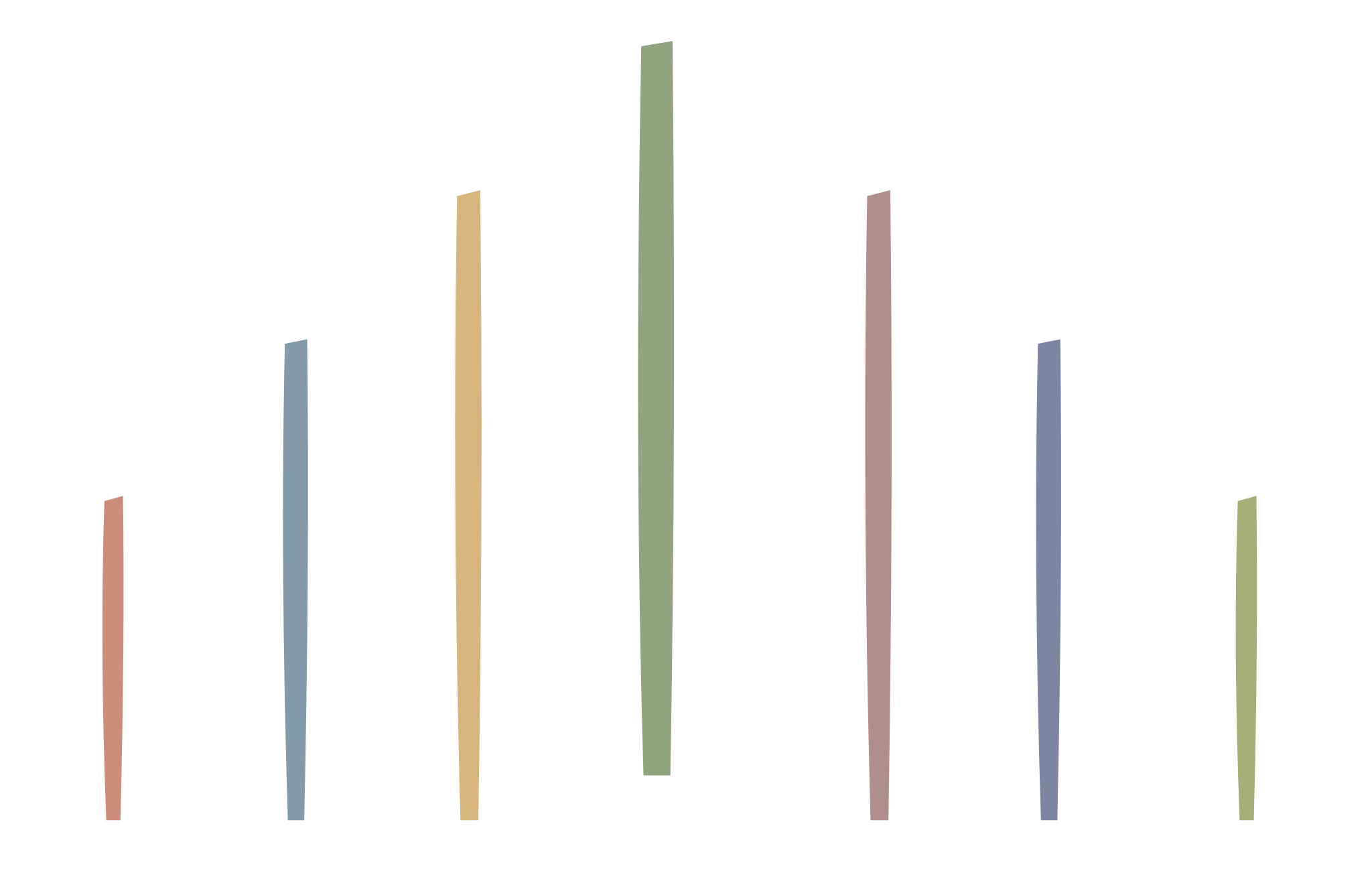
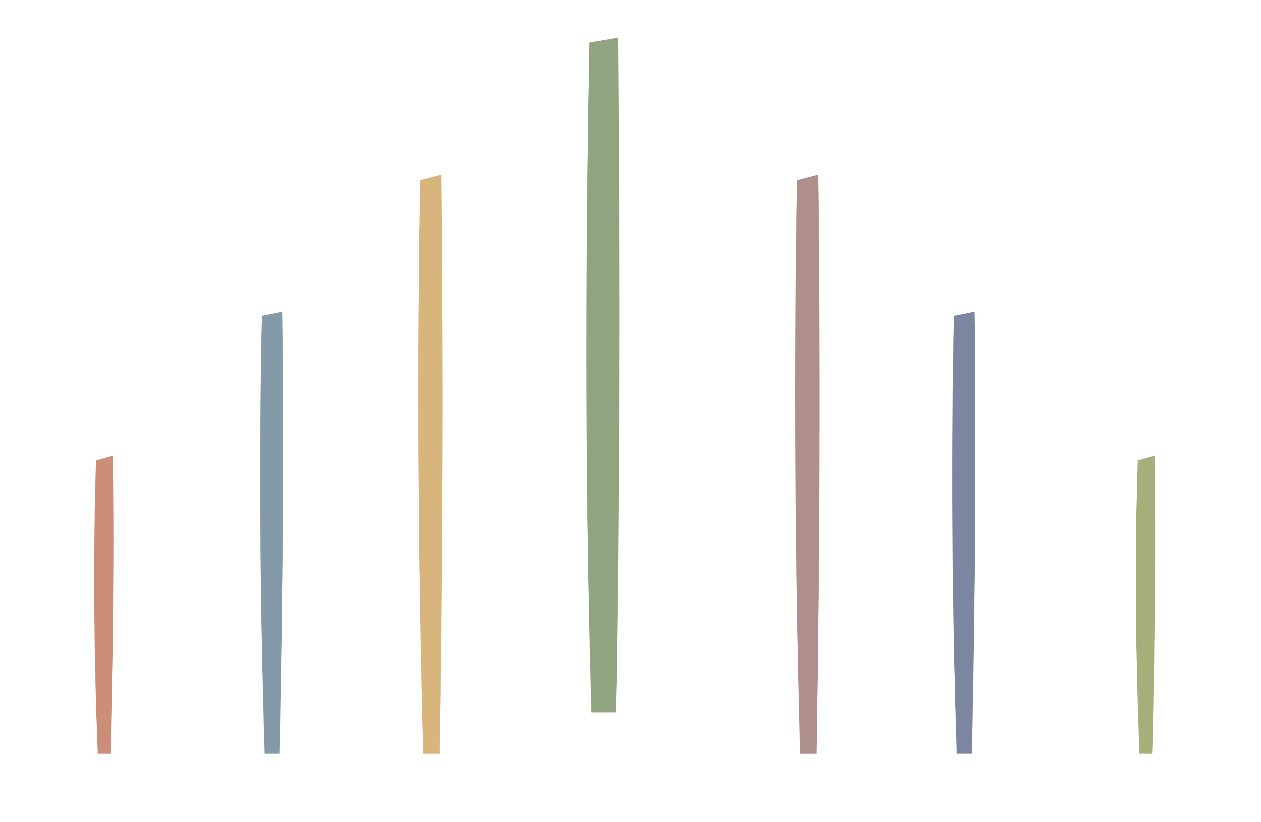
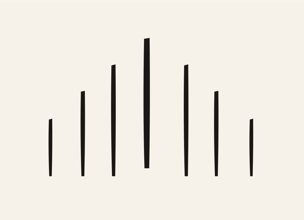
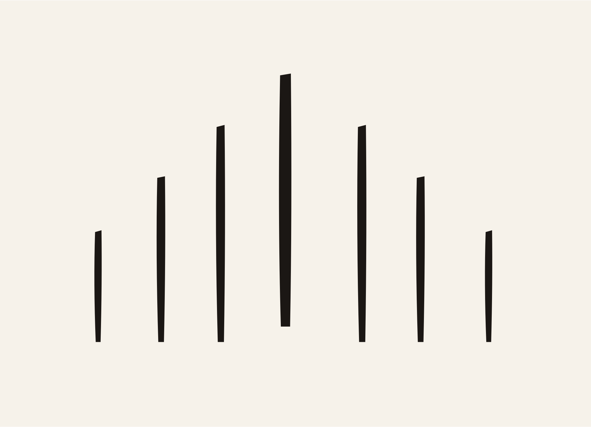
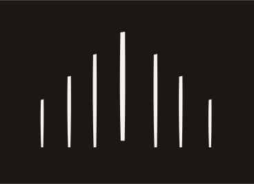
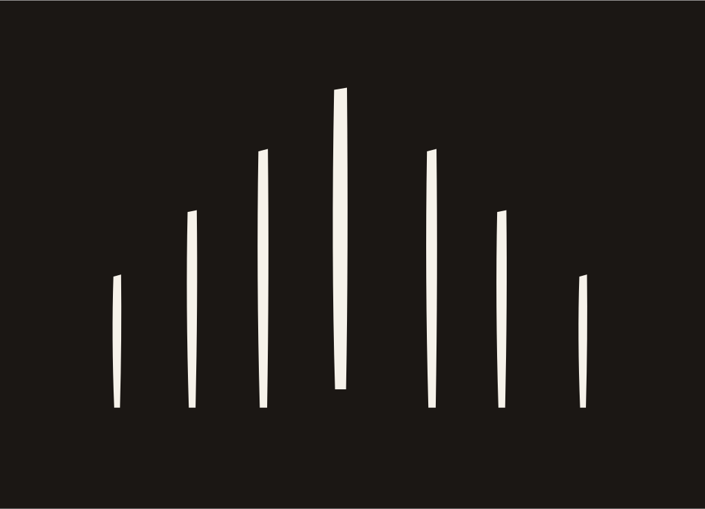
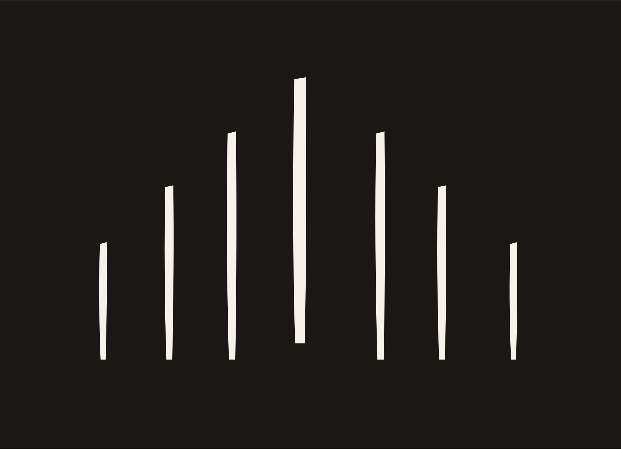
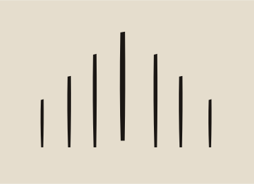
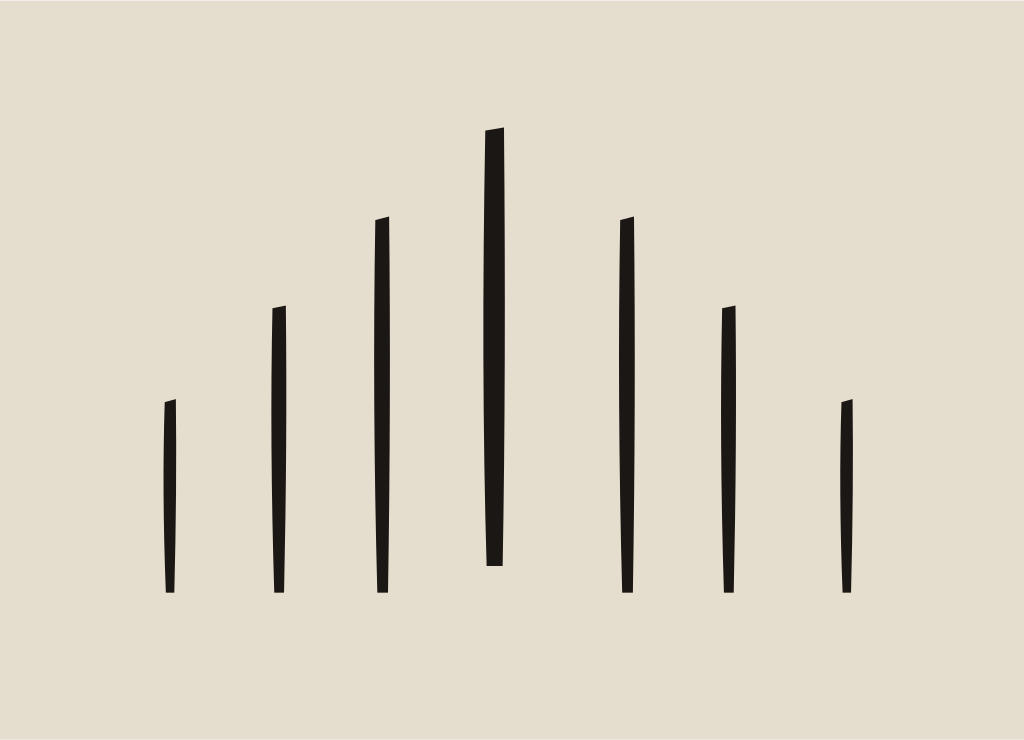
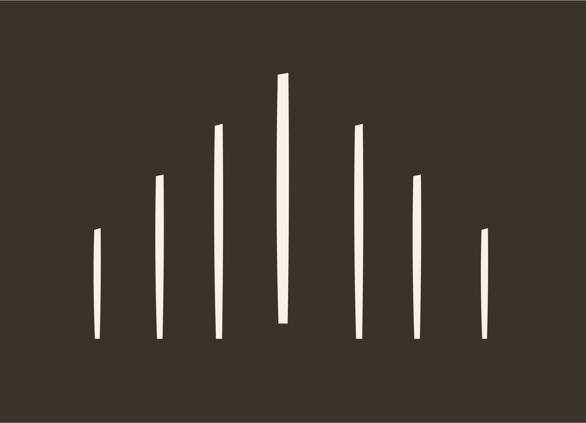
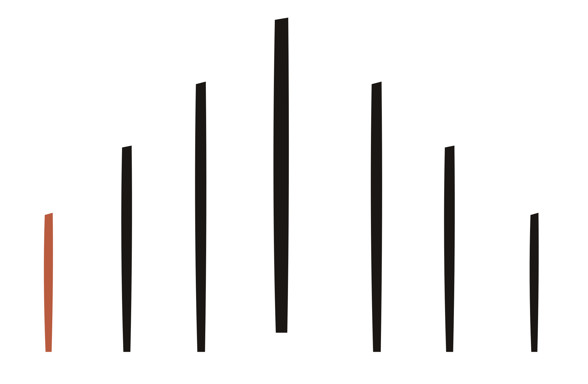
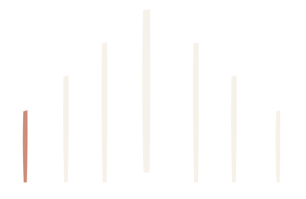
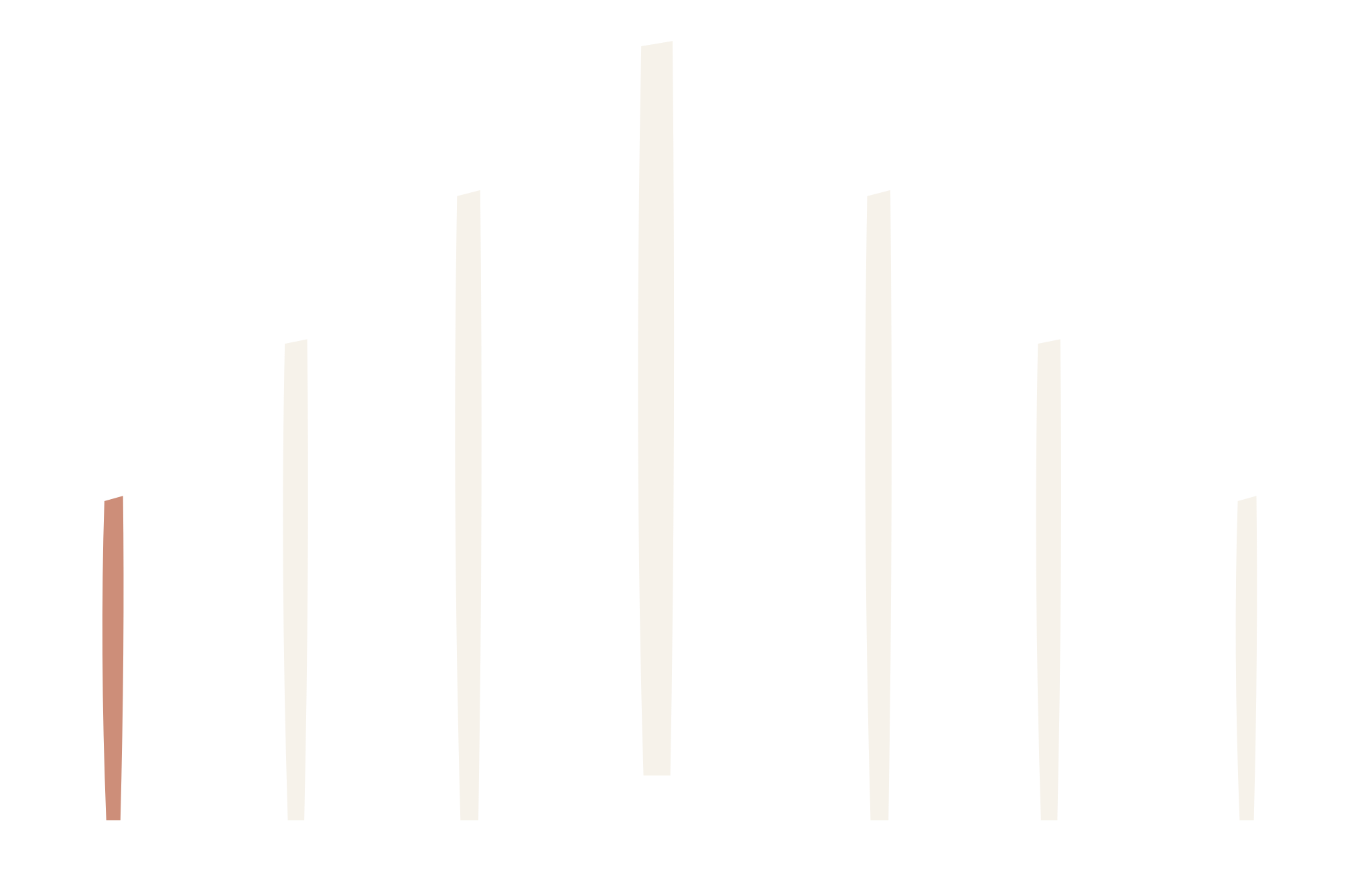
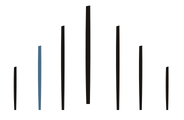
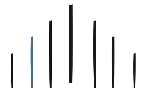
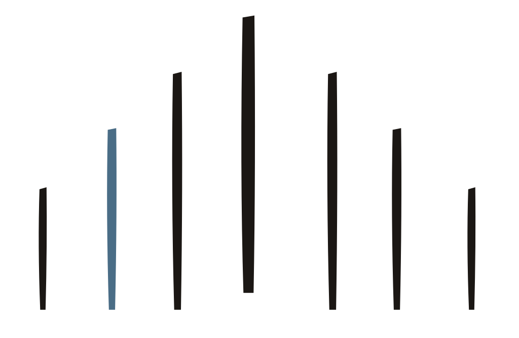
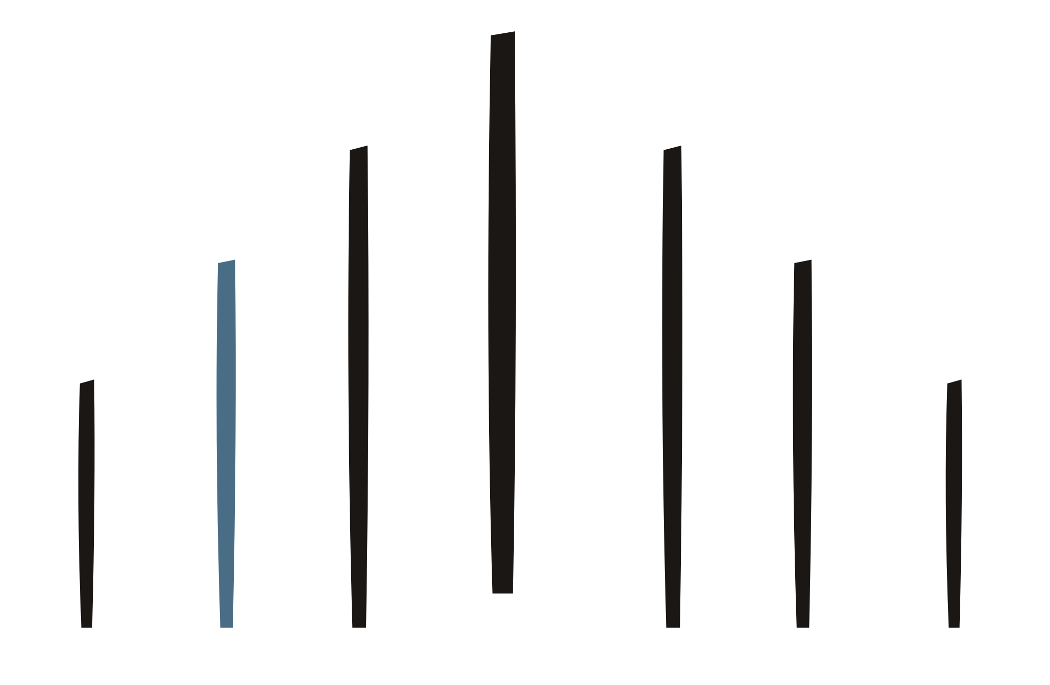
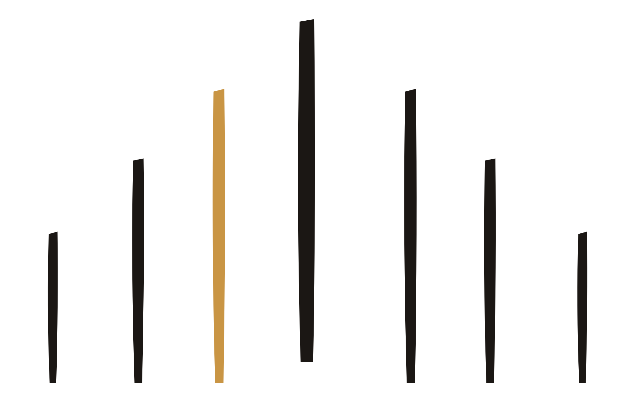
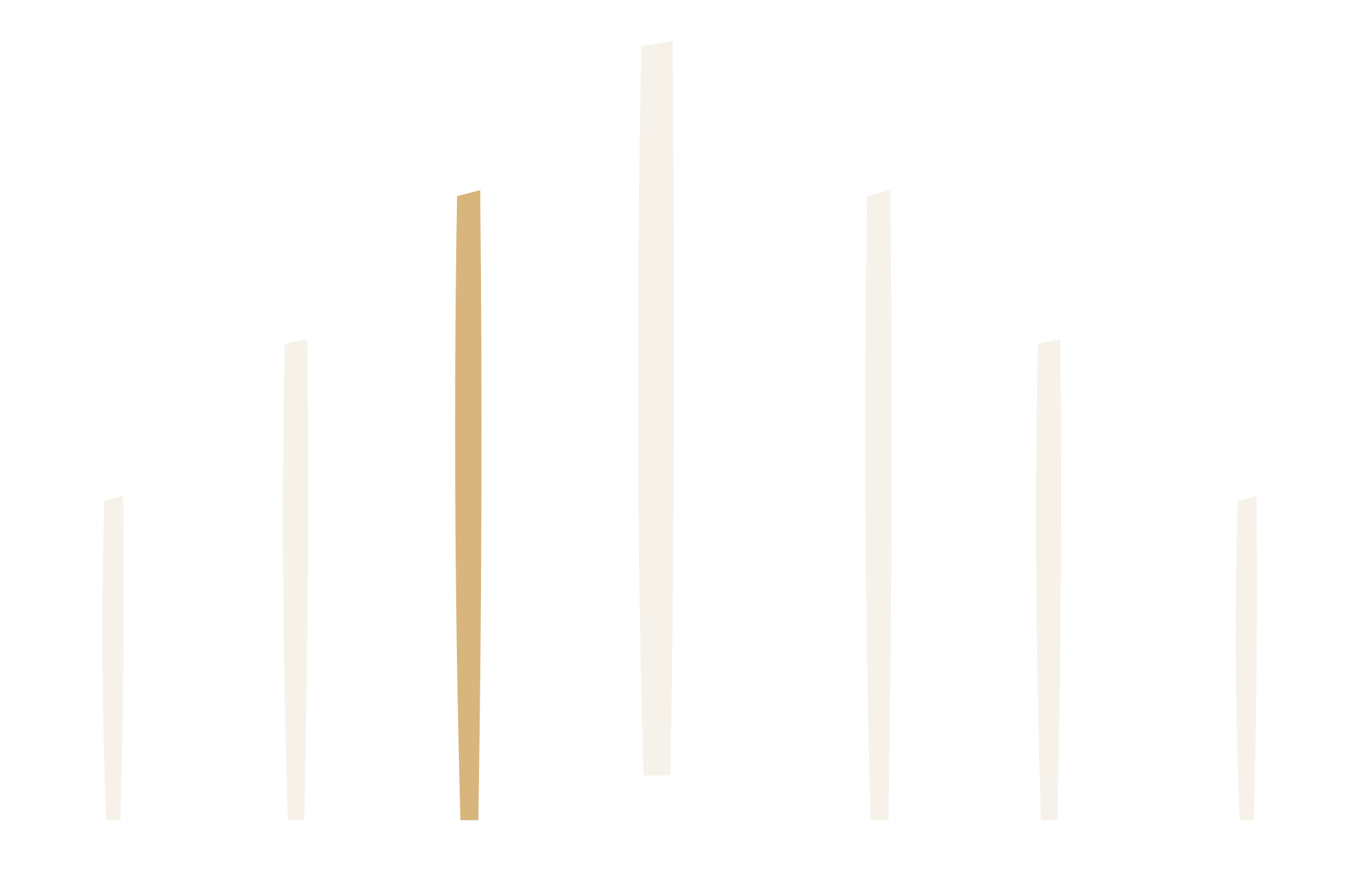
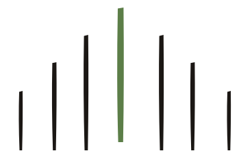
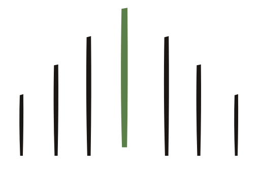
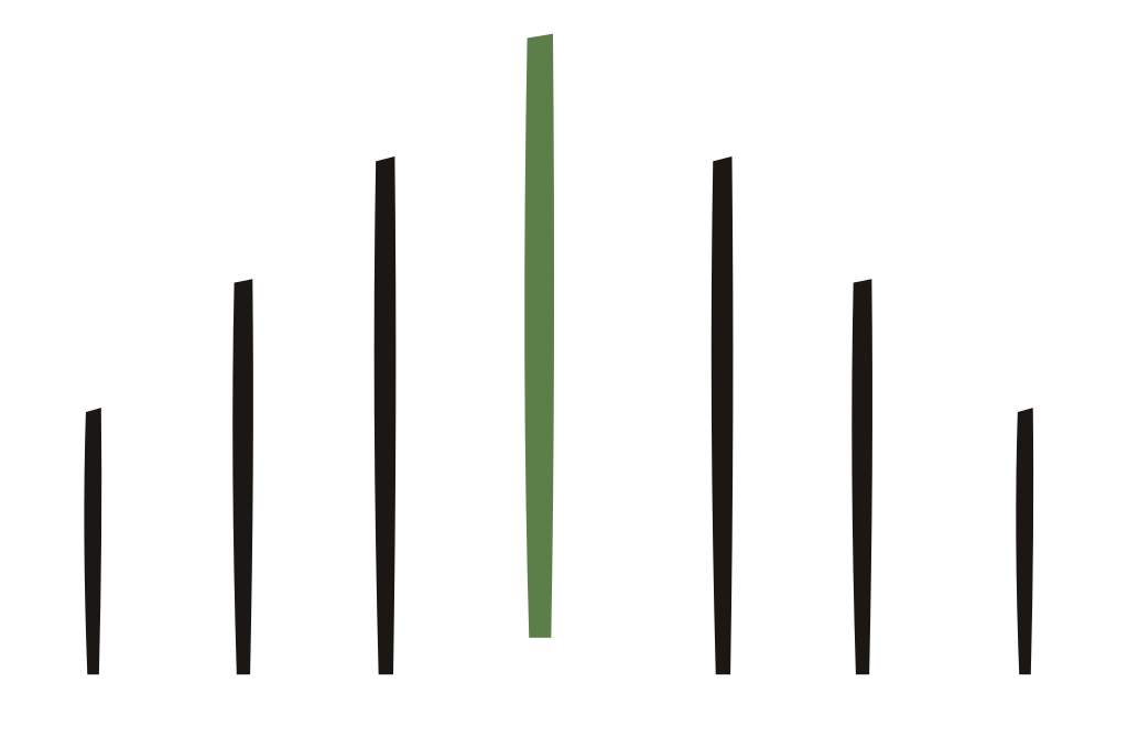
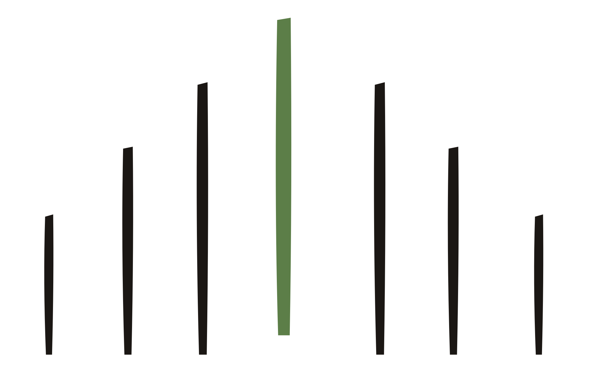
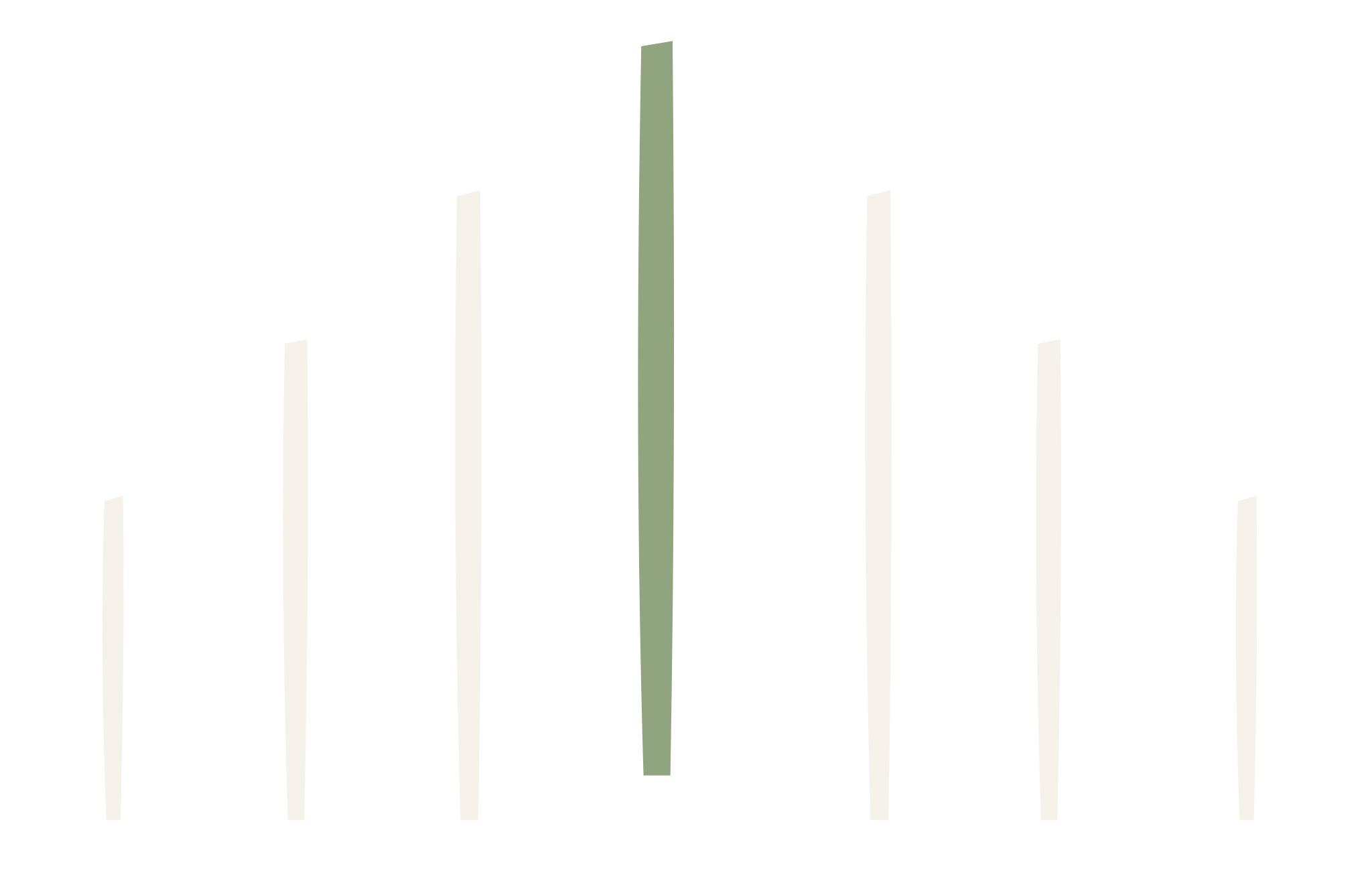
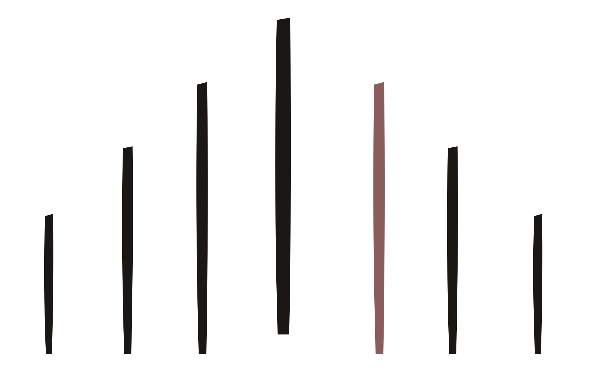
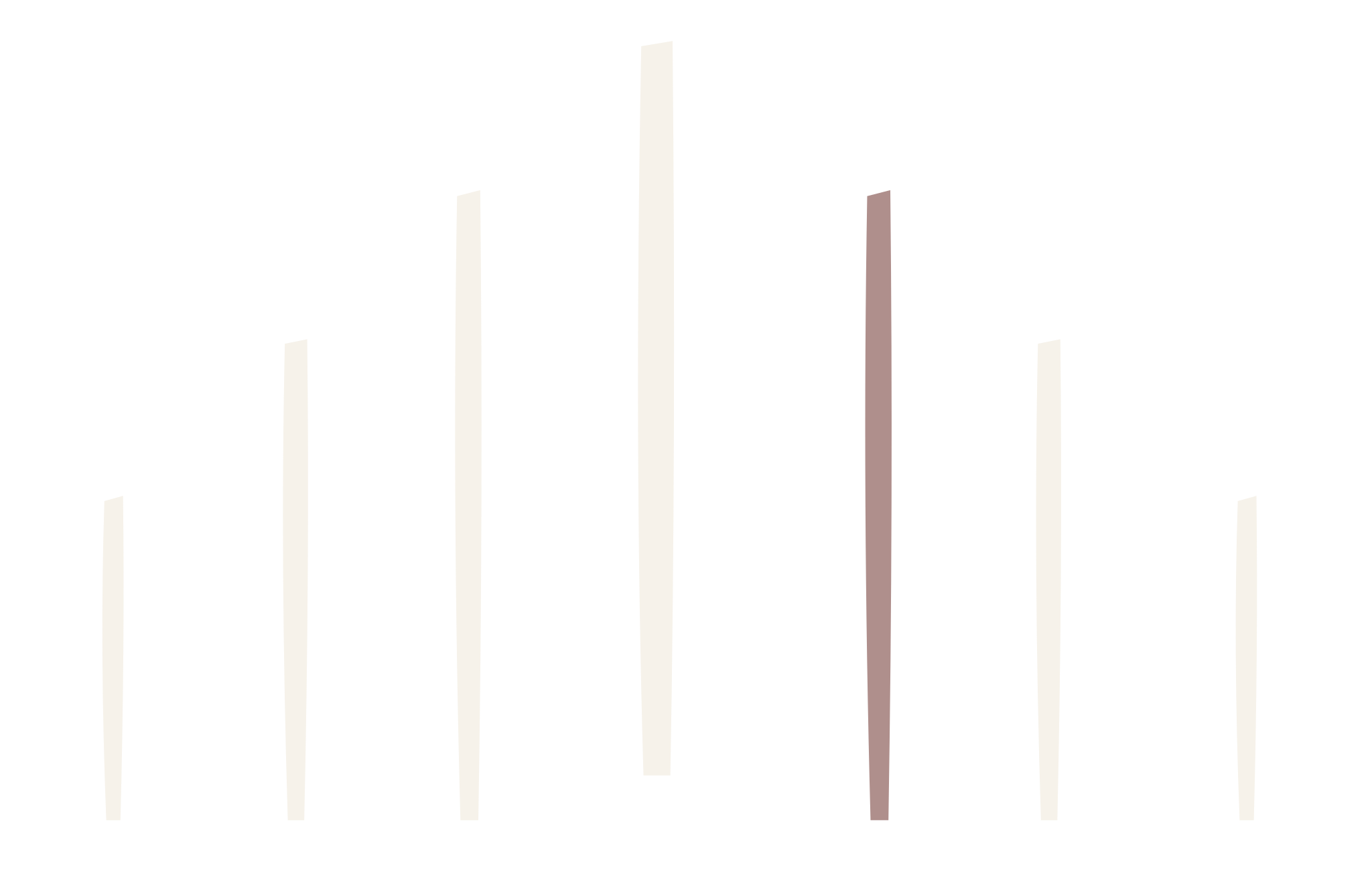
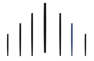
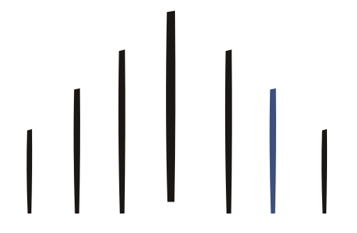
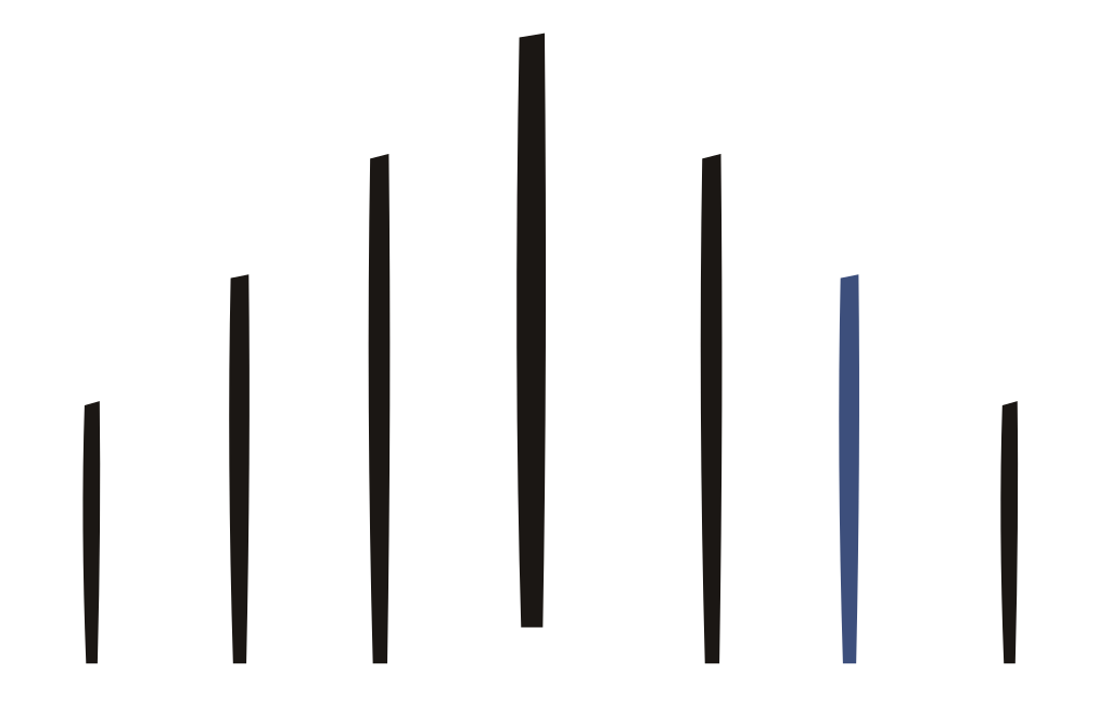
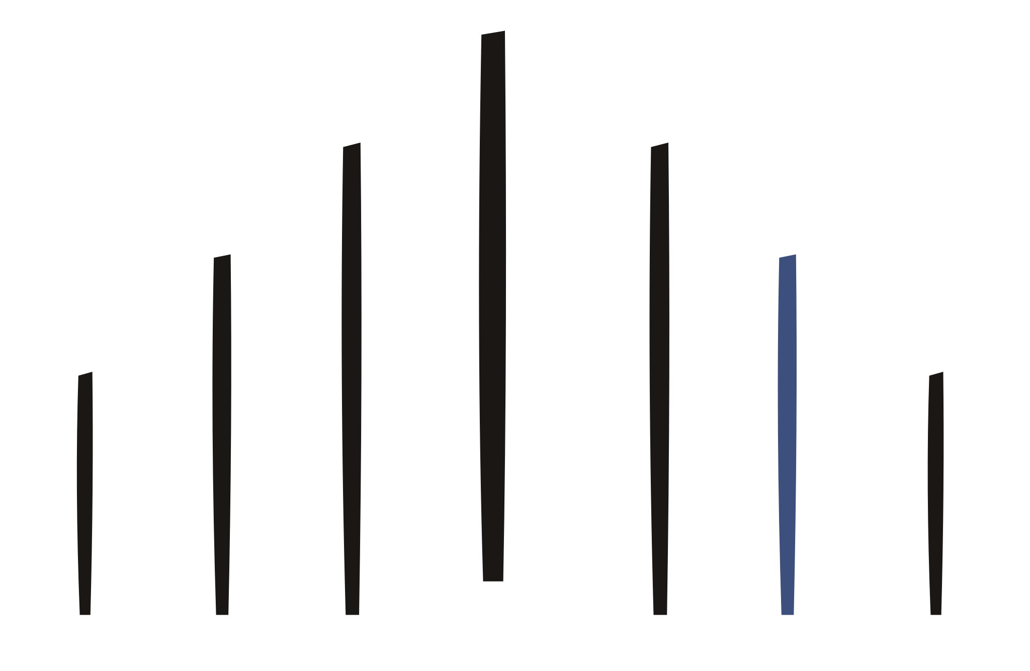
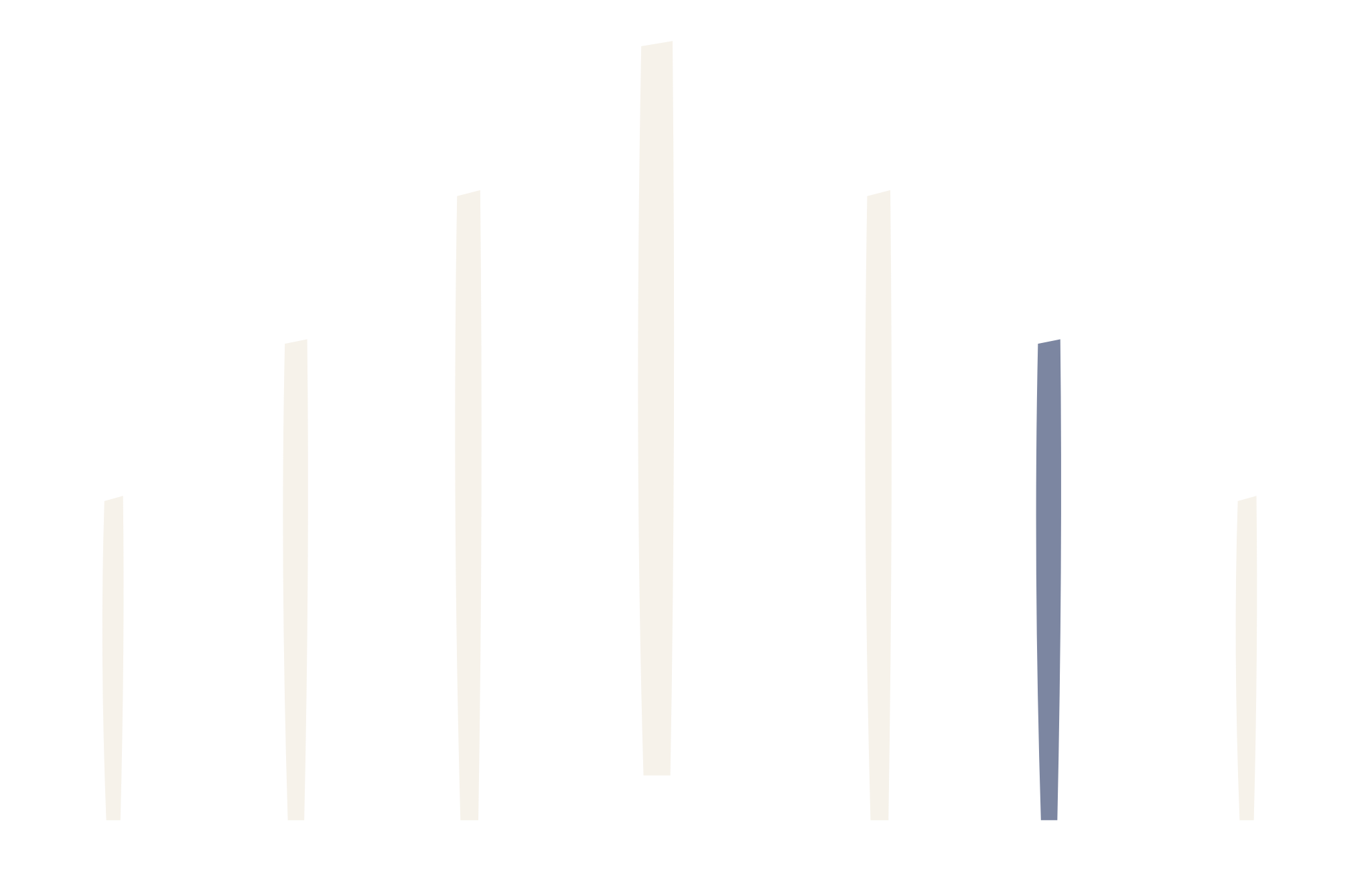
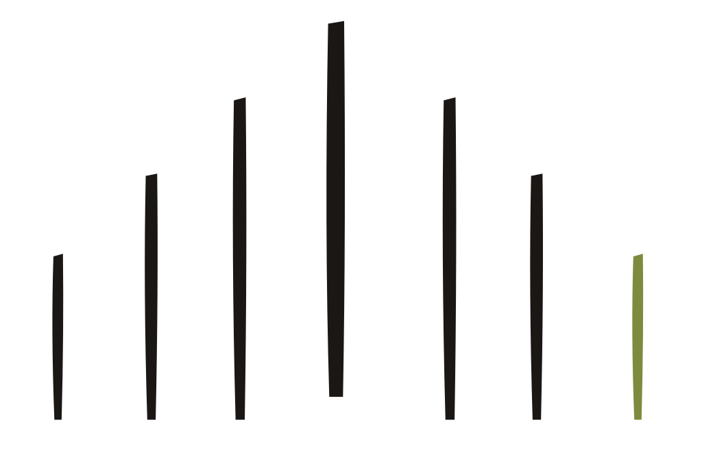
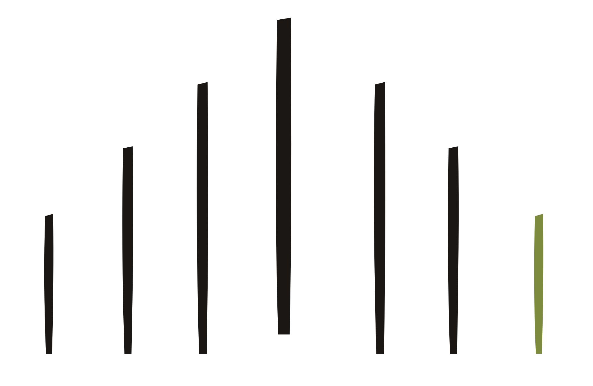
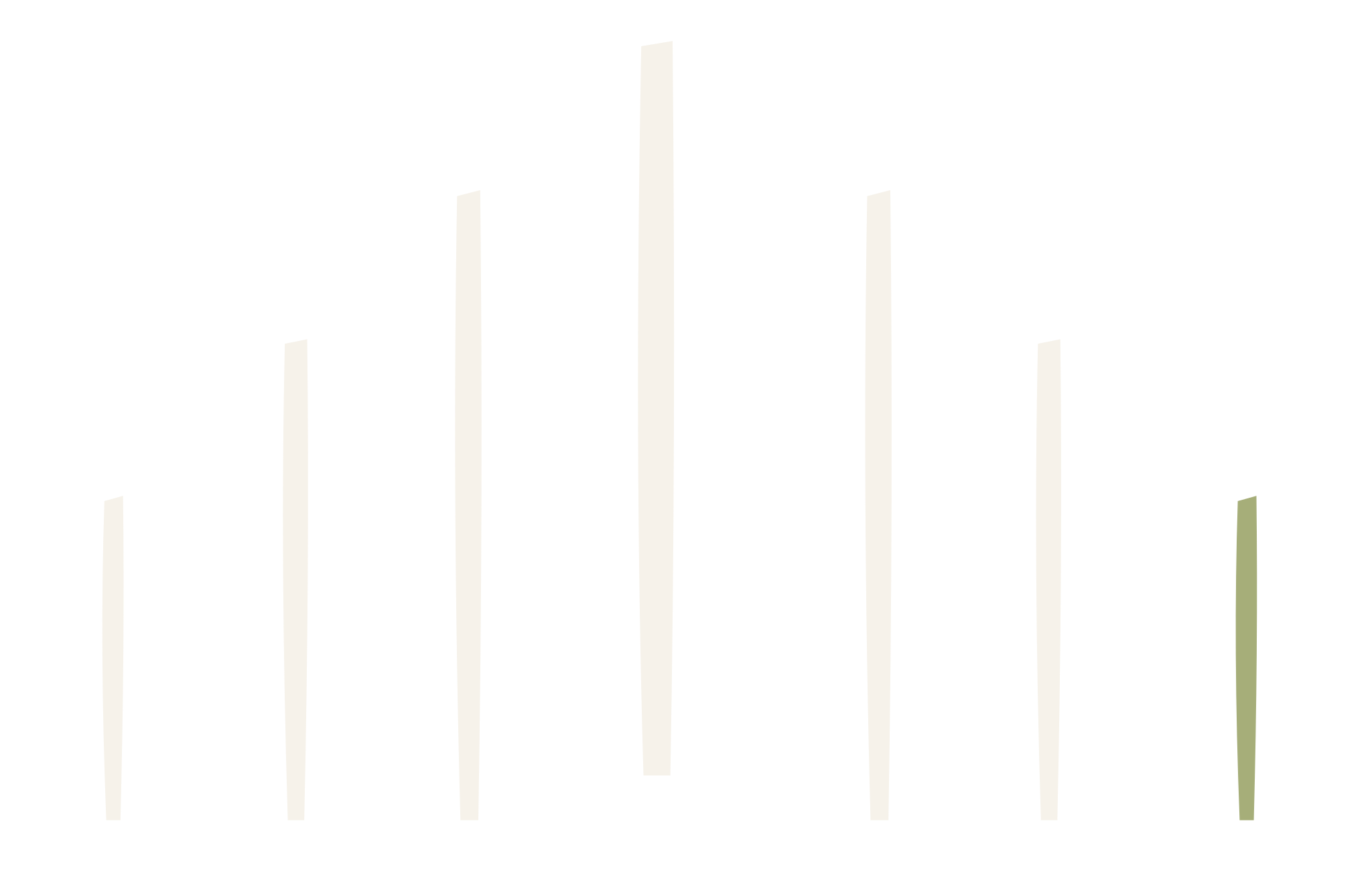
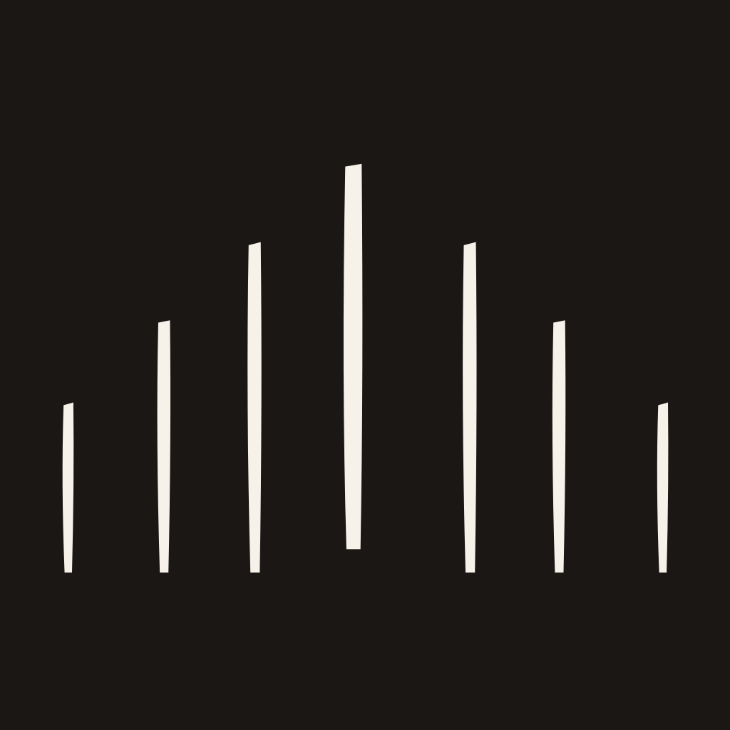
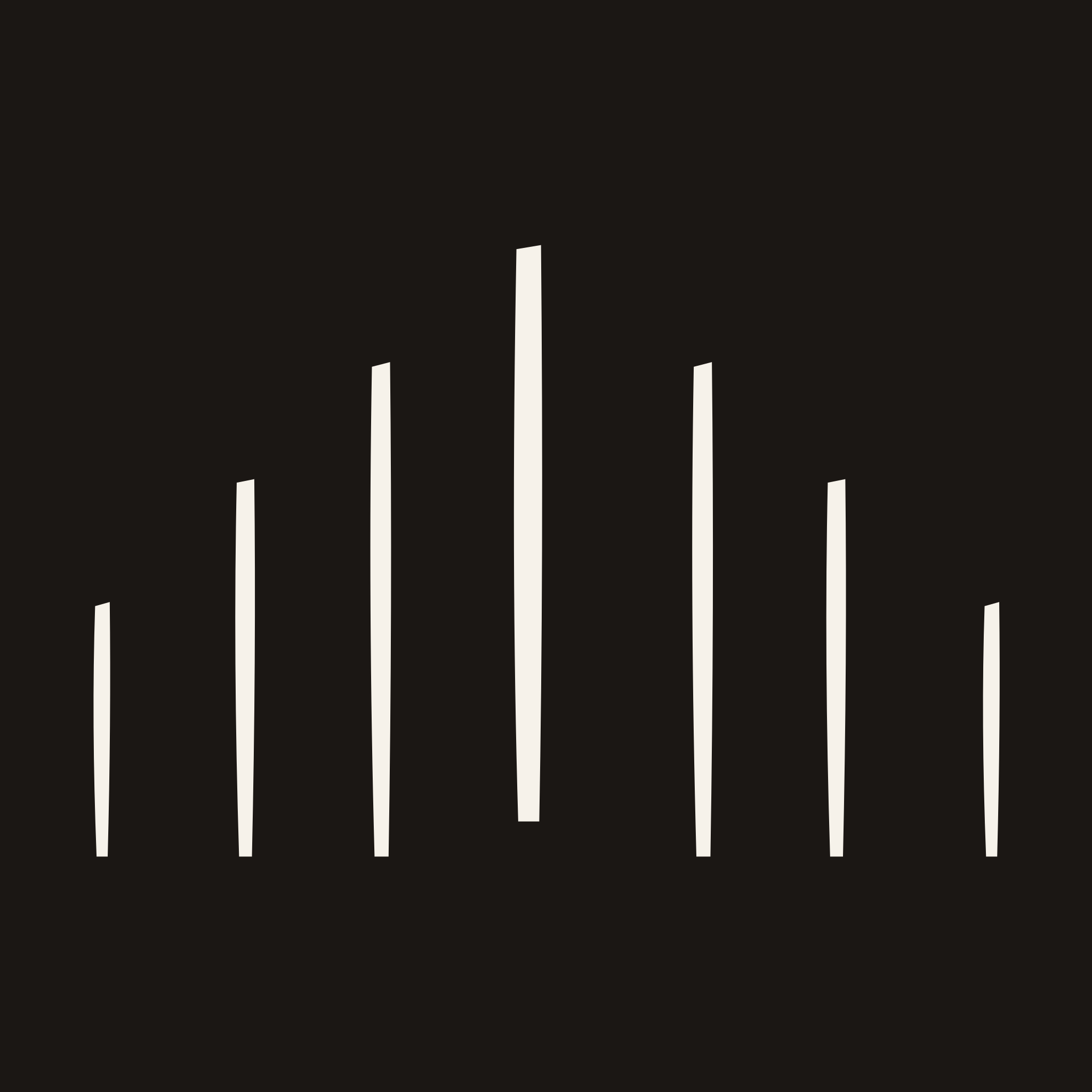
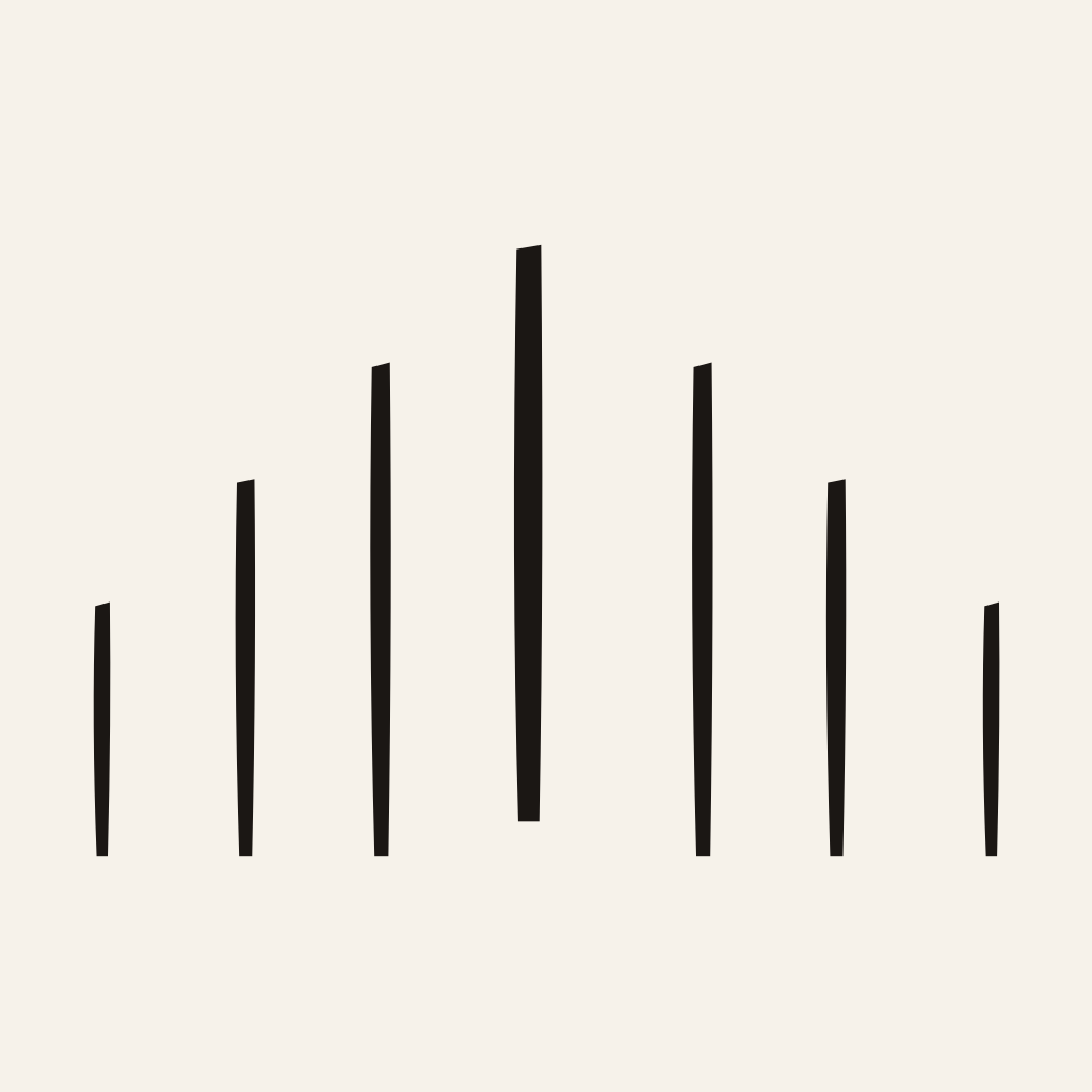
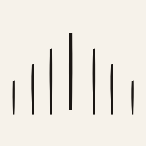
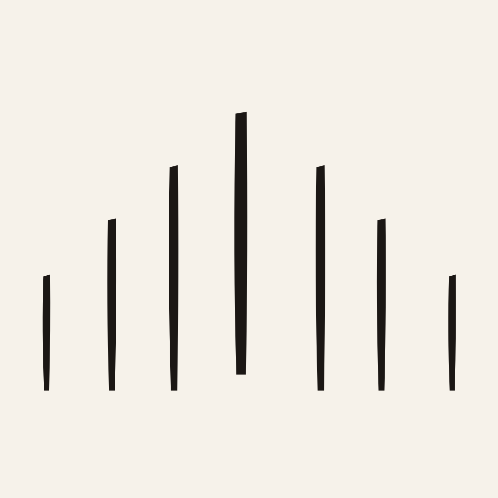
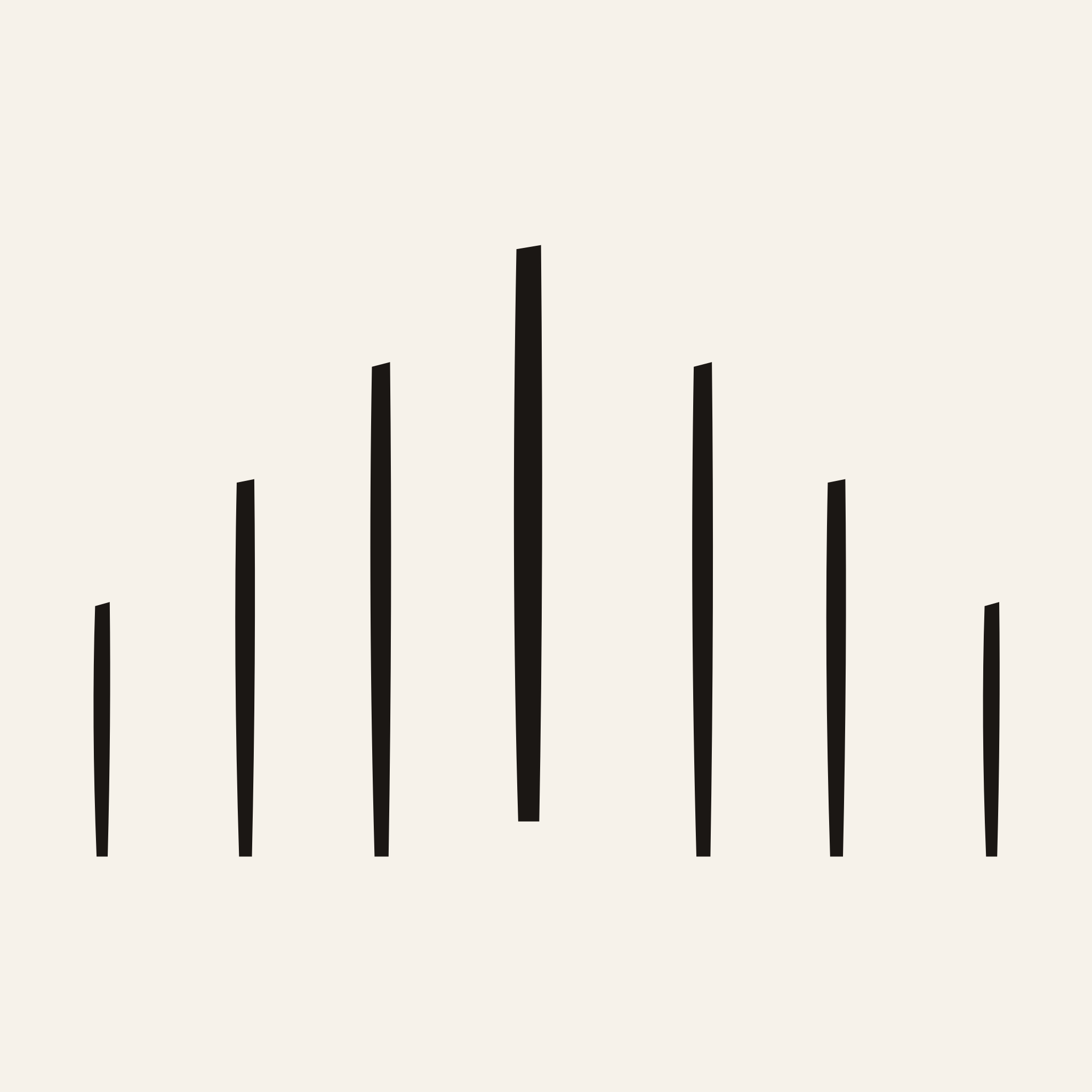
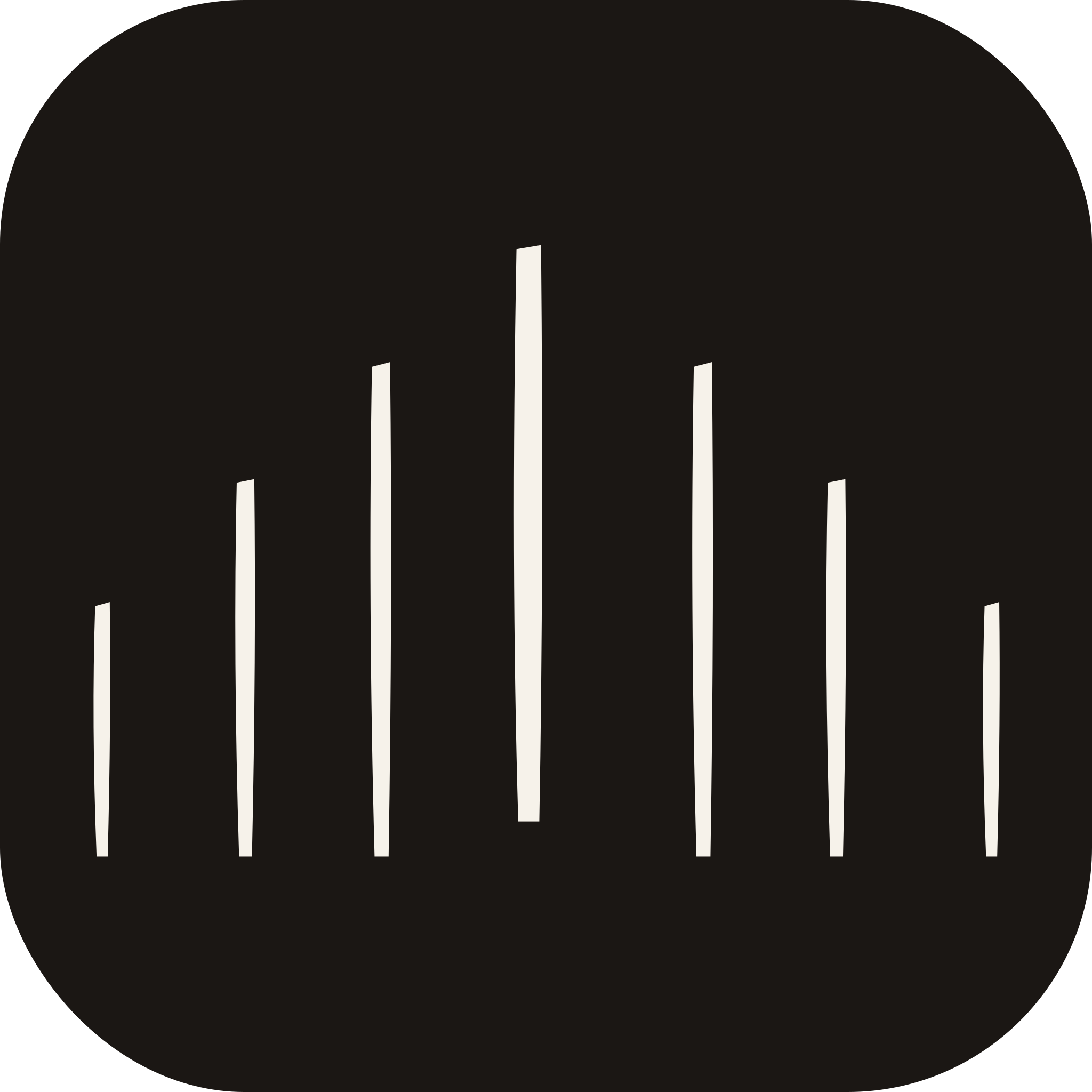
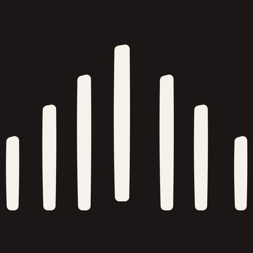
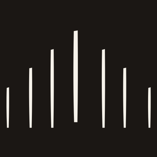
Seven vertical strokes, quadratic-curved, rising to a steep central pitch. A roofline read at a glance, with no construction lines to decode. The centre stroke is drawn slightly heavier than its neighbours, and its base stops short of the line the other six reach, leaving an open gap in its lower third.
The gap is negative space, not a drawn shape. It is formed by the centre stroke stopping 12 units above the baseline -- never an arch, doorway, or other literal opening cut into the stroke. It reads as a threshold by being absent, not by being illustrated. Because it is part of the base geometry rather than a separate small-scale feature, it holds at any size or weight without needing its own version.
Every colourway and ground
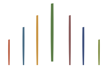
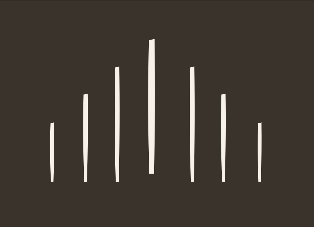
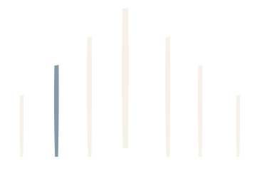
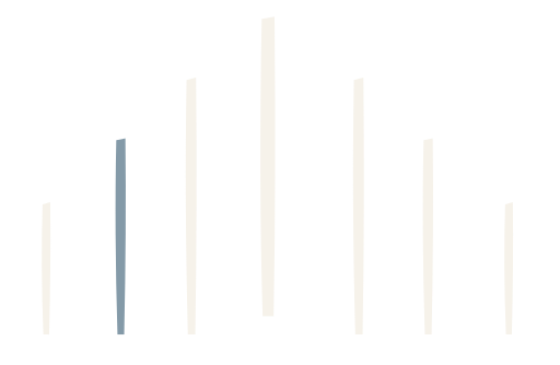
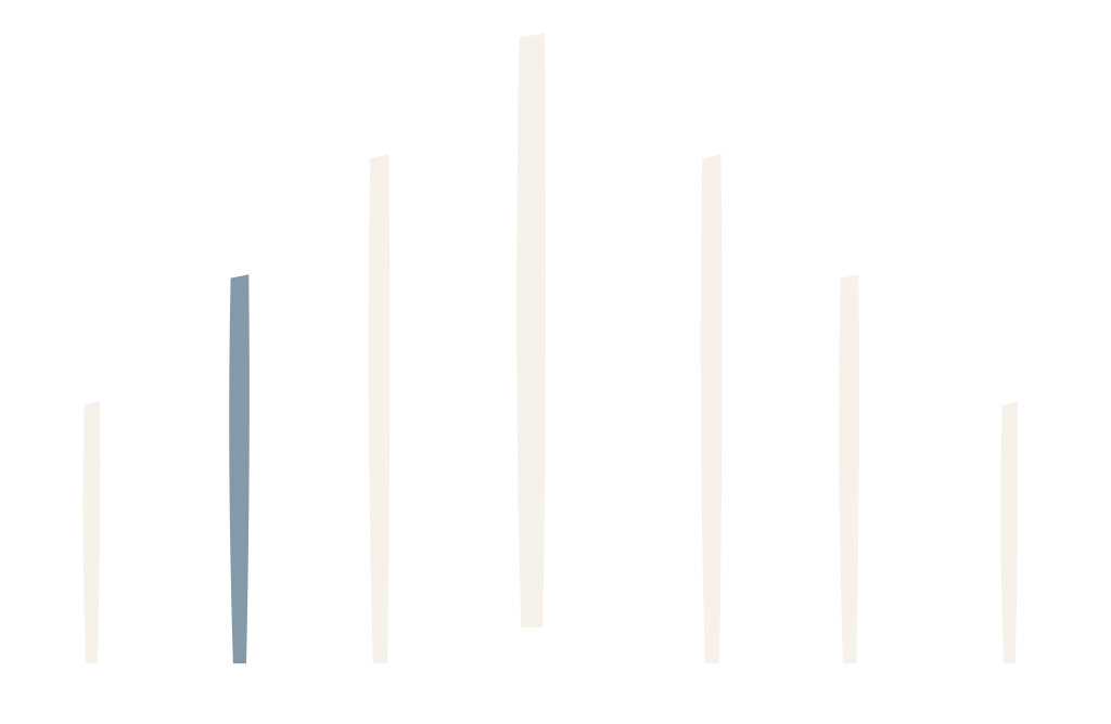
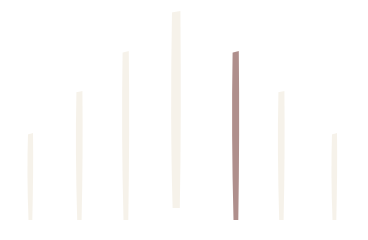
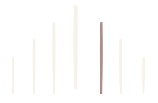
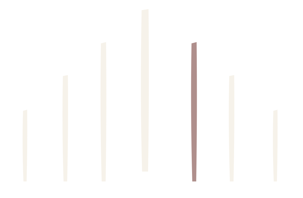
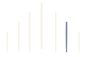
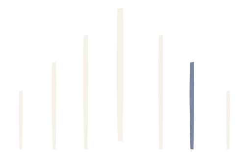
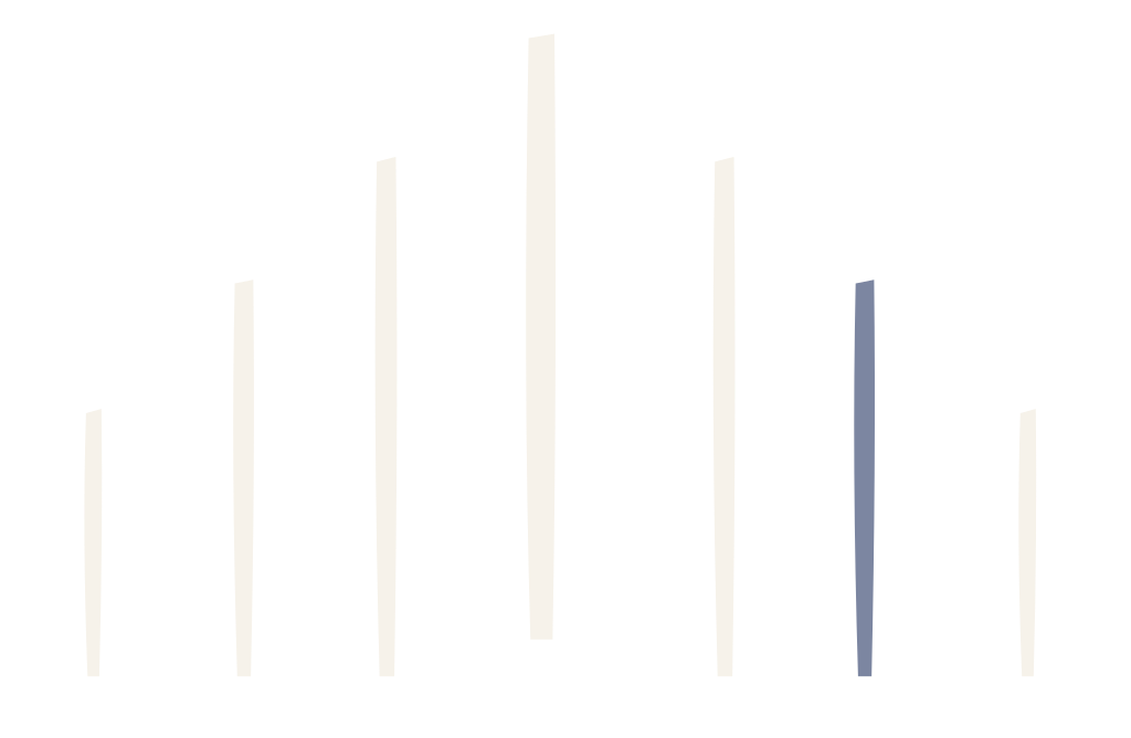
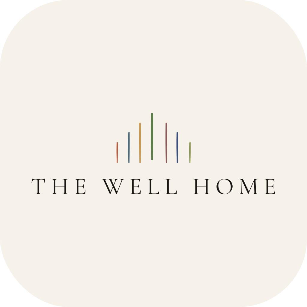
Ink on Bone and Bone on Ink are the default pairing. Stone is available for watermarks and secondary placements. Transparent versions carry no background. The Chroma colourway carries all seven Lever colours at once, one per stroke, Sleep to Safety left to right — use the standard-Chroma version on light grounds and the Chroma (dark grounds) version on Ink or other dark grounds, where the standard palette loses contrast.
Lever tints
Show 1 more ↓
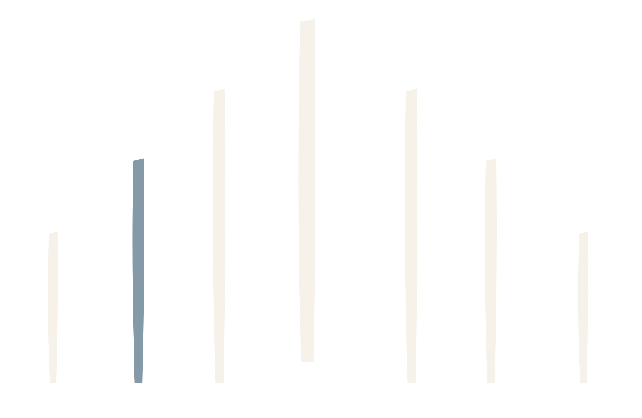
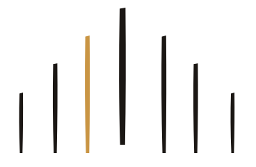
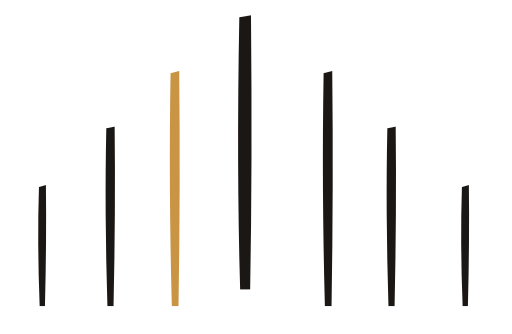
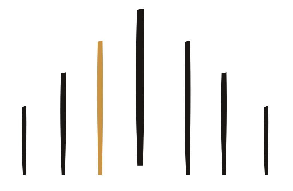
Show 6 more ↓
Badge & App Icons
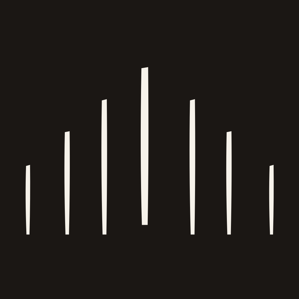
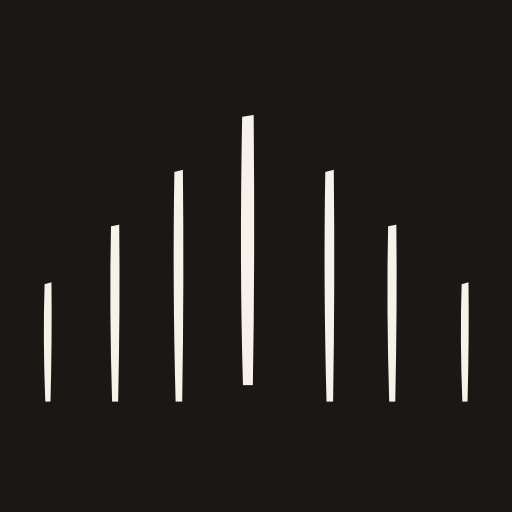
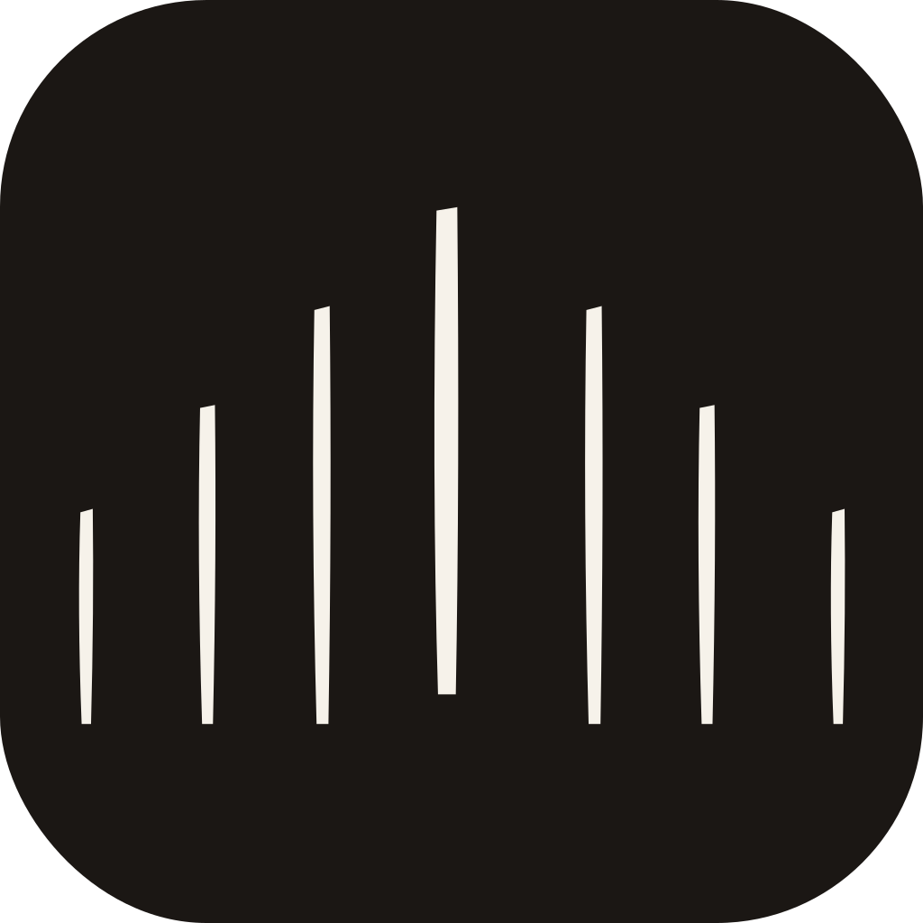
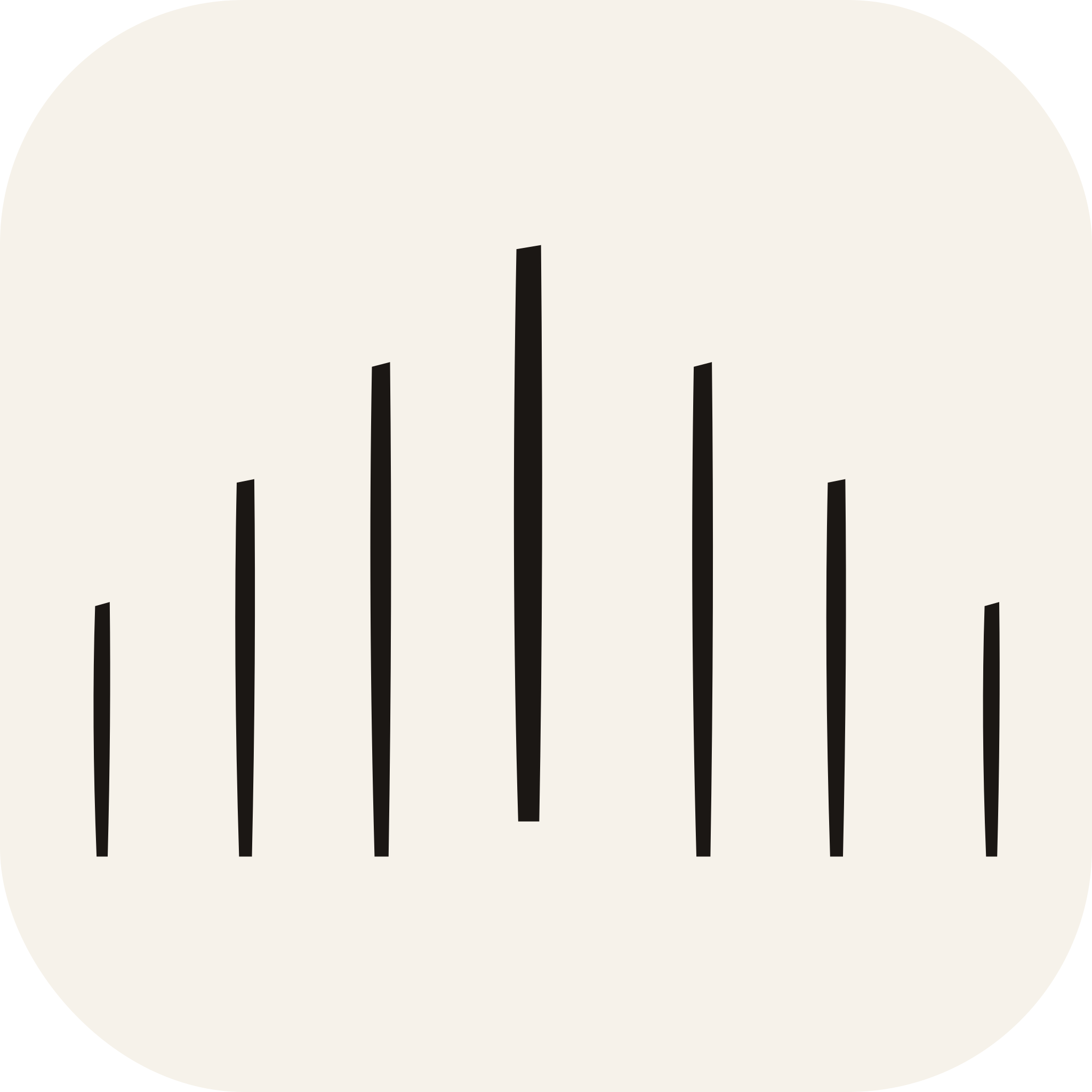
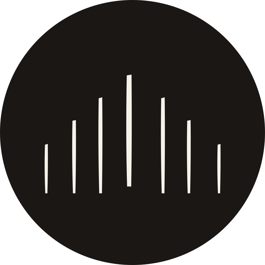
The badge is the one approved exception to the no-container rule. Use it only where the placement itself is a locked square or circle and the free-standing mark cannot survive: app icons, favicons, social avatars, and stamps. Everywhere else, the mark stands alone.
Mark + wordmark, for social and app icons
The mark alone reads as decoration without the name attached. This set carries both, stacked and centred on a solid ground, in white, black, and a full-colour Chroma version, across the same three shapes.
Favicon and app icon set
At 16px the seven-stroke mark blurs into a grey block. The set below uses a seven strokes at every size, bolded at 16px so each one stays distinct. The mark is never reduced, at any size, in any process.






Show 6 more ↓

Show 1 more ↓


Wordmark
The wordmark is set in Cormorant Garamond, uppercase, tracked at 0.20em. The Chroma Period is the signature element.
Stacked
For narrow formats and square placements.




















Secondary Wordmark
Cormorant Garamond is the identity wordmark and stays the default everywhere. Jost is the secondary: a geometric sans for the places a high-contrast serif physically fails. Jost 300 is the only permitted weight, because its stroke weight sits closest to Cormorant 400 and the two need to read as siblings rather than as two different companies.
| Specification | Value |
|---|---|
| Typeface | Jost, 300 Light |
| Licence | SIL Open Font License 1.1. Free to embed, no foundry relationship required. |
| Designer | indestructible type* |
| Tracking | 0.16 em, locked |
| Case | All caps, always |
| Chroma Period | Same rules as the primary: Sleep Terracotta on light, lifted on dark |
| Clear space | Identical to the primary: one cap height on every side |
| Minimum size | 11px cap height on screen, 4mm in print |
When to reach for it
Every row below is a physical constraint, not a preference.
| Situation | Why the serif fails |
|---|---|
| Below 14px cap height | Cormorant's hairlines drop out. Jost holds. |
| Embroidery under 30mm | Serifs at that size become lint. The merch section already assumes this. |
| Signage read at speed or distance | Geometric caps resolve faster than a modelled serif. |
| App and product interface | Where the wordmark sits beside UI type rather than editorial type. |
| Video lower-thirds and motion | Thin serifs strobe on compression and low-bitrate playback. |
| Etched glass, laser, screen print | Any process with a minimum stroke width that a hairline serif cannot meet. |
| Reversed on busy imagery | Jost survives a noisy ground; Cormorant fills in. |
Horizontal
Stacked
Vertical lockup
Horizontal lockup
Rules
- Cormorant is the primary. If it can be used, it is used. The secondary is a technical fallback, not a style choice.
- Never because you want a more modern look. That is taste, not necessity, and it fragments the identity faster than anything else in this guide.
- Jost 300 only. The heavier weights break the sibling relationship with Cormorant and start to read as a different brand.
- Tracking is locked at 0.16. Cormorant is locked at 0.20. These are not interchangeable numbers and neither is a starting point for adjustment.
- One wordmark per artefact. Never both on the same surface, and never both inside one lockup.
- Across a campaign, keep them on separate artefacts rather than separate pages of the same artefact.
- The Chroma Period behaves identically in both. Same colour, same spacing rule, same restraint.
- Every display option that exists for the primary exists here: horizontal, stacked, both lockup orientations, all colourways, both taglines. If you cannot find the secondary version you need, it is because it should not exist.





















Lockups
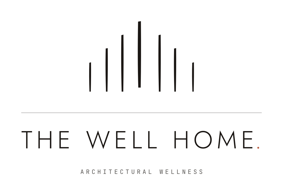
Mark centred above a hairline rule, wordmark below, with an optional category line in JetBrains Mono, wide-tracked.
Vertical
Horizontal
Clear Space & Misuse
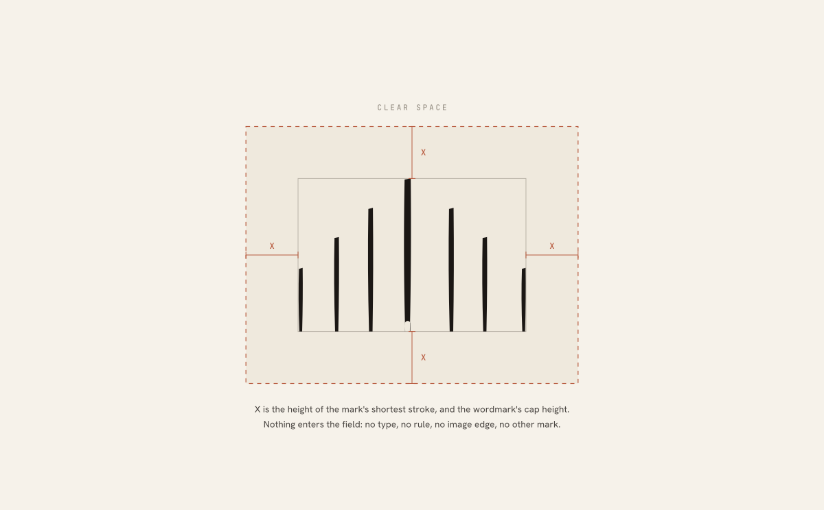
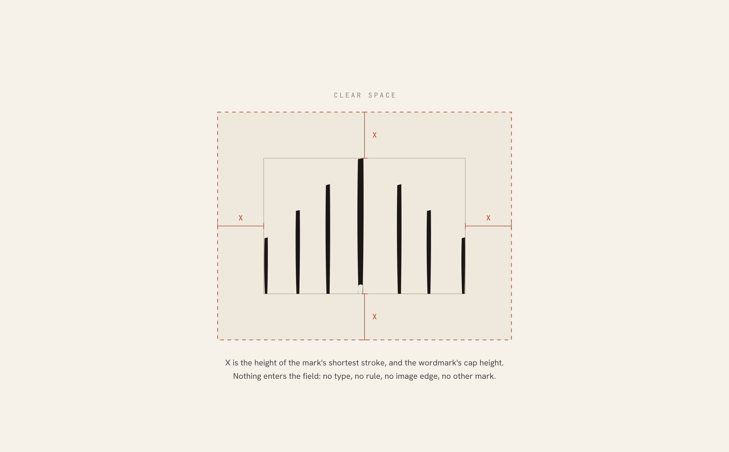
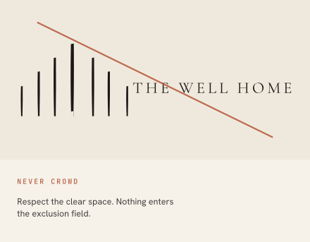
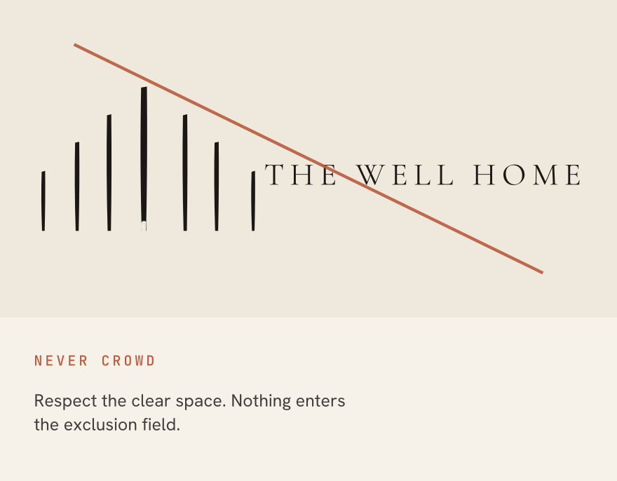
Clear space is X on every side, where X is the height of the mark's shortest stroke, which is also the wordmark's cap height. One measurement, derived from the artwork itself, so it scales with the mark and never needs recalculating. Nothing enters the field: no type, no rule, no image edge, no other mark, no partner logo.
Minimum sizes
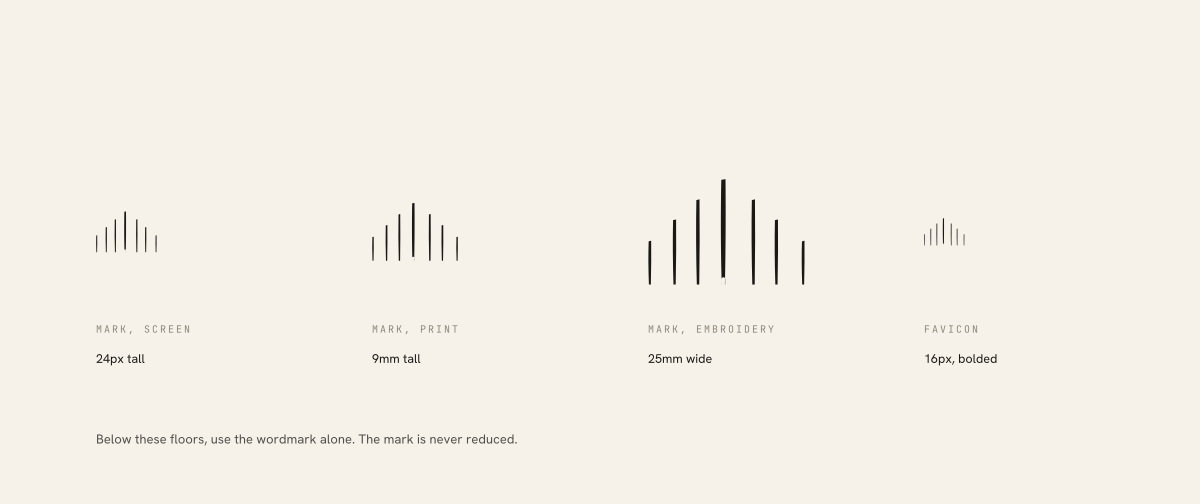
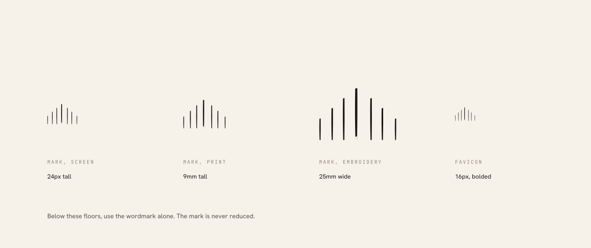
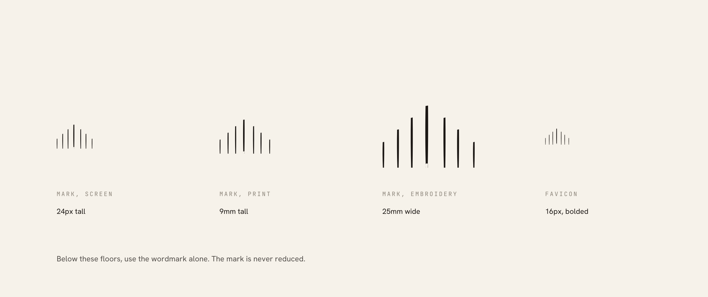
Every floor below is where the artwork physically stops working, not a preference.
| Asset | Floor | Why |
|---|---|---|
| Logomark, screen | 24px tall | Below this the stroke gaps close. Use the badge instead. |
| Logomark, print | 9mm tall | At 300dpi. Below this, ink spread merges the two thinnest strokes. |
| Logomark, embroidery | 25mm wide | Thread minimum. Below this, wordmark only. |
| Favicon | 16px | Bolded. Seven strokes at every size; the mark is never reduced. |
| Wordmark | 80px / 24mm wide | Below this the tracking closes up and it reads as one word. |
| Horizontal lockup | 160px / 46mm wide | Below this, use the mark and wordmark separately. |
Misuse
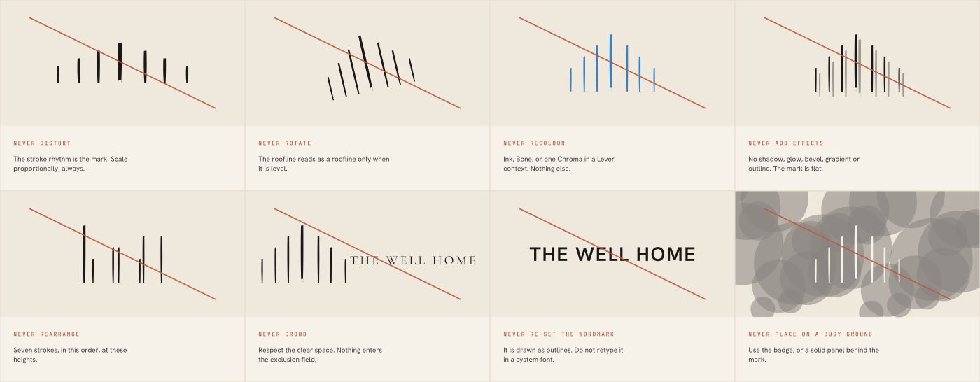
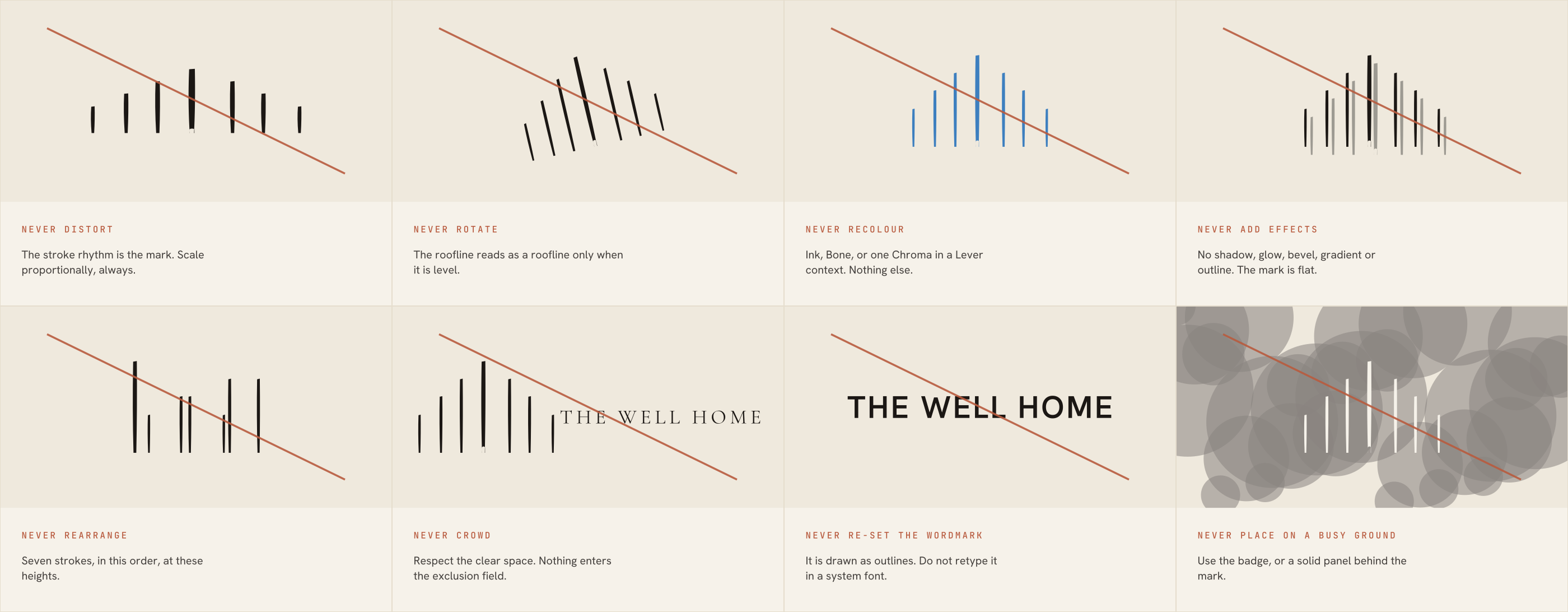
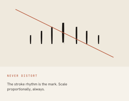
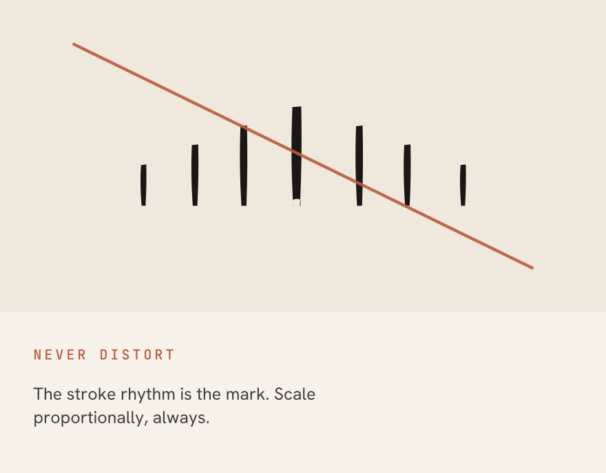
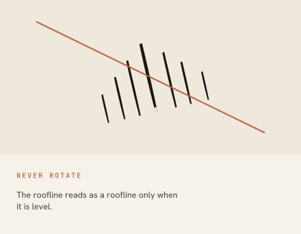
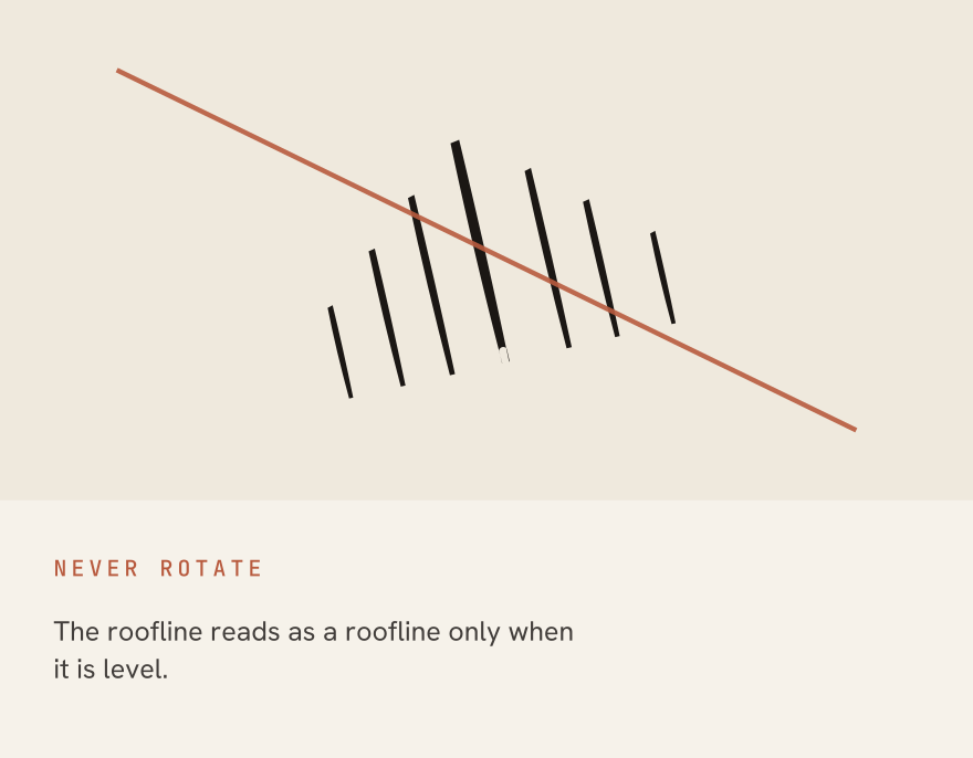
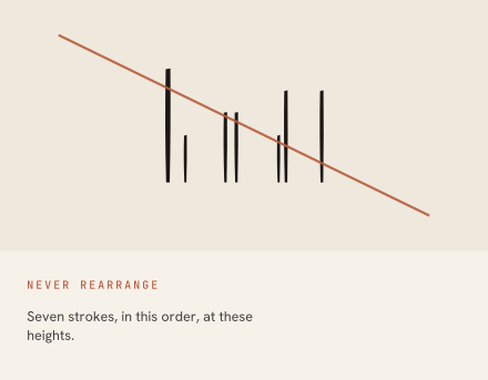
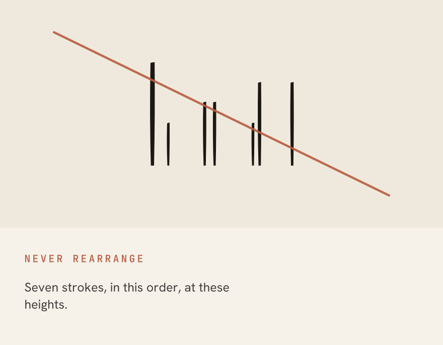
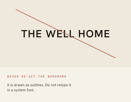
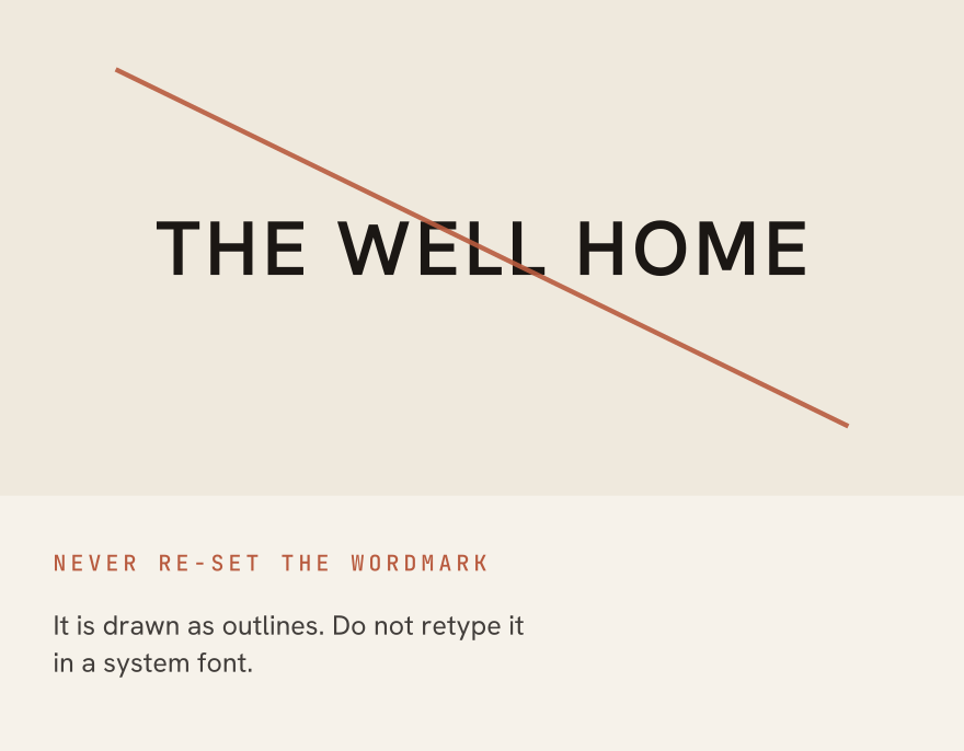
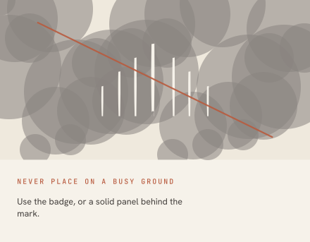
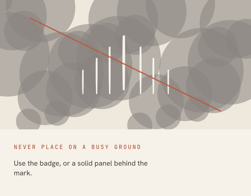
Eight ways the mark breaks, each drawn from the real artwork rather than illustrated. This is the page to send someone who has already got it wrong, so every panel says what the rule is and why it exists, not just that it was broken.
Each case on its own
Do
- Keep the seven-stroke rhythm and steep pitch exact. This is the recognisable silhouette.
- Use Ink-on-Bone or Bone-on-Ink as the default pairing.
- Let the centre stroke's extra weight and open base be the only irregularity.
- Give the mark at least one stroke-gap of clear space on every side.
Do not
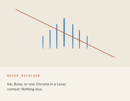
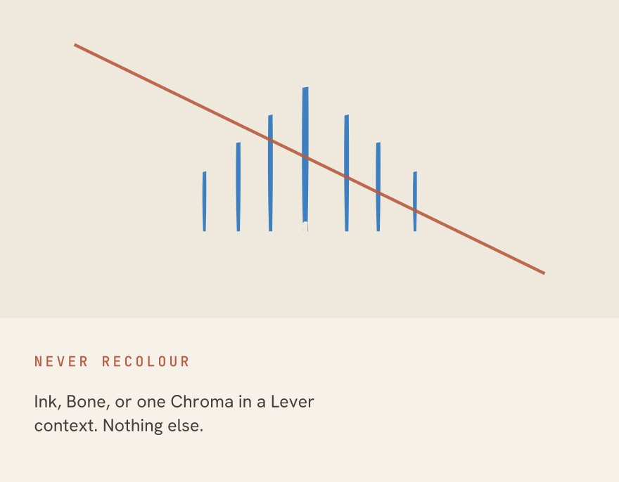
- Do not recolour all seven strokes for decoration. Multi-colour is reserved for Lever-specific data contexts.
- Do not enlarge the gap beneath the centre stroke, and never render it as an arch, doorway, or other literal opening -- it is negative space, not a drawn shape.
- Do not add a container around the free-standing mark. The arch and keyhole containers were explored and superseded.
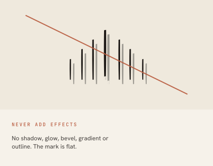
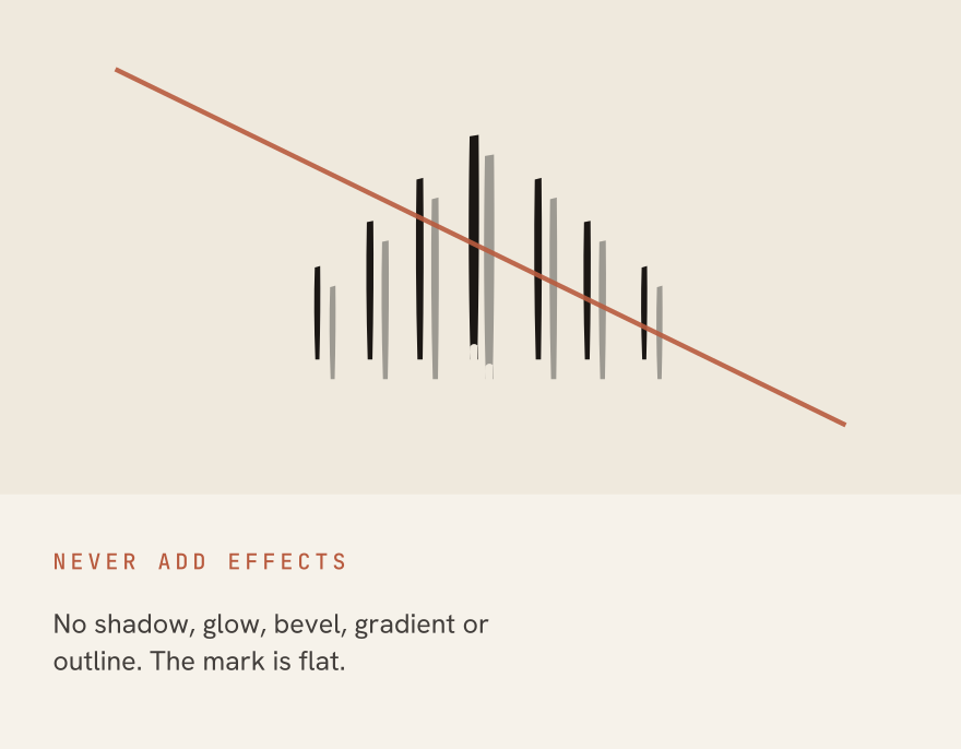
- Do not distort proportions, add shadow or glow, outline the mark, or use it as a background fill.